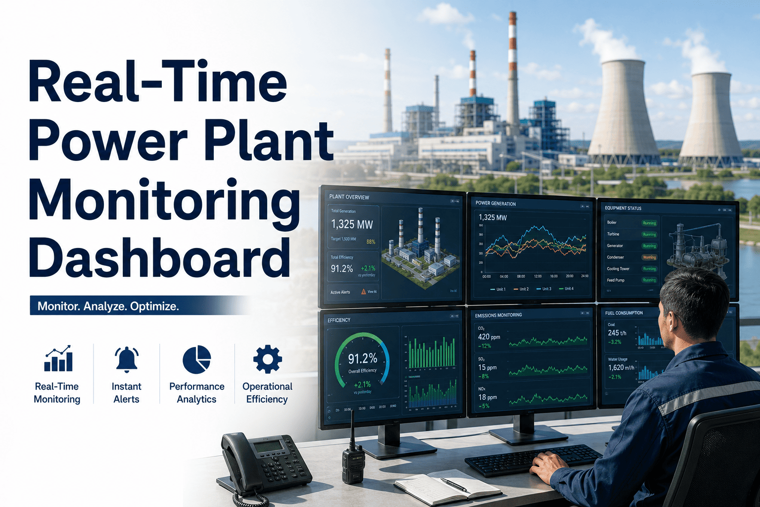
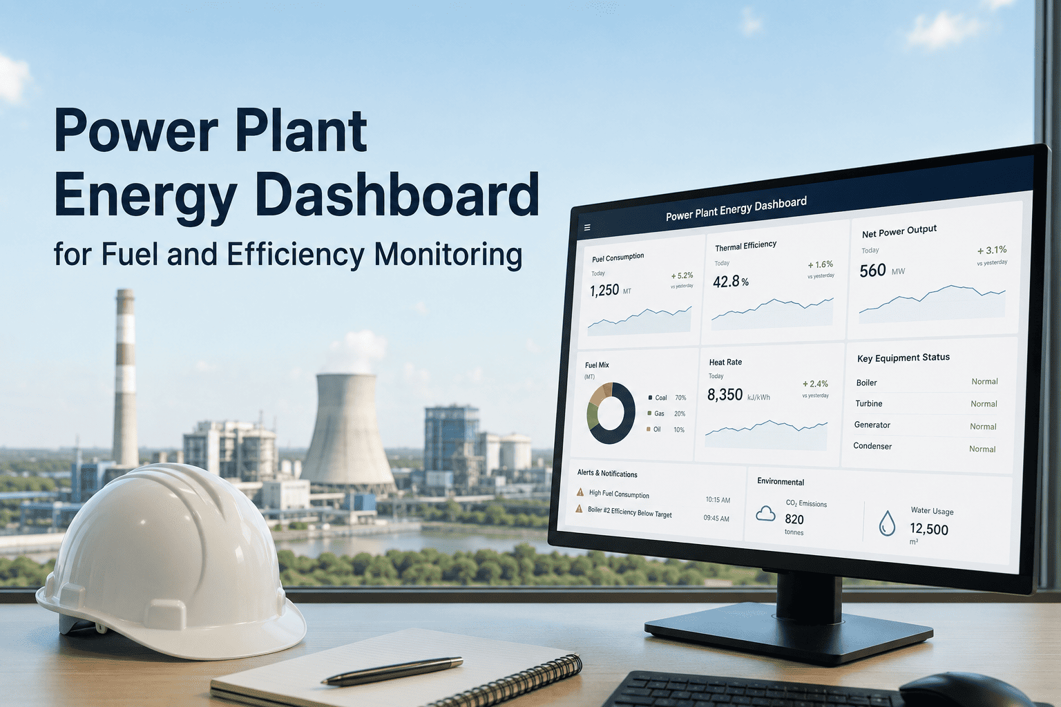
A power plant produces more data per minute than most industrial operations produce in a day. Turbine exhaust temperatures, generator output curves, vibration spectrums, pressure differentials, coolant flows — thousands of data points streaming continuously from every major system. Yet most plants make maintenance decisions from a weekly report compiled manually from four different systems by someone who is not in the control room. The gap between the data your plant produces and the intelligence your maintenance team acts on is exactly where unplanned outages are born. Real-time monitoring dashboards powered by AI close that gap — presenting asset health, performance trends, and failure risk in a single visual interface that lets plant managers and maintenance engineers act on what is happening now, not what happened last Tuesday. Book a demo to see Oxmaint's live monitoring dashboard built for power generation operations, or start a free trial and connect your first assets today.
Dashboard · Real-Time Analytics · AI Asset Intelligence
Real-Time Power Plant Monitoring Dashboard
How AI-powered dashboards convert raw plant data into actionable maintenance decisions — and what plant engineers see when they log in to Oxmaint each morning.
Oxmaint — Power Plant Dashboard · Live
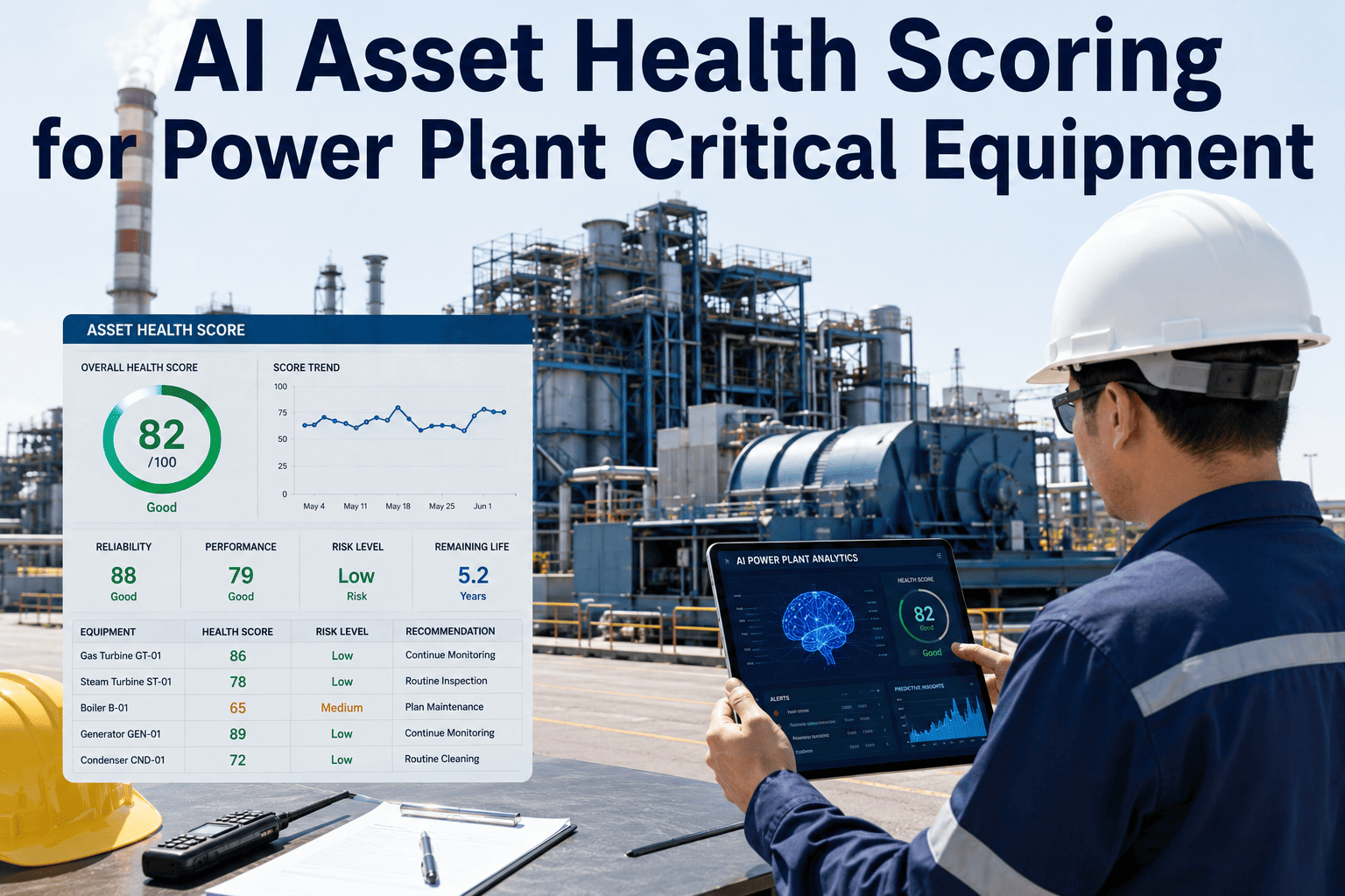
GT Unit 1 — Main Bearing
82 — Good
HRSG Unit 2 — Economizer
54 — Monitor
Cooling Tower Fan Motor
31 — Critical
Generator Stator Winding
91 — Good
HP Steam Turbine Blades
67 — Monitor
Cooling Tower Fan Motor: Vibration amplitude 3.2× baseline — work order generated
HRSG Economizer: Stack temp rising 2.3°C/day — inspection recommended within 5 days
GT Unit 1: Compressor inlet temp within normal band — no action required
What Plant Engineers See — And What They Can Act On
The difference between a monitoring dashboard and an operational intelligence platform is not the number of charts. It is whether the people looking at the screen know exactly what to do next. Oxmaint's dashboard is designed around three roles — each seeing the right level of information for their decision-making responsibility.
Plant Manager
Executive View
Fleet-wide reliability score and PM compliance rate
Maintenance cost per MWh — trending over time
Forced outage frequency and equivalent forced outage rate (EFOR)
Top 5 highest-risk assets requiring board-level attention
Budget variance — planned vs actual maintenance spend
Maintenance Engineer
Operational View
Asset health scores with degradation trend per system
AI anomaly alerts ranked by failure probability and consequence
Open work orders by priority, assignee, and SLA status
PM schedule adherence — which assets are overdue and by how many days
MTBF and MTTR per asset — updated in real time as jobs close
Field Technician
Mobile View
Today's work orders — prioritized by urgency and asset location
Relevant maintenance history for the asset being worked on
Parts needed and inventory availability — before leaving the workshop
Procedure documents and P&IDs linked directly to the work order
Job completion logging with photo evidence — no post-shift paperwork
The Six KPIs Every Power Plant Dashboard Should Track
Not all metrics are maintenance metrics. These six KPIs separate plants running on operational intelligence from plants running on intuition — and each one is updated continuously in Oxmaint from live data rather than assembled manually at month end.
KPI 1
PM Compliance Rate
Percentage of scheduled preventive maintenance tasks completed on time. The single most predictive indicator of future unplanned outage frequency. Plants sustaining above 85% PM compliance consistently outperform those below it on every reliability metric.
Target: 85%+ sustained over 90 days
KPI 2
Planned vs Reactive Ratio
The ratio of planned work orders to reactive work orders by cost. Reactive emergency repairs cost 4.8× the same work done as planned maintenance. A plant at 60% planned and 40% reactive is significantly overspending versus one at 80/20 — even if total repair counts are similar.
Target: 80% planned, 20% reactive or better
KPI 3
Mean Time Between Failures (MTBF)
Average operating time between failure events per asset. Rising MTBF indicates that PM intervals and procedures are correctly calibrated to the asset's actual failure patterns. Falling MTBF signals deteriorating asset health or PM interval misalignment that needs immediate review.
Target: Trending upward quarter-over-quarter
KPI 4
Mean Time To Repair (MTTR)
Average time from work order creation to confirmed job completion. Tracks how efficiently the maintenance team responds and resolves issues once they occur. High MTTR often indicates parts availability problems, workflow bottlenecks, or technician skill gaps on specific asset types.
Target: Trending downward as processes mature
KPI 5
Maintenance Cost Per MWh
Total maintenance spend (labour, parts, contractor fees) divided by megawatt-hours generated. The definitive metric for maintenance efficiency because it normalizes cost against actual production output. Allows meaningful comparison across units, sites, and reporting periods regardless of load factor changes.
Target: Trending downward versus prior-period baseline
KPI 6
Asset Health Score
AI-generated composite score per asset integrating sensor readings, maintenance history, failure patterns, and OEM life limits. Provides a single number (0–100) that lets engineers prioritize attention across hundreds of assets without reviewing raw data streams. Scores below 50 trigger automatic priority escalation.
Target: No critical assets (score below 40) unactioned
Oxmaint tracks all six KPIs automatically from live data — no manual report assembly. Plant managers, engineers, and technicians each see the view calibrated to their role.
From Raw Sensor Data to Maintenance Action — How AI Turns Numbers Into Decisions
Raw Sensor Data Collection
Thousands of readings per minute from vibration sensors, temperature probes, pressure transmitters, flow meters, and SCADA historians. Data ingested via OPC-UA, Modbus, or direct API — no manual entry at any stage.
Baseline Profiling and Anomaly Detection
Machine learning models establish each asset's normal operating envelope across different load levels and ambient conditions. Deviations from this envelope — not from static alarm setpoints — are what trigger alerts. This catches early degradation weeks before it reaches an alarm threshold.
Failure Probability Scoring and Prioritization
Detected anomalies are scored by estimated time to failure and operational consequence. A cooling tower fan motor with a 35-day estimated failure horizon and medium consequence is ranked differently than an HP turbine bearing with a 14-day horizon and high consequence. Engineers act on ranked risk, not raw sensor lists.
Automated Work Order and Maintenance Scheduling
High-priority anomalies trigger work orders automatically — pre-populated with asset context, relevant procedures, required parts, and assigned technician based on skill and availability. The maintenance team responds to structured tasks, not raw alarm notifications.
Closed-Loop Learning and KPI Update
Completed work order findings feed back into the AI model — confirming or correcting the anomaly classification. Over time the model improves its failure horizon accuracy for each specific asset type. Every intervention makes the next prediction more precise. Dashboard KPIs update in real time as jobs close.
Frequently Asked Questions
How long does it take before the AI dashboard starts producing useful anomaly alerts?
Machine learning models typically catch 3–5 pre-existing degradation conditions within the first month of data ingestion. Baseline profiling improves as more operational cycles are observed — the model becomes measurably more accurate at 3 months and highly reliable at 6 months.
Start your free trial to begin the baseline period immediately.
Can the dashboard be customized for different roles — managers, engineers, and technicians?
Yes. Oxmaint uses role-based dashboards. Plant managers see fleet-level reliability, cost, and EFOR metrics. Maintenance engineers see asset health scores, open work orders, and anomaly alerts. Field technicians see their assigned jobs, procedures, and parts requirements on mobile — no configuration required per user.
Book a demo to see each role view live.
Does the dashboard work for multi-unit or multi-site power plant portfolios?
Oxmaint supports multi-site operations with a centralized executive dashboard across all sites, drill-down to site-level and unit-level views, and cross-site comparison of KPIs like maintenance cost per MWh and PM compliance rate. Site-specific access controls ensure teams only see relevant data.
How does the dashboard support compliance reporting for NERC or environmental audits?
Compliance reports — including NERC GADS event logs, EFOR calculations, and inspection records — are generated directly from work order data in the dashboard. Every task is timestamped and technician-signed. Audit-ready reports export in minutes, replacing the 15–20 hours per month most plants spend assembling documentation manually.
What data sources does Oxmaint's dashboard connect to?
Oxmaint connects to SCADA and DCS historians via OPC-UA and Modbus, vibration monitoring systems (GE Bently Nevada, SKF), oil analysis lab imports, ERP and procurement systems via API, and manual meter readings from field technicians. All data streams feed the same asset record — creating a single source of truth for every asset in the plant.
Your Plant Data Is Already Telling You What Will Fail Next. Are You Listening?
Oxmaint's real-time monitoring dashboard surfaces asset health, anomaly alerts, and maintenance priorities in one view — so your team acts on intelligence, not instinct. Every KPI updated live. Every role seeing what they need.