The board meeting starts in two hours. The provost wants to know why deferred maintenance has increased 23% while the facilities budget grew only 4%. You have spreadsheets from three different systems, handwritten logs from the HVAC team, and a vague sense that emergency repairs consumed most of Q3's budget. Somewhere in that data is the story of an aging chiller plant that's been hemorrhaging money—but you can't tell it because you can't see it.
Campus facilities teams operate in data-rich environments where critical insights remain buried in disconnected systems. Work orders live in one platform, budget tracking in another, and safety inspections in paper files. Without unified visibility, facilities directors make decisions based on institutional memory rather than institutional intelligence—and boards make funding decisions without understanding the true cost of deferred maintenance.
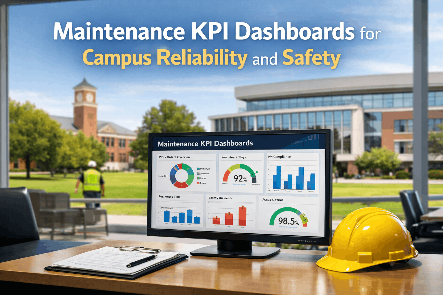
This guide establishes a comprehensive framework for building maintenance KPI dashboards that serve campus operations, from daily technician productivity to board-level capital planning. Institutions implementing these dashboards report 30-45% improvement in budget accuracy and measurable gains in stakeholder confidence. Teams ready to centralize their metrics can sign up free.
What if every maintenance decision was backed by real-time data that stakeholders actually trust?
Why KPI Dashboards Define Modern Campus Facilities Management
Educational institutions face unique accountability pressures. Administrators demand cost transparency. Accreditation bodies require documented safety compliance. Parents expect facilities that support learning outcomes. Boards need evidence-based capital planning. Without unified dashboards, facilities teams spend more time compiling reports than improving operations.
- Budget requests based on estimates rather than documented need
- Safety compliance gaps discovered during audits, not prevented
- Deferred maintenance growing invisibly until systems fail
- Technician productivity unmeasured and unoptimized
- Capital planning disconnected from actual asset condition
- Data-backed budget justification for administrators and boards
- Proactive safety monitoring with documented compliance
- Visible deferred maintenance backlog with prioritization
- Technician workload balancing and performance insights
- Asset lifecycle data informing replacement decisions
Essential KPI Categories for Campus Maintenance
Effective maintenance KPI dashboards organize metrics into categories that serve different stakeholder needs—from technicians monitoring daily workloads to boards evaluating long-term capital requirements. The framework below identifies critical metrics, target benchmarks, and the operational questions each KPI answers.
| KPI Category | Key Metrics | Target Benchmark | Stakeholder Value | Update Frequency |
|---|---|---|---|---|
| Work Order Performance | Completion rate, response time, backlog | 95% completion, <24hr response | Operations managers, technicians | Real-time / Daily |
| Safety & Compliance | Inspection completion, incident rate, violations | 100% on-time inspections | Risk management, administration | Daily / Weekly |
| Asset Health | Failure rate, mean time between failures, condition scores | MTBF improving year-over-year | Capital planning, facilities directors | Monthly |
| Budget & Cost | Cost per sq ft, labor vs. parts ratio, variance to budget | <5% budget variance | CFO, budget committees, boards | Monthly / Quarterly |
| Preventive Maintenance | PM completion rate, PM vs. reactive ratio | 80%+ PM, <20% reactive | Operations managers, technicians | Weekly / Monthly |
| Energy & Sustainability | Energy use intensity, utility cost trends | Year-over-year improvement | Sustainability office, administration | Monthly |
Dashboard Views by Stakeholder Role
Core Safety and Compliance KPIs for Campus Operations
Educational institutions carry unique safety obligations—protecting minors in K-12 settings, managing laboratory hazards in research universities, ensuring accessibility compliance across aging building stock. Safety KPIs transform compliance from checkbox exercises into continuous monitoring that prevents incidents before they occur.
Building Effective Work Order Performance Dashboards
Work order metrics form the operational backbone of maintenance dashboards. These KPIs reveal whether teams are keeping pace with demand, responding appropriately to priorities, and resolving issues effectively. Well-designed work order dashboards enable supervisors to balance workloads and identify bottlenecks before they cascade into backlogs.
Timestamp captured for response time calculation; request source logged for demand analysis
Priority classification tracked; assignment time logged; technician workload updated
Labor hours captured; parts usage logged; wrench time vs. travel time distinguished
Resolution time calculated; first-time fix rate determined; cost totaled
Requester satisfaction captured; recurring issue flagged; data flows to trend analysis
Connecting Dashboards to Continuous Improvement
Dashboards deliver value only when they drive action. The architecture below shows how KPI data flows from daily operations through analysis to improvement initiatives—creating a closed loop where insights generate changes and changes generate new insights.
Alert Thresholds for Proactive Management
Trigger: Safety inspection overdue, life safety system failure, backlog exceeds 200% of weekly capacity
Response: Director notification, emergency resource allocation, incident documentation
Trigger: PM completion below 90%, response time SLA breached, budget variance exceeds 10%
Response: Supervisor review, root cause investigation, corrective action planning
Trigger: Trending toward threshold breach, recurring issues on same asset, technician overtime increasing
Response: Include in weekly team review, monitor for escalation, preventive intervention
Trigger: All KPIs within target ranges, trends stable or improving
Response: Continue standard operations, capture baseline for benchmarking
Ready to transform maintenance data into stakeholder confidence?
Join campus facilities teams using Oxmaint to demonstrate operational excellence.
Implementation Roadmap: From Data Chaos to Dashboard Clarity
Audit existing data sources and identify gaps
Interview stakeholders to define reporting needs by role
Establish KPI definitions and calculation methodologies
Set target benchmarks based on institutional context
Configure CMMS to capture required data fields consistently
Establish work order classification standards
Build asset hierarchy aligned with reporting needs
Train technicians on data entry requirements
Build role-specific dashboard views
Configure alert thresholds and notification rules
Create scheduled report templates for stakeholders
Validate calculations against manual spot-checks
Roll out dashboards to all stakeholder groups
Train users on interpretation and action protocols
Gather feedback and refine visualizations
Establish governance for ongoing KPI evolution
KPI Dashboard Success Metrics
Percentage of work orders closed within target timeframe by priority level
Percentage of scheduled preventive maintenance completed on time
Average time from request submission to technician acknowledgment
Percentage of work orders resolved on initial visit without return trips
Proportion of preventive/planned work versus emergency/reactive
Percentage of required safety inspections completed before due date
"The institutions winning budget battles today are the ones who can show their boards exactly where money goes and exactly what happens when it doesn't. Dashboards transformed how my team communicates with administration. Instead of defending budget requests with 'we need more,' we demonstrate that our PM completion rate correlates directly with emergency repair costs. When we dropped PM compliance to 78% during the hiring freeze, emergency work orders jumped 45% and costs exceeded the savings from the unfilled position. That story—told with data—got us approval for two new technicians. Numbers don't argue; they inform."
Conclusion: Data-Driven Campus Operations
Maintenance KPI dashboards transform facilities management from a cost center defending budgets to a strategic function demonstrating value. When boards see documented deferred maintenance liability, when accreditors see complete inspection histories, when administrators see cost-per-square-foot trending down while satisfaction trends up—facilities teams earn the credibility and resources they need. The investment in dashboard infrastructure pays returns through every budget cycle, every audit, and every stakeholder conversation. Sign up free to start building the foundation for data-driven campus operations.
Stop defending maintenance budgets with guesswork. Start demonstrating value with data.
Frequently Asked Questions
Initial operational insights emerge within 30-60 days as work order data accumulates. However, meaningful trend analysis requires 3-6 months of consistent data collection to establish baselines and identify patterns. Strategic metrics like asset failure rates and cost-per-square-foot need 12+ months for year-over-year comparisons. Start with operational KPIs that drive daily decisions, then layer in strategic metrics as your data matures. The key is establishing consistent data entry practices from day one.
Many legacy systems capture adequate data but lack visualization capabilities. Options include exporting data to business intelligence tools, implementing middleware for dashboard integration, or migrating to modern platforms with built-in analytics. Before deciding, audit what data your current system actually captures—you may be surprised by available fields that simply aren't being used. Modern cloud-based CMMS platforms like Oxmaint include dashboard capabilities designed specifically for facilities KPIs. Book a demo to see dashboard capabilities.
Technician adoption requires three elements: ease of entry (mobile-first interfaces), visible value (showing them how their data improves their work), and management reinforcement (making data completeness part of performance expectations). Start with mandatory fields that capture essential KPIs, then expand as habits form. Show technicians dashboards that help them—like personal completion rates or workload visibility—not just dashboards that monitor them. When technicians see data helping them get resources and recognition, compliance improves naturally.
Start with work order completion rate (operational health), PM compliance rate (program maturity), and safety inspection currency (risk management). These three metrics provide a foundation that satisfies most stakeholder questions while establishing data collection habits. Add response time and first-time fix rate as your team's data entry becomes consistent. Budget metrics require accurate cost capture, which typically develops in Phase 2 after basic work order tracking is reliable.
Translate facilities metrics into business language boards understand. Instead of "PM compliance dropped to 78%," say "We completed 78% of scheduled maintenance, which correlates to the 23% increase in emergency repair costs." Connect every metric to institutional risk, student experience, or financial impact. Use visual trends rather than tables of numbers. Lead with the story the data tells, not the data itself. And always include a "so what" for each metric—what action does this information suggest or what risk does it highlight?