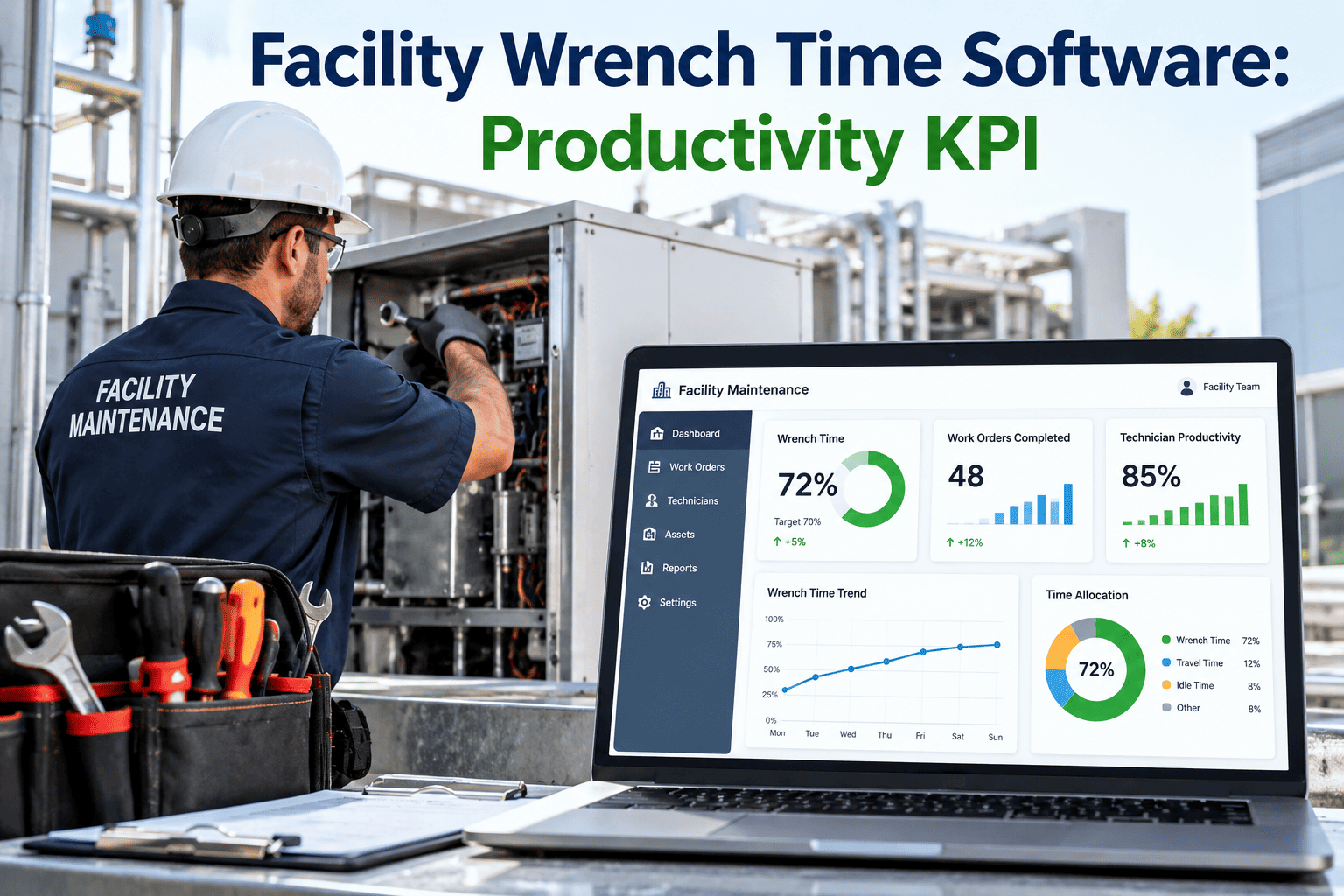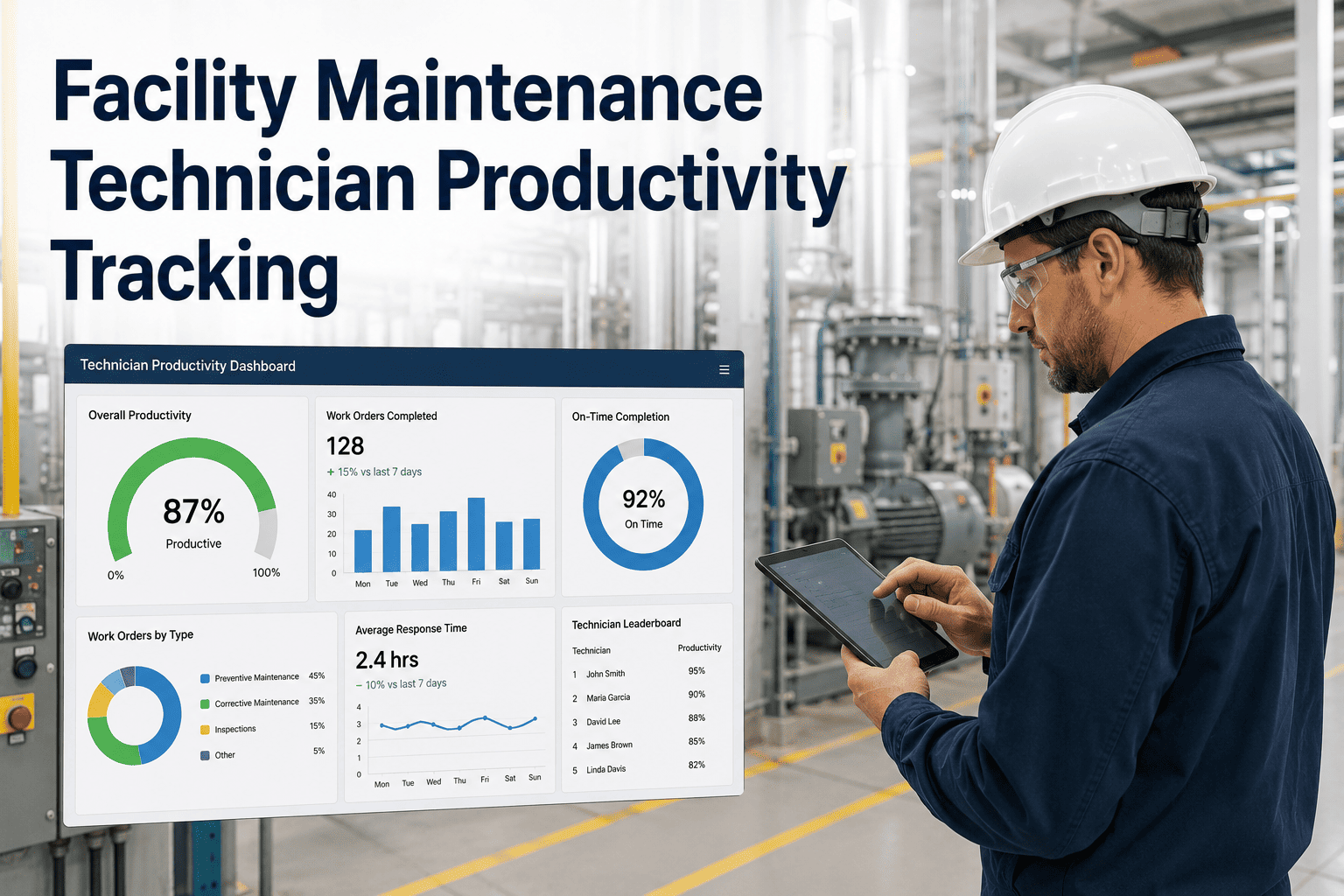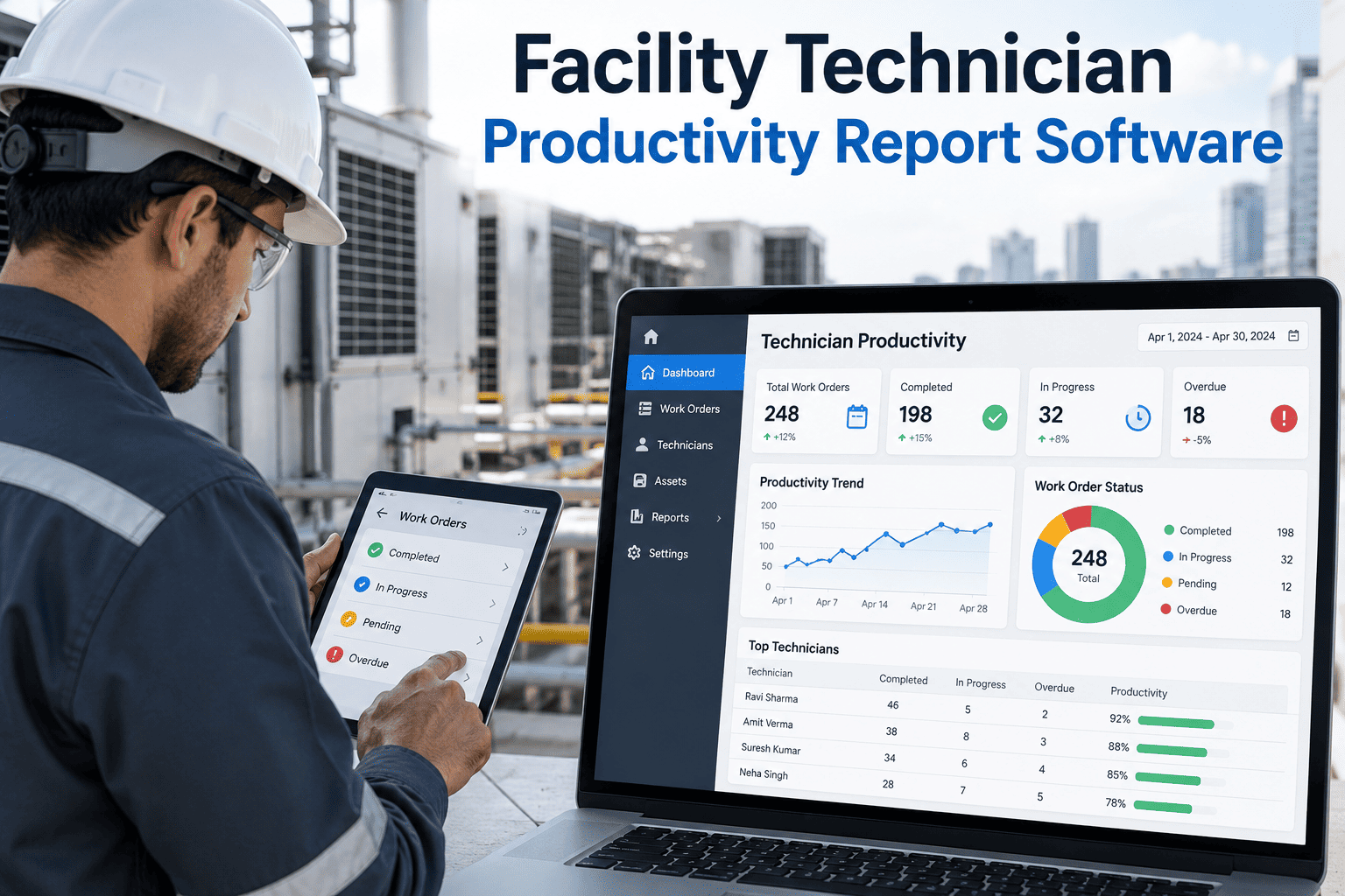
When a regional facilities director asks a maintenance manager how productive the technician team actually was last quarter, the honest answer is often a guess. Timesheets show hours worked, not hours spent wrenching on equipment, and spreadsheets rarely separate real repair work from travel, parts hunting, and paperwork. A facility technician productivity report turns that guesswork into a number leadership can act on, built from the same system technicians already use to log their day, from wrench time to work orders closed per shift. Sign up free and start capturing that data from your very next shift.
Facility Technician Productivity Report Software
Turn scattered work order logs into a single productivity report that shows wrench time, work orders per shift, first-time fix rate, and rework, updated automatically from the mobile app your technicians already use, so the numbers are ready before the engineering director even asks for them.
Facility directors do not need more data, they need one report that separates real hands-on labor from everything that gets in its way. Without it, budget conversations turn into anecdotes, headcount debates stall on opinion instead of evidence, and technicians end up defending their day instead of improving it. A single trusted report changes all three conversations at once, because everyone in the room is working from the same numbers instead of competing memories of a difficult week.
| Metric | What it measures | Reactive facility | Reporting-driven facility |
|---|---|---|---|
| Wrench time | Hands-on repair time versus total shift time | 25-35% | 45-55% |
| Work orders per shift | Completed work orders per technician per shift | 3-4 | 6-8 |
| First-time fix rate | Jobs closed without a return visit | 65-75% | 88-95% |
| Rework rate | Work orders reopened within 30 days | 12-18% | 3-6% |
| PM compliance | Scheduled preventive maintenance completed on time | 60-70% | 92-98% |
Ranges reflect typical facility maintenance benchmarks. A technician productivity report software platform pulls each of these directly from mobile work order timestamps instead of manual entry, so the numbers reflect what actually happened on the floor rather than what a supervisor estimated at the end of a long shift. Tracking all five together also matters more than optimizing any single one in isolation, since a team can inflate work orders per shift by closing jobs early, only to see rework rate climb the following month and quietly erase the apparent gain.
A ten-hour shift rarely loses time to one single cause. Work sampling studies across manufacturing and facility maintenance teams consistently point to five recurring categories.
Facility teams that switch to a technician productivity report software platform still make a handful of avoidable mistakes in the first few months. Watching for these keeps the report credible instead of turning into another number nobody trusts, and it usually takes only one or two review cycles to correct course once a manager knows what to look for.
The team now reviews the report every Monday morning as part of the standing maintenance meeting, and the parts room reorganization that followed the first month of data has become the template the portfolio is rolling out across three additional sites this year.
A facility technician productivity report is only as reliable as the data feeding it. Manual timesheets and end-of-shift memory recall introduce rounding errors that compound across a large crew, which is why the platforms facility directors trust most pull timestamps directly from the mobile work order itself. When a technician taps to start a job and taps again to close it, the system captures the real duration without asking anyone to remember or estimate. That single change is usually enough to move a report from a rough approximation to a number a director is comfortable presenting to a budget committee.
The best productivity reports also separate planned work from reactive work, because the two behave very differently. A technician handling an emergency call will naturally show lower wrench time on that job due to diagnostic time and travel, while a technician working through a scheduled preventive maintenance route should show consistently high wrench time. Blending both into a single average hides which part of the operation actually needs attention. Facility teams that break the report into planned versus reactive segments find their improvement targets far easier to hit, because the fix for a slow PM route looks nothing like the fix for a chronically delayed emergency response.
Rework rate deserves the same scrutiny as wrench time, because a technician who closes six work orders per shift but reopens two of them within a month is not actually more productive than one who closes four and reopens none. A productivity report software platform should flag reopened work orders automatically and tie them back to the original technician and root cause, so recurring failures on the same asset surface as a reliability issue rather than getting lost as five unrelated tickets. Facility engineering teams that track rework alongside wrench time consistently report fewer emergency callbacks within two to three reporting cycles.
Facility directors who present these reports to executive leadership also gain a language that finance teams already understand. Wrench time converts directly into labor capacity, and labor capacity converts directly into dollars. A ten point improvement in wrench time across a forty person crew is roughly equivalent to adding several full-time technicians without a single new hire, which is a far more persuasive line in a budget review than a general claim that the team worked hard. Framing productivity gains in capacity terms rather than effort terms tends to earn continued investment in mobile tools, parts room reorganization, and training, because each of those requests can be tied back to a measurable percentage point.
Smaller facility teams sometimes assume productivity reporting is only useful at large multi-site portfolios with dozens of technicians, but the opposite is often true. A five or six person crew has almost no slack to absorb a single technician losing half a shift to a parts run, so the report matters just as much, if not more, at a smaller site. Because the platform pulls data automatically from mobile work orders rather than requiring a dedicated analyst to compile it, a small team gets the same visibility as a large one without adding administrative overhead to already stretched staff.
Choosing the right facility technician productivity report software comes down to how the data gets in, not just how the dashboard looks. A platform that still relies on a technician typing start and stop times into a form at the end of the day reintroduces the same rounding errors that made the old spreadsheet unreliable in the first place. Look for automatic timestamping tied to the work order lifecycle, offline mobile capture for sites with weak signal, and a parts module that talks to the same system so a delayed part shows up as a delay reason rather than an unexplained gap. Facility directors evaluating vendors should ask to see a live report from an existing customer rather than a demo built on sample data, since the real value shows up in how the numbers behave across a normal, messy week with call-outs, absent crew members, and a rush order that disrupts the planned schedule. A platform that stays accurate through that kind of week is one a director can defend in front of leadership without caveats.