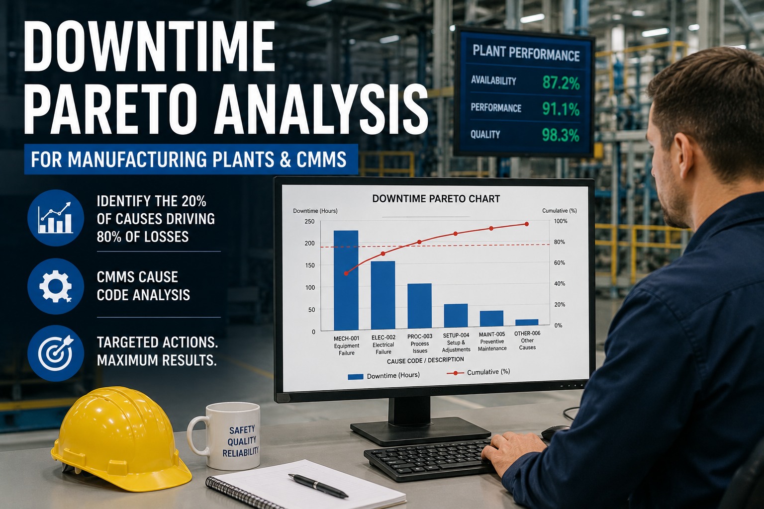
Eighty percent of your downtime comes from twenty percent of your causes — but most plants cannot say which twenty percent. That gap is the whole problem. Vilfredo Pareto noticed in 1906 that a fifth of Italians owned four-fifths of the land, and the same uneven distribution shows up almost everywhere in a factory: in most shops, the top two or three downtime categories account for 60 to 80% of all lost minutes. Find and fix those, and you produce more reliability improvement than chasing twenty minor causes at once. The trouble is that without a structured way to rank losses, effort spreads evenly across everything — supervisors, maintenance, and quality teams all pulled thin fixing whatever is loudest rather than whatever is largest. Downtime Pareto analysis in a CMMS surfaces the vital few, so improvement work lands where it actually pays back. Plants that run this discipline on their top few assets cut total downtime 35 to 50% in twelve weeks, and Pareto-driven loss reduction typically adds 6 to 12 OEE points within a year. This guide shows how to structure downtime codes, run rolling Pareto reports, and turn the chart into a prioritized action list. Start a free Oxmaint trial and auto-generate a downtime Pareto from failure events, or book a demo to see cause codes ranked by lost minutes.
Manufacturing · Downtime Analytics · CMMS
Downtime Pareto Analysis for Manufacturing Plants & CMMS
How to apply Pareto analysis to downtime — identify the 20% of causes driving 80% of losses, structure CMMS cause codes, run rolling reports, and turn the vital few into targeted improvement.
-
80 / 20
of downtime minutes from a fifth of causes
-
60–80%
of lost time in just the top 2–3 buckets
-
35–50%
downtime cut in 12 weeks on top assets
-
+6–12
OEE points within a year of Pareto-driven work
The Shape of the Problem
What a Downtime Pareto Actually Looks Like
Rank every cause by total minutes lost, tallest to shortest, and overlay the running cumulative total. The bars show the size of each loss; the line shows how fast they add up. Where the line crosses 80% is your dividing point between the vital few and the trivial many.
In this illustrative pattern the first three causes drive roughly two-thirds of lost time — the navy bars are the vital few that get the effort; the amber bars are the trivial many that wait. Book a demo to see this chart generated from your own cause codes.
From Raw Stops to Ranked Causes
Building the Pareto in Four Moves
A Pareto needs only four data layers per stop: machine, timestamps, duration, and a reason code. With those, the chart practically draws itself — the discipline is in how you rank and where you cut.
-
1
Capture the four data layers
Machine state, event timestamps, stop duration, and a consistent reason code per stop. These four are enough to calculate frequency, total lost time, and a ranking — adding shift makes patterns surface faster. -
2
Sum minutes per reason code
Total the lost minutes for each cause and rank largest to smallest — by cumulative hours lost, never by how often a stop occurs. Plot the bars tallest to shortest and the Pareto is there. -
3
Draw the cut line
Pick a vital-few cutoff — commonly 70 to 85% cumulative minutes — and ignore the long tail for now. Use a recent, stable window of 2 to 4 weeks, and start with constraint or pacer machines if you have them. -
4
Segment if it's too generic
If the first Pareto is too broad, segment by machine and shift to find where the minutes actually concentrate. The goal is a chart specific enough that the top cause is obvious at a glance.
Post a daily Pareto by reason code per line on the shift dashboard — the single top cause for the day should be identifiable by any operator or supervisor at a glance. Sign up for Oxmaint to auto-rank causes by lost minutes daily.
Two Errors That Break the Chart
How a Pareto Lies to You
A Pareto is only as honest as its inputs, and two specific mistakes quietly invert the answer — making the biggest loss look small and a nuisance look urgent. Both are preventable in the CMMS.
| Mistake | What It Does | Fix |
|---|---|---|
| Ranking by frequency | Nuisance stops dominate; long, rare failures stay invisible | Always sort by cumulative hours lost |
| Inconsistent codes across shifts | One big cause fragments into several small categories | Standardized codes, CMMS enforcement fields |
| Fixing what's loudest | Effort goes to the visible, not the largest minute-eater | Let the ranked chart set priority |
| Stale spreadsheet exports | Analysis is two weeks old before it's done | Native CMMS generates it daily |
Ranking by count rather than duration produces a chart dominated by minor stops while high-duration, low-frequency failures — the real killers — remain hidden. Book a demo to see codes enforced consistently across shifts.
Analysis Into Action
The Hardest Part Is Saying No to the Lower 80%
Pareto does not solve root cause — it is the prioritization tool that tells you where root-cause work will pay back fastest. The discipline it demands is uncomfortable: operators will complain that their asset is "always broken," and it probably is, but if it is not in the top 20% of downtime hours, it does not get the same urgency. The top 20% comes first. The playbook is a short sprint. Rank assets by total downtime hours and identify the vital few. Allocate the bulk of the improvement budget there. Take the top two or three causes and convert each into an owner, a containment action, and a verification plan — then execute the intervention and set up a daily monitoring chart for that asset alone. After a couple of weeks, decide: if events dropped meaningfully, lock the fix in and move to the next top-20% asset; if not, the diagnosis was wrong, so restart with a different cluster. Confirm every win with a before-and-after Pareto, because a chart is also how you prove you actually regained the time. Run this on your top four to six assets and total downtime falls 35 to 50% in twelve weeks — and the trailing 80% improves too, because the vital-few work surfaces reusable patterns.
Oxmaint for Downtime Pareto
How Oxmaint Turns Downtime Into Priority
-
Cause Capture
Four Layers, Every Stop
Capture machine state, timestamps, duration, and a reason code on every failure event — the four data layers a Pareto needs — with auto-classification so nothing depends on manual logging after the fact.
-
Ranked by Minutes
Hours Lost, Not Counts
Generate the Pareto ranked by cumulative minutes lost, so long low-frequency failures surface instead of hiding behind nuisance stops — the ranking that actually correlates with production impact.
-
Code Enforcement
Consistent Across Shifts
Standardized failure codes with CMMS enforcement fields, so the same failure is classified the same way on every shift and a single big cause never fragments into several small ones.
-
Rolling Reports
Daily, Not Two Weeks Late
A native, always-current Pareto over a rolling 2–4 week window — posted to the shift dashboard so the top cause of the day is visible at a glance, with no CSV export or pivot table.
-
Segment Views
By Machine and Shift
Slice the Pareto by machine, line, and shift to find where the minutes concentrate when the top-level chart is too generic — the segmentation that turns a broad picture into an actionable one.
-
Before / After
Prove the Time Back
Compare before-and-after Pareto charts to verify an intervention actually reduced events, then move the effort to the next top-20% asset — closing the loop from analysis to confirmed reduction.
Frequently Asked
Downtime Pareto Questions
What is downtime Pareto analysis?
It is ranking your downtime causes by total minutes lost, largest to smallest, and focusing on the top few — because 80% of downtime almost always comes from 20% of causes. You sum the lost time per reason code, plot the categories tallest to shortest, and overlay a cumulative line; where it crosses about 80% divides the vital few from the trivial many. Most factories find the top two or three buckets account for 60 to 80% of all lost minutes, so attacking those first is the highest-leverage maintenance work available. Sign up for Oxmaint to build the Pareto automatically.
Should I rank downtime by frequency or by duration?
Always by duration — total minutes or hours lost — never by how often a stop occurs. Ranking by frequency produces a misleading chart dominated by minor nuisance stops, while high-duration, low-frequency failures that quietly swallow the week's capacity stay invisible. In CNC environments especially, the most common stops are small (air blasts, chip clears, quick resets) but a few longer patterns like extended setups or maintenance response time eat far more capacity. Cumulative hours lost is the metric that directly correlates with production and revenue impact.
How do I structure downtime reason codes?
Start from a framework like the Six Big Losses — equipment breakdowns, setup and adjustments, idling and minor stops, reduced speed, process defects, and reduced yield — then define specific reason codes beneath it that your operators can apply consistently. The critical requirement is standardization across shifts: when different shifts classify the same failure differently, a single significant cause fragments across several small categories and looks less important than it is. CMMS enforcement fields and code training prevent that distortion. Book a demo to see a Six Big Losses code structure.
How often should the Pareto be refreshed?
Continuously, over a rolling recent window of two to four weeks. Historically a Pareto meant exporting CSVs from a legacy CMMS, cleaning data, and building pivot tables — by which point the analysis was two weeks stale. A native CMMS regenerates the ranking daily, which matters because criticality is dynamic: a machine in the trivial many yesterday can develop a bearing fault today and move into the vital few. A daily Pareto per line, posted where operators can see it, keeps the priority current rather than historical. Sign up for Oxmaint to keep the Pareto always current.
Capture · Rank · Cut · Verify
Fix the Vital Few, Not the Loudest
Every hour spent on a nuisance stop that ranked high by count, every big cause split across three shift-specific codes, and every improvement budget spread evenly across assets is effort that a ranked chart would have redirected to where it pays back. Oxmaint gives manufacturing teams one platform to capture every stop with a consistent code, rank causes by lost minutes, refresh the Pareto daily, segment by machine and shift, and prove the time back with before-and-after charts — so the vital few get fixed first and the OEE points follow.
.png)