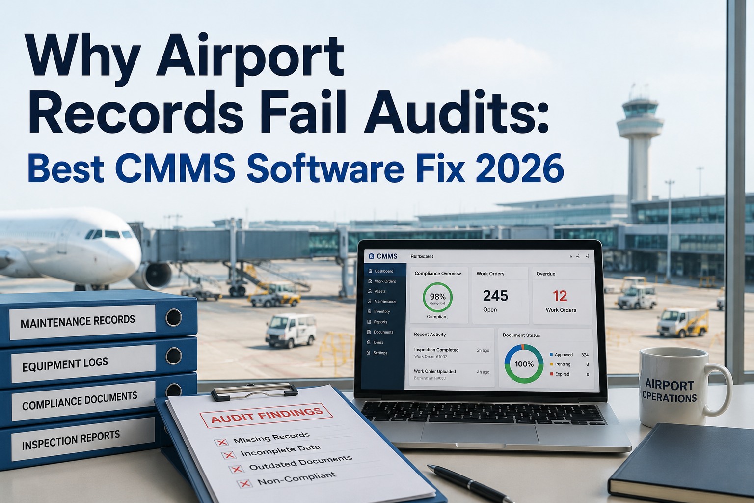
Airport reliability metrics software has to do something a generic manufacturing dashboard can't — track MTBF, MTTR, and OEE against asset classes where a three-hour baggage-belt repair costs $12,000 in airline SLA violations, a jet-bridge outage cascades into gate reallocation across the concourse, and an escalator failure at Gate A means an ADA compliance incident by shift change. Best-in-class airports keep emergency work orders below 10% of total, hit 89% PM compliance within 12 months on OxMaint, and hold MTTR under 5 hours across most equipment categories but the real leverage comes from zone-level breakdowns that catch a Gate A escalator failing three times as often as Gate B before capital planning takes it as an asset-wide problem. Reliability KPIs at an airport aren't a scorecard — they're the input into every gate assignment, every airline SLA negotiation, and every capital replacement decision. Book a Demo to see OxMaint's aviation reliability dashboard live — per terminal, per asset class, drill-down to the individual jet-bridge or belt motor.
Airport Reliability Metrics Software: MTBF, MTTR, OEE 2026
Track MTBF, MTTR, and OEE with the best 2026 airport reliability software — CMMS platforms delivering real-time reliability KPIs across every terminal, gate, baggage system, and GSE asset.
The Airport Asset-Class Reliability Grid — Per-Class Targets
Generic MTBF or MTTR targets fail at an airport because a passenger boarding bridge is not a plant chiller. Each aviation asset class has a distinct failure profile, downtime cost, and target band. Below is the reference grid every airport reliability dashboard should sort against. Start a free OxMaint workspace and load your asset hierarchy against these targets in one sitting — OxMaint's aviation library ships with per-class MTBF and MTTR benchmarks pre-configured for jet bridges, baggage, escalators, HVAC, and GSE.
Zone-Level Reliability Heatmap — Where Failures Cluster
Airport-wide averages hide the operational truth. A 92% availability number can conceal Gate A concourse escalators failing three times as often as Gate B — until zone-level tracking exposes the cluster. The heatmap view below is how the OxMaint dashboard sorts reliability by terminal, concourse, and gate area. Book a live demo to see the zone heatmap running against your specific terminal layout — an OxMaint aviation specialist walks the drill-down from airport average to individual asset during the call.
One Baggage Belt. Three Hours Down. $12,000 in SLA Violations.
Airport reliability isn't a KPI — it's a P&L line. OxMaint's aviation reliability dashboard translates every MTTR trend into airline SLA exposure, every MTBF decline into capital replacement input, and every zone anomaly into an actionable work order.
The 3 KPIs — What Each Actually Tells You About the Airport
MTBF, MTTR, and OEE answer three completely different questions about an airport operation. Reading them together is what surfaces the operational truth; reading them in isolation is how leadership gets misled. Here is what each measures, and what the number is trying to tell you. Sign up free and OxMaint calculates all three per asset class, per terminal, per shift — updated live as work orders close, with drill-down to the specific asset behind each number.
The Cost of Manual KPI Tracking — Why Spreadsheets Fail in Aviation
Airport operations run 24/7 across dozens of asset classes and hundreds of individual assets. Manual KPI tracking gets stale before the ink dries — and by the time the monthly report lands, the number that mattered has already caused the incident. Here's the delta between spreadsheet reliability and live CMMS reliability at airport scale. Schedule a working session to migrate your current airport KPI spreadsheets into OxMaint's live dashboard — most airports have their first zone heatmap running within their pilot week.
Our reliability numbers looked fine at the airport-wide level — 91% availability across all asset classes was the number we'd been reporting to the board for two years. When OxMaint's zone heatmap went live in Terminal A, the picture flipped inside a week. Concourse-north jet bridges were running at 65% MTBF versus target, and we hadn't seen it because the concourse-south average was pulling the terminal total up. Six weeks of targeted PM refactoring on the four worst bridges, and we cut jet-bridge SLA violations to zero for a full quarter. The number wasn't wrong. The zoom level was.
Frequently Asked Questions
Turn Reliability Metrics Into Airport Operations Decisions.
OxMaint's aviation reliability dashboard tracks MTBF, MTTR, and OEE per terminal, per asset class, per gate — with SLA cost translation, zone heatmap drill-down, and one-click executive rollup. Live from every closed work order, no spreadsheets, no lag.