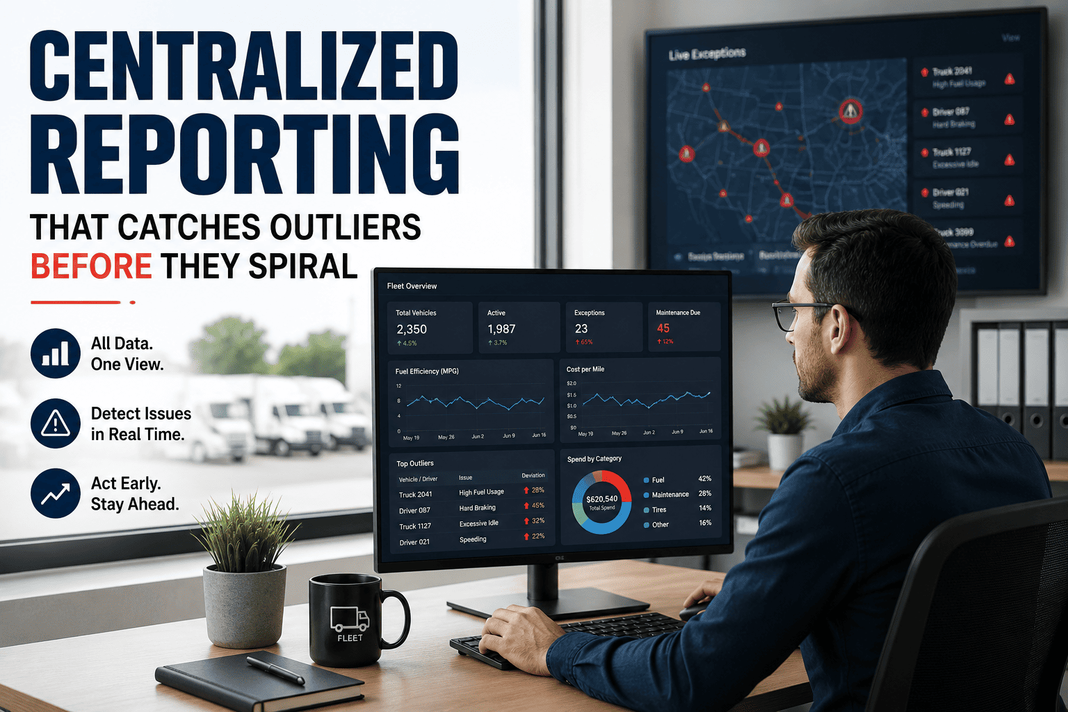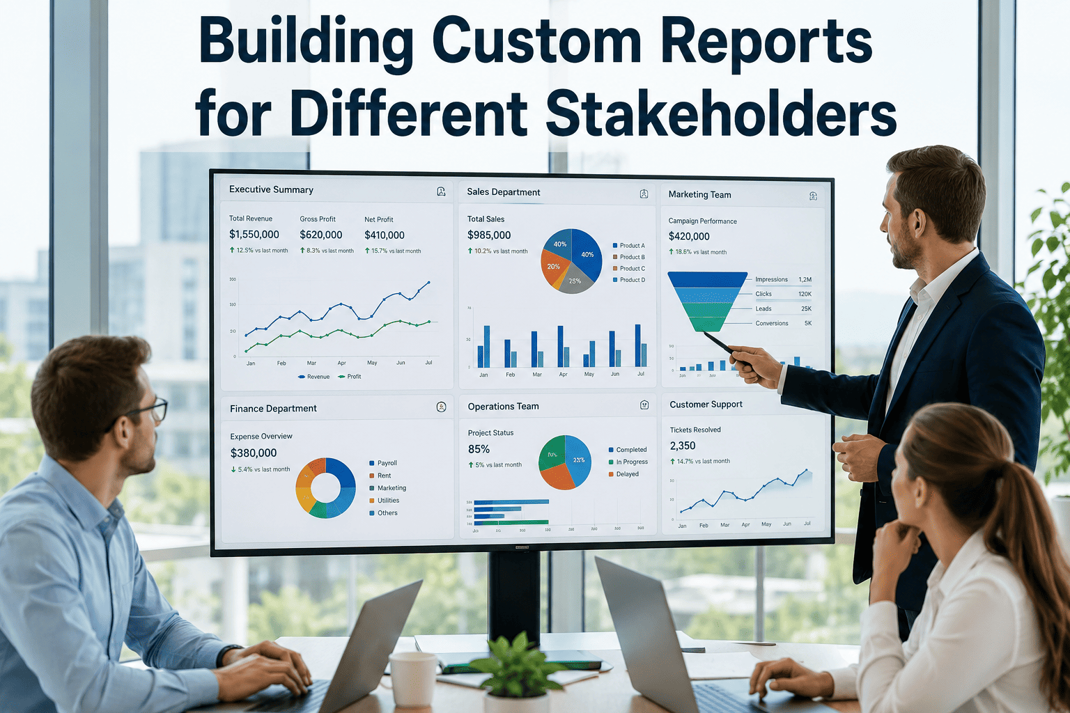
Eight different stakeholders touch a typical fleet management platform, and almost none of them need the same data on the same cadence. A CEO scanning monthly revenue-per-truck has no patience for a dispatcher's live HOS board, just as a shop foreman caring about bay utilization cannot act on a CFO's CapEx forecast. Custom report building solves this by letting each role drag, filter, save, and schedule the exact view that answers their questions — turning one platform into eight purpose-built dashboards without eight custom builds. This guide breaks down what each stakeholder actually needs, the report-design principles that make those views actionable, and how a builder like the one in Start Free Trial ships role-based templates that accelerate adoption from day one.
One platform, eight stakeholders — do they all read the same dashboard?
Fleets that force every role into a single shared view lose 30–40% of the platform's decision value. A modern custom report builder lets each user configure, save, and schedule the metrics that actually move their KPI — from revenue per truck to MTTR to DVIR completion.
ready to clone in seconds
Eight roles, eight reports — what each one actually opens in the morning
A 250-truck fleet generates over 1.4 million telemetry records per day. No single dashboard can serve a CEO and a shop foreman from that stream. Below is the report each stakeholder needs, the top three metrics they live by, and the cadence they expect it on.
| Stakeholder | Top 3 Metrics | Report Cadence | Primary Question |
|---|---|---|---|
| CEO | Revenue per truck · Cost per mile · Uptime % | Monthly, 1 page | Is the fleet profitable and safe this month? |
| CFO | CapEx forecast · TCO per vehicle · Maintenance spend vs budget | Monthly + quarterly | What do we own, what does it cost, what's coming due? |
| VP Operations | Utilization by yard · On-time delivery % · Revenue per hour | Daily + weekly | Are we moving freight efficiently and retaining drivers? |
| Fleet Manager | PM compliance rate · Breakdown frequency · MTTR | Daily | Which units are slipping out of preventive maintenance? |
| Safety Director | Incident rate · Driver scorecard distribution · CSA scores | Weekly | Who needs coaching before the next preventable crash? |
| Compliance Officer | DOT inspection due dates · DQ file status · IFTA filing status | Weekly + monthly | Are we audit-ready on every driver and every unit? |
| Shop Foreman | Work order queue · Bay utilization · Technician workload | Real-time + daily | What gets pulled into a bay first this shift? |
| Dispatcher | Live vehicle status · DVIR-cleared units · Driver HOS availability | Real-time | Which truck-and-driver pair can take the next load? |
Four rules that separate a report people read from one they ignore
A Bain study on enterprise dashboards found that 61% of reports built in the last 24 months are opened fewer than three times. The principles below are why the other 39% get used.
One metric per chart
A chart with three series asks the reader to do math in their head. Show one KPI per visual — revenue per truck, or cost per mile, not both — and let a second chart carry the comparison. Comprehension jumps roughly 40% in eye-tracking tests on single-metric tiles.
Time series over tables
A 12-month trend line reveals direction and seasonality that a table of 144 numbers hides. Reserve tables for exception lists — the 8 units with open recalls, the 14 drivers scoring below 70 — where row-level detail is the point.
Exception lists for outliers
A fleet of 300 assets has 290 performing normally. The report's job is to surface the 10 that aren't — units past PM due date, drivers with three hard-brake events this week, yards below 70% utilization. Action lives in the outliers, not the average.
Drill-through to detail
A summary tile showing MTTR of 6.2 hours is only useful if a click reveals which 12 work orders drove that average. Drill-through turns a report from a screenshot into a decision tool — and cuts the "can you pull me a list" email volume by an estimated 50%.
A 220-truck regional carrier, three stakeholders, three saved reports
Consider a dry-van carrier running 220 power units across four Southeast yards. Before adopting a custom report builder, the fleet manager emailed a 9-tab Excel export every Monday morning. The CFO ignored six tabs, the safety director rebuilt two from raw data, and the CEO never opened it. After configuring role-based reports, the same data flow serves all three in under 90 seconds of weekly effort.
CapEx & TCO snapshot
- TCO per vehicle: $0.92/mile (target: $0.85)
- Maintenance spend YTD: $612K vs $580K budget (+5.5%)
- Insurance premium trend: +9% over 24 months — flagged for broker review
- 12 units crossing 600K miles — CapEx replacement forecast flagged
Outcome: CFO killed two ad-hoc data requests per month, saved ~4 hours.
Coaching pipeline & CSA pulse
- Incident rate: 0.31 per 100K miles (down from 0.44 prior quarter)
- 14 drivers in scorecard bottom decile — coaching assigned
- CSAUnsafe Driving percentile: 47 (improved from 68)
- 9 drivers with DQ file expiring inside 30 days
Outcome: Preventable incidents dropped 29% in one quarter.
Bay & workload live board
- Work order queue: 18 open (4 high priority, 9 routine, 5 waiting parts)
- Bay utilization: 82% across 6 bays (target: 75–85%)
- Parts availability: 3 critical SKUs below safety stock
- Technician workload: 2 techs over 48 hrs this week — rebalance flagged
Outcome: MTTR fell from 7.4 to 5.9 hours within six weeks.
Five capabilities that separate a real report builder from a fixed dashboard
Many platforms advertise "custom reports" but deliver a fixed dashboard with two filter dropdowns. A genuine builder gives the user structural control — not just date-range filtering — and ships templates so adoption doesn't stall on a blank canvas.
Drag-and-drop dimensions & metrics
Users should compose a report by dragging fields — VIN, driver, yard, cost center — into rows and columns, then dropping metrics like cost per mile or hours-of-service remaining alongside. No SQL, no ticket to IT.
Saved layouts per user
A report is only useful if it persists. Each user should save unlimited personal layouts and share role-based ones with their team — so the shop foreman's board doesn't overwrite the CFO's monthly snapshot.
Scheduled delivery to email or Slack
The CEO's monthly summary lands in the inbox at 7 AM on the first Monday. The dispatcher's HOS snapshot pushes to Slack every 15 minutes during shift. Scheduling turns a report from a pull into a push.
Role-based starter templates
Blank canvases kill adoption. Pre-built templates for CEO, CFO, fleet manager, safety, compliance, shop, and dispatcher roles give users a working report to edit — not build from scratch. Time-to-first-report drops from days to minutes.
Export & API to BI platforms
Excel and PDF cover 90% of needs. The last 10% — executive scorecards, cross-system benchmarks — flows through an API into Power BI, Tableau, or Looker. A builder that traps data inside its own wall isn't a builder, it's a silo.
Stop emailing a 9-tab export nobody reads.
Build, save, and schedule role-based fleet reports in Oxmaint — eight templates ready to clone today.
Custom fleet report building — what teams ask before they roll out
Do I need a developer to build a custom report for each stakeholder?
No. A modern builder like the one in Oxmaint uses drag-and-drop dimensions and metrics — no SQL, no IT ticket. A fleet manager can clone the dispatcher template, swap in HOS-availability fields, save the layout, and schedule it to Slack in under five minutes. Role-based templates mean most users never start from a blank canvas.
How do role-based templates actually save time?
Templates ship with the right dimensions, metrics, filters, and chart types pre-configured for each role — the CEO template already has revenue per truck and uptime; the shop foreman template already has bay utilization and work order queue. Users edit rather than build, which cuts median time-to-first-report from days to roughly three minutes. You can try it yourself with a Start Free Trial.
Can reports be scheduled to email and Slack automatically?
Yes. Every saved report supports scheduled delivery — daily, weekly, monthly, or real-time intervals — to email inboxes or Slack channels. The CEO's monthly summary lands at 7 AM on the first Monday; the dispatcher's HOS snapshot pushes every 15 minutes during a shift. Scheduling turns a report from a pull into a push.
What happens when a stakeholder outgrows a template?
Templates are starting points, not cages. Any user can add or remove metrics, change chart types, apply new filters, and save the modified layout as their own. Power users can export to Excel or push data through the API into Power BI, Tableau, or Looker for cross-system benchmarking — the report builder never traps data inside a wall.
How long does it take to roll out reporting across all eight roles?
Most mid-size fleets (100–500 assets) complete a full eight-role rollout in one to two weeks. The bulk of that time is stakeholder alignment — confirming which three to five metrics each role cares about — not configuration. Walk through the rollout plan in a 30-minute session at Book a Demo.
Give every stakeholder the report they actually open.
Eight role-based templates. Drag-and-drop metrics. Scheduled delivery to email and Slack. Export to Excel, PDF, or your BI stack via API.
Free 14-day trial · No credit card