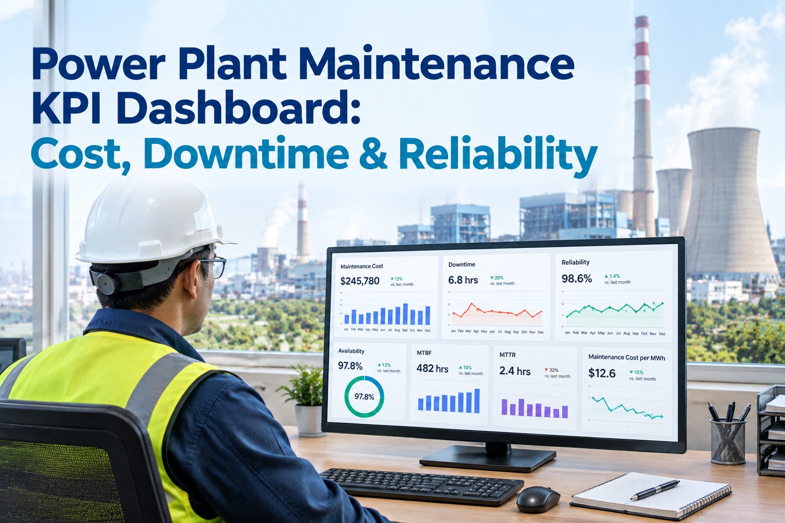
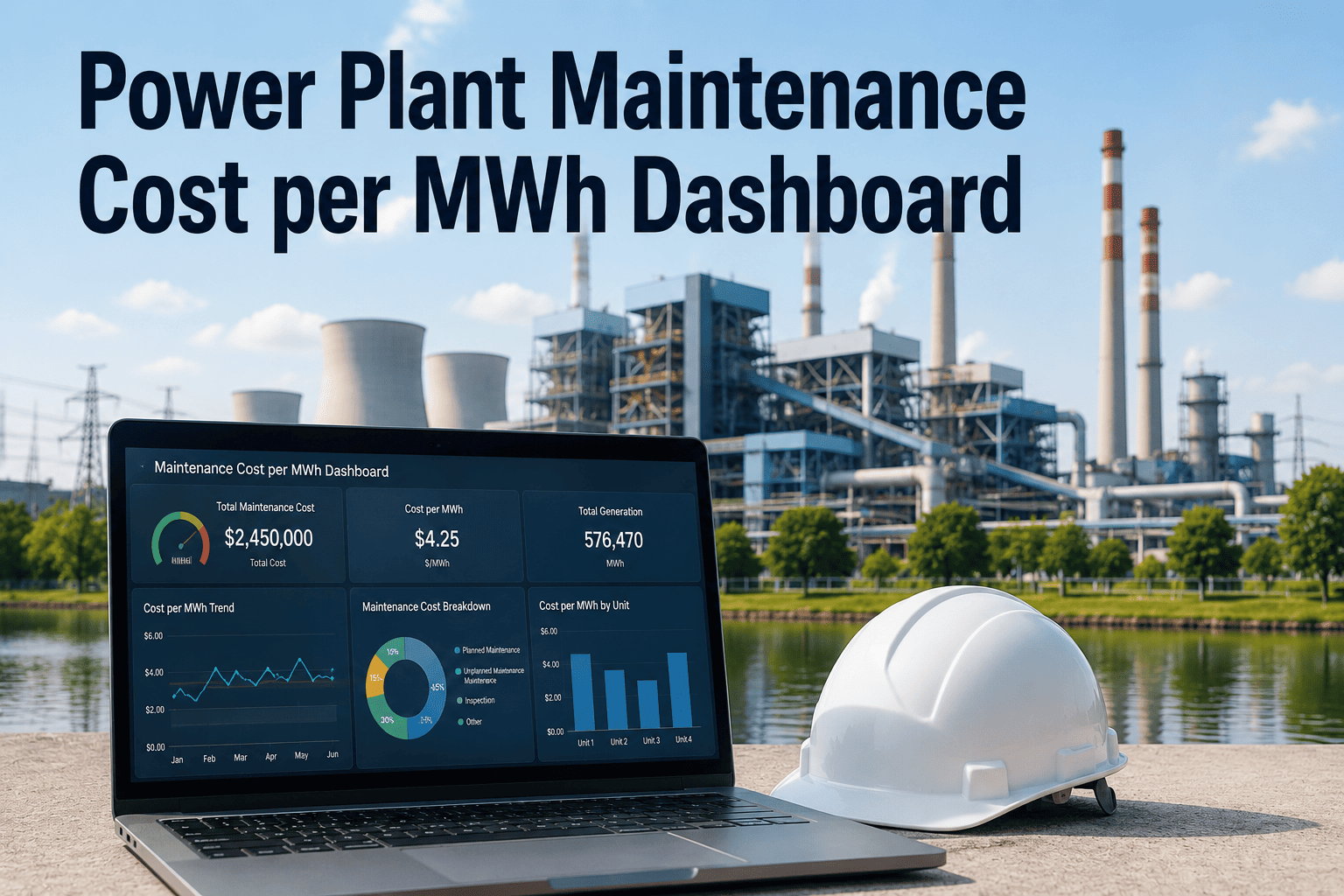
A power plant maintenance dashboard fails the moment it becomes a wall of numbers nobody acts on. The plants that run tight programs track a small, connected set of KPIs — cost per MWh, availability, reliability, and response speed — that each answer a specific question and together tell one story: is maintenance protecting generation, and at what cost. This guide lays out that KPI set the way a plant reliability manager actually uses it, how the metrics interlock, and what a dashboard has to show to drive decisions instead of decorate a screen. Start free on OxMaint to build your live dashboard, or book a demo.
Cost · Availability · Reliability · Response
Power Plant Maintenance KPI Dashboard
The connected metric set that shows whether maintenance is protecting MWh — and what it's costing to do it.
$/MWh
The one cost metric that normalizes maintenance spend against actual generation
MTBF
Reliability — how long equipment runs between failures, trending up when the program works
MTTR
Response — how fast a failure is fixed, trending down as execution sharpens
Avail.
Availability — the share of time the unit is ready to generate, the bottom line
The Four Questions a KPI Dashboard Must Answer
Every maintenance KPI on a power plant dashboard exists to answer one of four questions. Group them this way and the dashboard stops being a data dump and starts being a decision tool — each cluster owns a question, and no metric is on the screen unless it moves an answer.
$
What is it costing?
Maintenance cost per MWh, total maintenance cost, PM vs reactive spend ratio.
↑
Is the equipment reliable?
MTBF, failure frequency, PM compliance — is the failure rate falling?
⚡
Is the unit available?
Availability factor, forced outage rate, planned vs unplanned downtime.
↺
How fast do we recover?
MTTR, mean time to acknowledge, backlog size and age.
The Cost Cluster · Normalize to Generation
Raw maintenance spend is a meaningless number in isolation — a plant that generated more should spend more. The metric that matters is cost per MWh, which normalizes spend against what the plant actually produced and makes this month comparable to last, and this unit comparable to that one.
Maintenance Cost per MWh
Total maintenance cost ÷ net MWh generated
The headline cost KPI. Trends this metric — not raw dollars — to see whether maintenance is getting more or less efficient per unit of output. Rising cost/MWh with flat reliability is the classic aging-asset warning.
PM vs Reactive Ratio
Planned maintenance cost ÷ total maintenance cost
How much spend is proactive vs firefighting. A program shifting toward planned work is maturing; a slide toward reactive is the leading indicator of rising cost/MWh to come.
The Reliability & Availability Cluster · Protecting the MWh
These are the metrics generation leadership actually cares about, because they translate directly into revenue. Reliability (MTBF) says how often equipment fails; availability says how much of the time the unit can generate. They're related but not the same — and the dashboard needs both.
| KPI | What It Measures | Formula | Good Trend |
|---|
| MTBF | Mean time between failures — reliability | Operating time ÷ number of failures | Rising |
| Availability Factor | Share of period the unit was available to generate | Available hours ÷ period hours | Rising |
| Forced Outage Rate | Unplanned unavailability — the costliest kind | Forced outage hours ÷ period hours | Falling |
| PM Compliance | Scheduled PM completed on time | PMs done on time ÷ PMs due | Rising |
| Failure Frequency | Count of failures per period, by asset | Failures ÷ period | Falling |
Why both MTBF and availability? A unit can have decent MTBF but poor availability if each failure takes forever to fix — that's a response problem, not a reliability one. And it can have high availability while MTBF quietly declines, masking degradation until the failures cluster. Read together, they separate a reliability problem from a repair-speed problem.
Turn These KPIs Into a Live Dashboard — Free Forever
A KPI is only useful when it updates itself from the work actually happening. Load your assets and work orders into OxMaint and let cost/MWh, MTBF, MTTR, availability, and PM compliance compute live from real maintenance data — no spreadsheet reconciliation. No card, no time limit.
The Response Cluster · MTBF and MTTR Together
The most-quoted pair in maintenance — and the most misread apart. MTBF is a reliability metric; MTTR is an execution metric. Improving one does nothing for the other, and availability depends on both. The clearest way to see it is the failure-and-recovery cycle.
RUNNINGuptime between failures
✕
REPAIRMTTR
RUNNING
MTBF — stretch the running stretches. Driven by PM quality, condition monitoring, RCM.
MTTR — shrink the repair gaps. Driven by spares, planning, technician response, documentation.
Availability ≈ MTBF ÷ (MTBF + MTTR) — which is why a dashboard that shows only one is blind in one eye.
What Separates a Dashboard From a Report
A report is a snapshot you read; a dashboard is a live instrument you steer by. Four properties make the difference — and a KPI screen missing them is really just a slower spreadsheet.
Live, Not Monthly
Computed from work orders as they close, not reconciled at month-end. A KPI you see six weeks late can't change a decision you made five weeks ago.
Trended, Not Snapshot
Direction beats absolute value. A single MTBF number means little; MTBF falling three months running is a call to act.
Drill-Down to Asset
A plant-level number is a starting point. The value is clicking into which unit, which asset, which failure mode is moving it.
Tied to Action
Every red metric should link to the work order, backlog, or asset behind it — so seeing the problem and acting on it are one motion.
How OxMaint Builds the Power Plant KPI Dashboard
Every KPI on the dashboard computes from the same underlying data — the work orders, PM schedules, failure records, and asset hierarchy already in the platform — so cost/MWh, MTBF, MTTR, and availability are always live, always drill-downable, and always tied to the work behind them.
Cost
Cost per MWh Live
Maintenance cost tracked against generation so the headline efficiency metric trends in real time, by unit.
Reliability
MTBF by Asset
Failure records roll up to MTBF and failure frequency per asset — reliability visible where it degrades.
Response
MTTR & Backlog
Repair and acknowledge times computed from work-order timestamps, with backlog age surfaced alongside.
Availability
Uptime & Outage Rate
Availability factor and forced-outage rate tracked against period hours — the generation bottom line.
Discipline
PM Compliance
On-time PM completion tracked as the leading indicator of where reliability is heading next.
Drill
Metric → Work Order
Every KPI clicks through to the assets and work orders behind it — seeing and acting in one motion.
Stop Reconciling Spreadsheets — Steer by a Live Dashboard
Free forever plan — no card, no time limit. Let cost/MWh, MTBF, MTTR, availability, and PM compliance compute themselves from the work your team is already logging, each one drill-downable to the asset behind it. Or book 30 minutes and we'll map your plant's KPI dashboard end to end.
Frequently Asked Questions
What is the single most important power plant maintenance KPI?
There isn't one — the point of the dashboard is the connected set. But if forced to pick, maintenance cost per MWh is the most revealing single number because it normalizes spend against actual generation, making it comparable across periods and units. Read alongside availability and MTBF, it tells you whether maintenance is protecting output efficiently or firefighting expensively.
What's the difference between MTBF and MTTR?
MTBF (mean time between failures) is a reliability metric — how long equipment runs before it fails, driven by PM quality, condition monitoring, and RCM. MTTR (mean time to repair) is an execution metric — how fast you recover once it fails, driven by spares, planning, and technician response. They're independent: improving one doesn't improve the other, and availability depends on both, roughly MTBF ÷ (MTBF + MTTR).
Why track cost per MWh instead of total maintenance cost?
Because raw spend is meaningless without context — a plant that generated more should spend more. Cost per MWh normalizes maintenance spend against output, so you can compare this month to last and one unit to another on equal footing. Rising cost/MWh while reliability stays flat is a classic early signal of aging assets or a program sliding toward reactive work.
How is a KPI dashboard different from a monthly maintenance report?
A report is a snapshot you read after the fact; a dashboard is a live instrument you steer by. The difference is four properties: it updates live from work orders as they close, it trends metrics rather than showing a single snapshot, it drills down from plant level to the specific asset and failure mode, and every red metric links to the work behind it. A KPI screen without those is just a slower spreadsheet.
Book a demo to see a live one.
What does high availability but declining MTBF mean?
It usually means degradation is being masked by fast repairs — you're fixing failures quickly enough to keep the unit available, but the failures are getting more frequent. It's a warning that reliability is eroding and the failures may soon cluster faster than your response can absorb. This is exactly why a dashboard must show MTBF and availability together rather than either alone.
Start free to trend both.