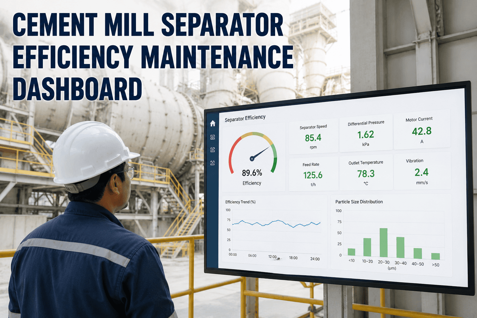
The separator is the silent governor of every closed-circuit cement mill. When the rotor blades wear, when the guide vanes drift from design angle, when the fan duct loads with caked material, the dashboard reads the same as it did last month, but specific energy consumption is creeping upward and Blaine variance has begun to drift. Most plants discover the degradation only when the quality lab flags a residue spike or finance flags a kWh per tonne band shift — both lagging indicators of a separator that was telling the maintenance team something three months earlier. A purpose-built efficiency dashboard turns separator inspections, wear findings, and performance KPIs into a single live view that connects every observed deviation to the corrective work order that addresses it. To see how OxMaint structures the separator dashboard, work order automation, and KPI trending for cement mills, book a 30-minute walkthrough or start a free trial.
Cement Mill Maintenance · Separator Efficiency · AI Analytics
Cement Mill Separator Efficiency Maintenance Dashboard
Rotor wear, vane drift, duct loading, and bearing degradation each leave a distinct fingerprint on the dashboard. Read them in real time — not in the next month's energy bill or quality variance report.
The cost of a drifting separator
8–15% SEC inflation accumulates silently between shutdowns
1–2%
Grinding efficiency lost per month without active separator maintenance
8–15%
SEC inflation over a six-month interval between major outages
$120K–$250K
Excess electricity cost at a 1.5 MTPA plant from neglected grinding circuit
18%
Rotor blade wear documented on half the blade set in a recent case
Dashboard tile preview
The Six KPI Tiles That Govern Every Separator Decision
A separator efficiency dashboard is built around six core metrics that together describe how the classifier is performing, where it is drifting, and what corrective action the data is asking for. Each tile carries a current reading, the configured operating band, and the work-order rule that fires when the value crosses out of band. Configure these six tiles first, then add product-specific overlays as the programme matures.
KPI 01
Specific Energy Consumption
kWh per tonne
Optimal · within 2% of baseline
Caution · 2 to 5% above baseline
Action · above 5% deviation
Work order fires when 24-hour rolling SEC exceeds Caution threshold
KPI 02
Bypass Fraction
% on Tromp curve
Healthy · below 12%
Caution · 12 to 18%
Action · above 18%
Tromp curve audit work order generated monthly with sample point logging
KPI 03
Circulating Load
% of fresh feed
Optimal · 185 to 215%
Caution · 215 to 250%
Action · above 250%
Rotor speed and fan damper review triggered automatically
KPI 04
Blaine Variance
cm² per gram
Stable · within target band
Drift · 100 cm²/g deviation
Action · sustained drift over 12 hours
Quality team notified, separator setpoint review work order created
KPI 05
Separator Fan Airflow
% of design velocity
Healthy · above 95% design
Caution · 90 to 95%
Action · below 90%
Inlet duct cleaning and damper calibration work order generated
KPI 06
Rotor Power Draw
kW at fixed RPM
Stable · within 3% of baseline
Drift · 3 to 7% rise
Action · above 7% sustained
Bearing condition check and rotor wear inspection work order created
Wear zone map
Five Component Zones Where Separator Efficiency Actually Degrades
Separator efficiency loss is not a single failure mode. It is the cumulative result of wear and drift across five distinct component zones, each with its own degradation rate and inspection requirement. The maintenance dashboard treats each zone as a child asset under the separator parent record — with its own PM schedule, work order history, and wear measurement field. Mapping the zones explicitly is what makes preventive maintenance plans repeatable across mills and shifts.
Wear patternLeading-edge erosion from continuous fine particle impact, blade tip rounding, asymmetric wear under uneven feed distribution
Dashboard signalBypass fraction rising, rotor power draw deviating from baseline at fixed RPM
Inspection cadenceVisual at every planned shutdown; thickness gauging every 6 months
Zone B
Guide Vane Assembly
Wear patternVane angle drift from set position, leading edge erosion, fastener loosening that allows position shift under load
Dashboard signalCut size d50 drift, Blaine variance widening, sharpness of separation reduced on Tromp curve
Inspection cadenceVane angle measurement quarterly; full vane set inspection annually
Wear patternMaterial caking on internal surfaces, hundreds of kilograms of accumulated buildup, airflow restriction at the distribution inlet
Dashboard signalSeparator fan airflow drifting below design velocity, fan motor current rising at fixed damper position
Inspection cadenceInternal inspection quarterly; cleaning scheduled when airflow drops below 95% of design
Zone D
Rotor Main Bearings
Wear patternLubrication degradation, race surface fatigue, increased radial clearance under continuous load, seal wear allowing dust ingress
Dashboard signalRotor power draw at fixed RPM rising, vibration trending up, bearing temperature creeping
Inspection cadenceGrease replenishment per OEM interval; vibration reading monthly; full inspection at major shutdown
Zone E
Material Blocking Ring
Wear patternRing erosion exposing classifying vanes to direct material underwashing, mounting integrity loss, asymmetric ring profile
Dashboard signalAccelerated vane wear despite normal operating hours, premature bypass rise, uneven product residue distribution
Inspection cadenceVisual inspection at every shutdown; replacement when ring thickness drops below specification
Tromp curve interpretation
What the Curve Shape Tells the Maintenance Team Before Energy Bills Do
The Tromp curve plots the fraction of feed particles of each size that reports to the coarse reject stream. A healthy separator produces a sharp S-curve with a defined cut size and a low bypass tail. A degraded separator produces a flattened curve with a high bypass and either fishhook distortion or shifted cut size. The three-panel comparison below shows the curve signatures the maintenance dashboard should be trained to recognise — and the corrective action each one calls for.
Healthy Separator
Bypass8 to 12%
Cut size d5035 to 45 micron
ImperfectionBelow 35%
Curve shapeSharp S, low tail
No corrective work order. Continue scheduled PMs and trend audit.
Drifting Separator
Bypass12 to 18%
Cut size d50Drifted 5 to 10 micron
Imperfection35 to 45%
Curve shapeFlattening slope, rising tail
Inspect rotor blades and guide vane angles. Verify fan airflow at design velocity.
Degraded Separator
BypassAbove 18%
Cut size d50Shifted significantly
ImperfectionAbove 45%
Curve shapeFishhook distortion, flat S
Plan shutdown intervention. Inspect rotor, vanes, duct, blocking ring, and fan.
OxMaint AI Analytics & Reporting
Every Out-of-Band KPI Becomes a Work Order. Every Work Order Closes With Evidence.
OxMaint connects to the plant DCS historian via OPC-UA, ingests mill motor power draw, separator speed, fan motor current, feed rate, and Blaine results, and builds per-product baselines automatically. The moment any of the six dashboard tiles crosses out of band, a corrective work order generates with fault type, affected component, recommended inspection, and the parameter trend attached as evidence.
Signal to work order
Translating Dashboard Signals Into Corrective Maintenance Decisions
A KPI moving out of band is only useful if a defined response follows. The dashboard's value is fully realised when each detected deviation maps automatically to the most likely root cause and the corrective work order that addresses it. The pipeline below captures the standard signal-to-action map for the six tiles, structured for cement mill reliability engineers responsible for the closed-circuit grinding system.
| Dashboard Signal |
Likely Root Cause |
Auto-Generated Work Order |
| SEC drift above baseline |
Cumulative wear across multiple components, recirculating load drift, fineness target mismatch |
Grinding circuit audit, rotor and vane inspection, Tromp curve sample collection |
| Bypass fraction rising |
Rotor blade wear, guide vane angle drift, fan airflow loss reducing classification sharpness |
Tromp curve measurement, rotor and vane inspection, fan inlet duct cleaning |
| Circulating load above range |
Cut size shifted toward finer, separator over-rejecting, rotor speed too high for current grindability |
Rotor setpoint review, vane angle verification, mill feed grindability check |
| Blaine variance widening |
Vane angle drift, rotor speed instability, feed chemistry variation, separator setpoint drift |
Quality team notification, vane angle measurement, control loop tuning review |
| Fan airflow below design |
Inlet duct loading with caked material, damper drift, fan blade wear, bearing degradation |
Internal duct inspection and cleaning, damper recalibration, fan vibration survey |
| Rotor power rising at fixed RPM |
Bearing wear increasing rotational drag, material accumulation on rotor, blade unbalance from uneven wear |
Bearing condition check, rotor balance verification, blade thickness gauging |
Dashboard configuration
The Eight Steps to Standing Up a Working Separator Dashboard in OxMaint
A maintenance dashboard is not a screen — it is an asset record, a set of configured thresholds, a connection to the plant historian, and a rule engine that fires work orders against verified asset owners. The eight steps below define the minimum viable configuration path for putting the separator efficiency dashboard into production on a cement mill, in the order they should be completed.
Step 01
Create the separator parent asset record in OxMaint with manufacturer, model, design rotor speed, design airflow, and commissioning date
Step 02
Add five child asset records covering rotor blades, guide vanes, fan inlet duct, main bearings, and material blocking ring
Step 03
Connect the plant DCS historian via OPC-UA and map mill motor power, separator speed, fan current, feed rate, and Blaine lab results
Step 04
Establish 90-day baselines per product grade and per shift pattern using the historian data — these become the dashboard reference values
Step 05
Configure the six dashboard KPI tiles with optimal, caution, and action bands referenced against the per-product baselines
Step 06
Define the work-order rule for each KPI deviation — fault type, asset reference, default assignee, response deadline, evidence attachments
Step 07
Schedule the standing PM cadence per child asset — visual inspections, thickness gauging, vibration surveys, Tromp curve audits
Step 08
Review the dashboard at the weekly reliability meeting and the monthly cost-of-quality review to keep configuration tuned
Frequently asked questions
Cement Mill Separator Maintenance — Reliability Engineer Questions
What separator KPIs should appear on the maintenance dashboard versus the production dashboard?
The maintenance dashboard owns the leading indicators of separator component health — rotor power draw at fixed RPM, fan airflow versus design velocity, bypass fraction from Tromp curves, and bearing vibration trends. The production dashboard owns the lagging indicators of process outcome — production rate, Blaine value, residue, and specific energy consumption. The two dashboards must talk to each other through shared baseline data, because a production KPI drifting is the earliest sign that a maintenance KPI has been creeping for weeks. The reliability engineer should be looking at the maintenance dashboard daily and reconciling against the production dashboard at the weekly review, using
OxMaint dashboards to keep both views consistent.
How often should a Tromp curve audit be performed on a cement mill separator?
A monthly Tromp curve measurement is the recommended baseline for any closed-circuit cement mill running at production. The audit requires synchronised samples from the separator feed, fines product, and coarse reject streams, with particle size distribution measured for each by sieve analysis or laser diffraction. If any dashboard KPI moves into Caution band — bypass rising, circulating load shifting, Blaine variance widening — the audit interval should accelerate to weekly until the root cause is identified and the parameter returns to optimal. Quarterly Tromp curves are the absolute minimum and only sufficient for separators with very stable feed chemistry and minimal product changes.
Why does rotor power draw at fixed RPM matter more than total separator power consumption?
Total separator power consumption is dominated by throughput and product mix and varies widely between shifts even on a perfectly healthy machine. Rotor power draw at a fixed rotational speed and reference loading is a cleaner signal because it isolates the energy required to spin the rotor against bearing drag and material loading from the energy required to move tonnes of cement through the classifier. A rising rotor power draw at fixed RPM points specifically to bearing wear, material accumulation on the rotor structure, or asymmetric blade wear introducing unbalance — each of which has a defined corrective work order. Tracking rotor power in absolute kilowatts hides these signatures inside throughput noise.
What does a fishhook on the Tromp curve indicate for separator maintenance?
A fishhook is an upturn in the Tromp curve at the very fine end of the particle size distribution, where fine particles unexpectedly report to the coarse reject stream instead of leaving with the product. The physical cause is fine particles agglomerating with coarse particles, attaching electrostatically to rotor surfaces, or being entrained by the coarse reject flow due to insufficient airflow at the classification zone. The corrective actions sit primarily in Zones C and D of the wear map — restore fan airflow to design velocity, inspect for material buildup that is disturbing the air pattern, and verify the rotor surface is free of caked accumulation. A persistent fishhook is one of the clearest signals that the separator needs a planned cleaning intervention.
How does OxMaint connect dashboard KPIs to actual corrective work orders in the field?
OxMaint stores the dashboard KPI rules as work order templates against the separator asset hierarchy. Each rule specifies the threshold band, the affected child asset, the default work order type, the responsible team, and the evidence to attach. When the historian data crosses a configured threshold, OxMaint generates the work order automatically with the relevant KPI trend pre-attached, populates the asset and component fields, and routes the work order to the assigned technician. On closure, the technician logs findings, photos, and measurements that update the asset trend record — closing the loop between detection and verified resolution.
Book a walkthrough to see the full configuration in a live environment.
OxMaint · Cement Mill Separator Maintenance Dashboard
Stop Reading Separator Degradation in the Energy Bill. Start Reading It on the Dashboard.
Every percentage point of bypass that goes uncorrected is energy, capacity, and quality variance that the next production review will have to explain. OxMaint gives cement maintenance teams the configured dashboard, per-asset thresholds, work-order automation, and Tromp curve audit workflow that turn separator efficiency from a reactive shutdown finding into a proactive monitoring discipline.