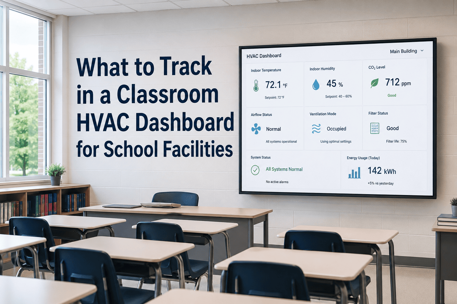
Most facilities dashboards show one thing well: whether a unit is on or off. That tells you almost nothing about whether a classroom is comfortable, whether a filter needs changing, or whether a unit is about to fail. The dashboards that actually prevent emergencies track a specific set of metrics — runtime, filter age, temperature drift, and fault history — tied to each individual classroom. Here is what belongs on that dashboard, and how it connects to automated maintenance scheduling in OxMaint.
What to Track in a Classroom HVAC Dashboard for School Facilities
A good dashboard turns hundreds of HVAC units into a short list of things that actually need attention today — not a wall of green lights that hides the unit about to fail.
The Five Metrics That Matter Most, At a Glance
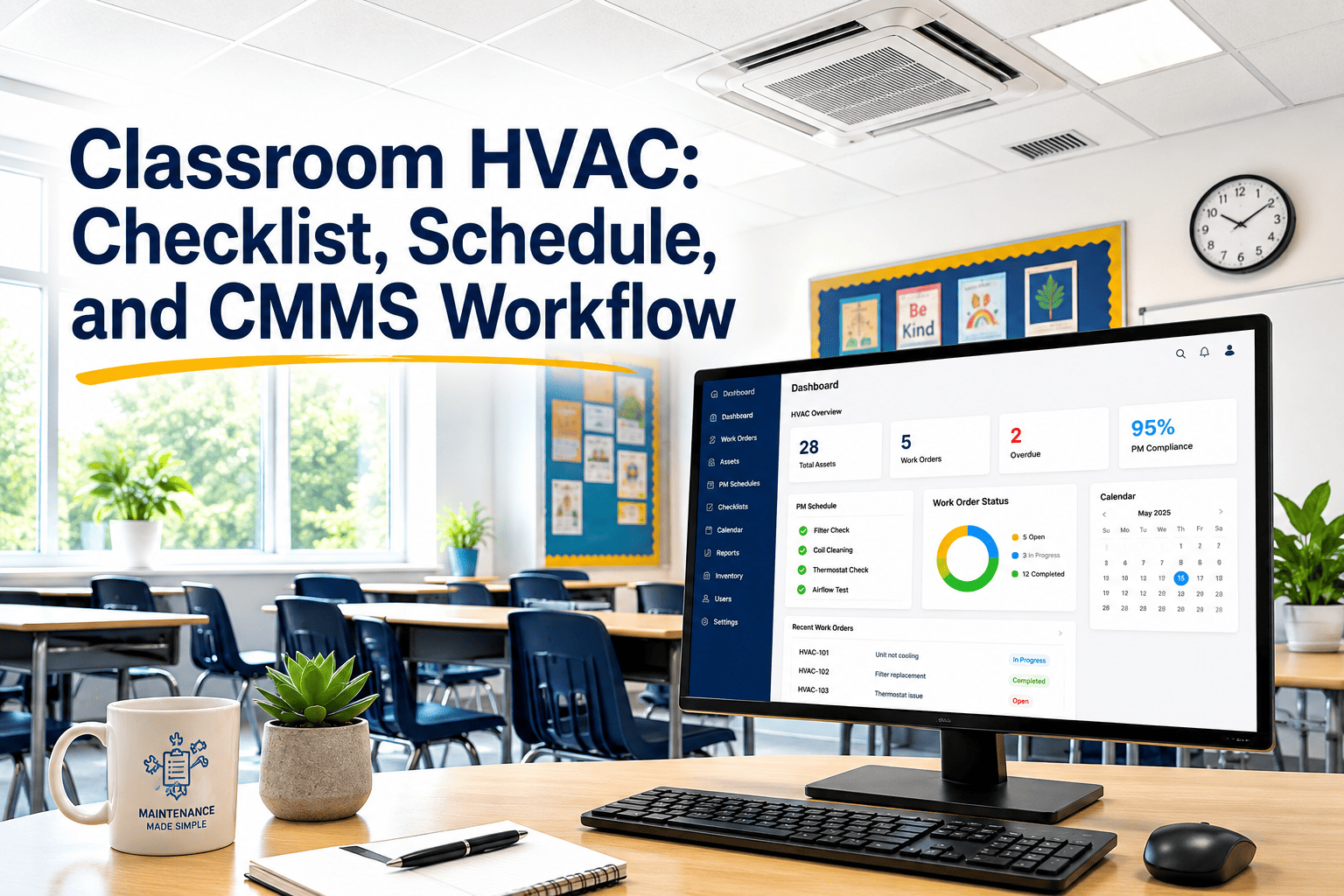
The Six Things Every Classroom HVAC Dashboard Should Show
The more a unit runs, the faster it wears. Tracking runtime by classroom flags units working harder than expected — often a sign of an undersized system or a comfort complaint waiting to happen.
A 90-day filter interval that quietly slips to 130 days is the single most common cause of classroom comfort complaints and rising energy bills. This should be the easiest red flag on the whole dashboard.
Classroom CO2 above 1,000 ppm is linked to lower cognitive performance. Pairing temperature with CO2 readings shows whether a unit is heating or cooling correctly and ventilating the room as designed.
A unit that has triggered the same fault five times in a year is not five unrelated problems — it is one unresolved root cause. The dashboard should surface repeat faults, not just the latest one.
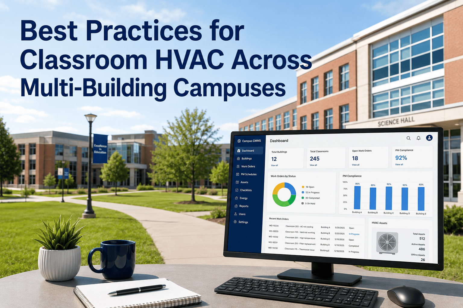
A campus-wide average hides the one building where PM has slipped for months. Completion rates broken out by building tell facilities directors exactly where to focus before it becomes an emergency.
A 20-year-old unit with a declining condition score should not sit on the same service schedule as a 3-year-old one. Tracking age alongside condition lets teams plan replacements before failure.
Turn These Metrics Into Automatic Work Orders
OxMaint connects each metric to a PM schedule — when a filter ages out or a fault repeats, a work order is created automatically and routed to the right technician.
How Dashboard Alerts Should Be Tiered
| Metric | Normal | Watch | Action Required |
|---|---|---|---|
| Filter age | Under 75 days | 75-90 days | Over 90 days |
| Classroom CO2 | Under 1,000 ppm | 1,000-1,100 ppm | Over 1,100 ppm |
| Temperature drift | Within 2°F of setpoint | 2-4°F drift | Over 4°F drift |
| Repeat faults (12 months) | 0-1 occurrences | 2-3 occurrences | 4 or more occurrences |
| PM completion rate | Above 90% | 75-90% | Below 75% |
The Cost of Not Having This Visibility
Frequently Asked Questions
Do we need sensors installed in every classroom to build this dashboard?
No. Many districts start with sensors in 10-20% of classrooms and PM-based tracking for the rest, then expand coverage over time. Start a free trial to see a sensor-light setup.
Can the dashboard show data across multiple school buildings at once?
Yes. OxMaint's dashboard rolls up metrics by classroom, building, and campus, so a district facilities director sees the same six metrics for every site in one view.
What happens when a metric crosses into the action-required range?
A work order generates automatically with the room, the equipment, and the relevant reading attached, so the technician arrives with full context. Book a demo to see this workflow live.
How long does it take to get a dashboard like this running?
Most districts import their existing equipment list and have a working dashboard within the first week, with alert thresholds tuned over the following month.
Build a Dashboard That Catches Problems Before Classrooms Feel Them
Get runtime, filters, CO2, faults, and PM completion in one view for every building on your campus.