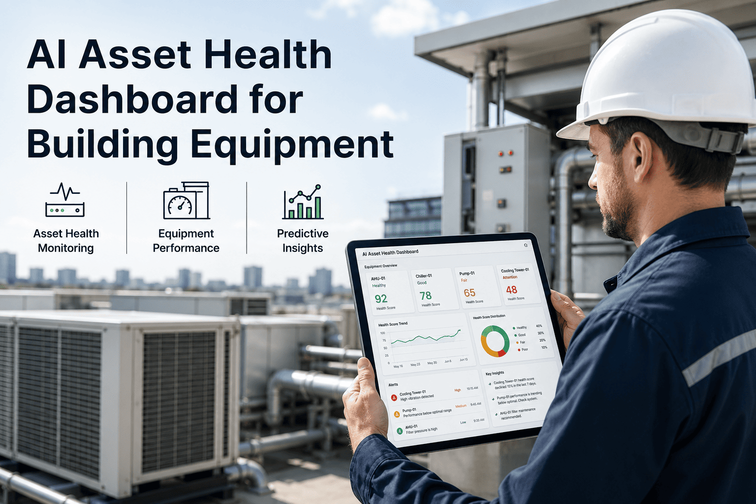
Facility operations teams track dozens of metrics, but most never translate data into action. The difference between high-performing facilities and struggling ones isn't the amount of data collected—it's whether that data appears in the right dashboard, at the right time, for the right person. Well-designed maintenance KPI dashboards transform raw numbers into decisions: which work orders need attention now, which assets are trending toward failure, and whether your team is actually improving. Modern CMMS platforms provide real-time dashboard capabilities that surface critical insights automatically, eliminating the spreadsheet chaos that delays action.
This guide covers the essential KPIs every facility operations team should track, how to structure dashboards for different stakeholders, and proven strategies to turn dashboard data into measurable reliability improvements.
Maintenance KPI Dashboard Defined
A visual interface that displays key maintenance metrics in real-time to drive decisions
The Dashboard Test
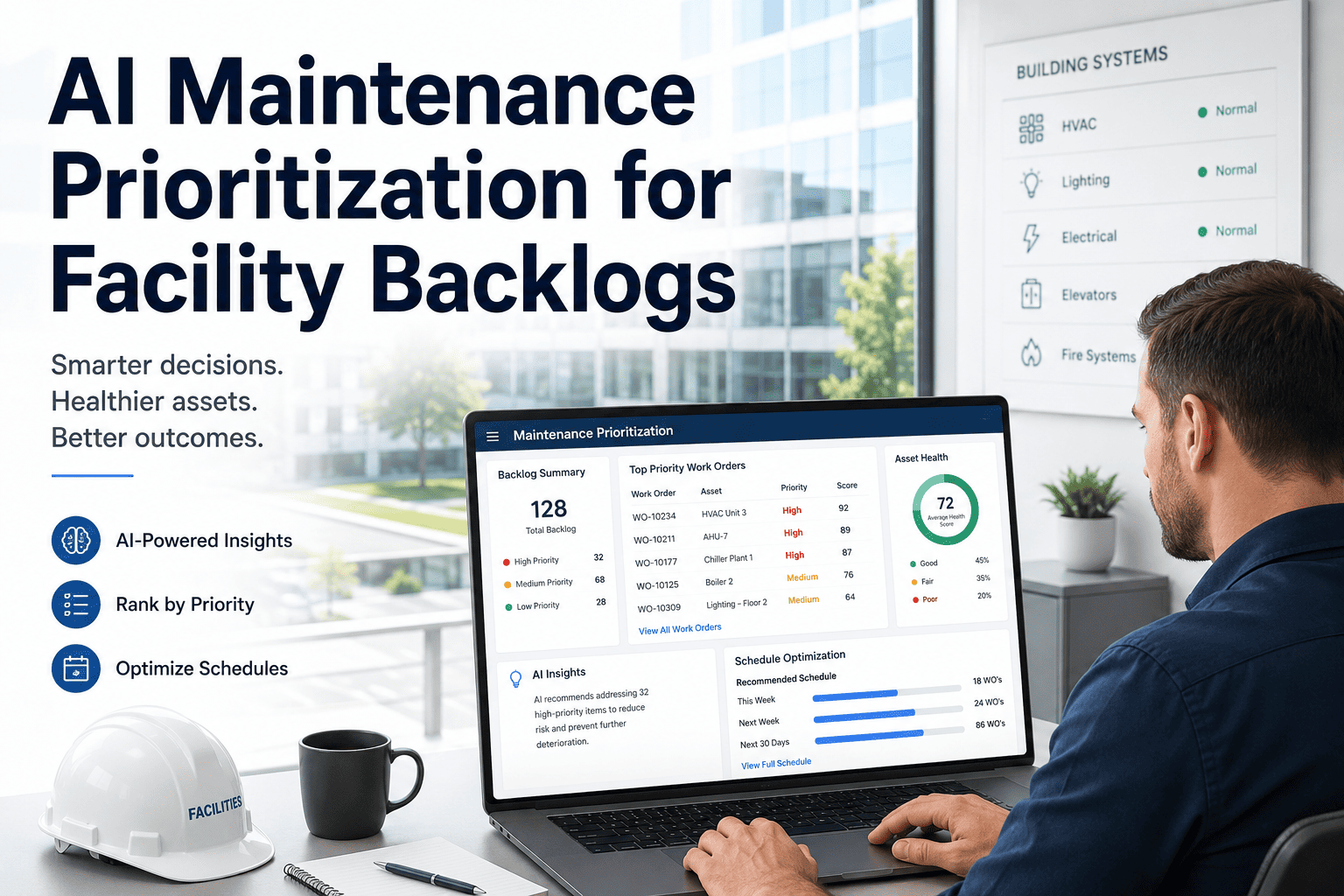
The Five Core Maintenance KPIs
Before building dashboards, you need the right foundation. These five metrics form the backbone of maintenance performance measurement—every facility should track these regardless of industry. Talk to our maintenance experts about establishing your baseline metrics.
Equipment Availability
Target: 95%+ for critical assetsThe percentage of scheduled time that equipment is actually available to operate. This is your facility's capacity to produce.
What It Reveals
PM Completion Rate
Target: 90%+ on scheduleThe percentage of scheduled preventive maintenance tasks completed on time. This leading indicator predicts future equipment reliability.
What It Reveals
MTBF (Mean Time Between Failures)
Average operating time between equipment failures. Higher is better—indicates equipment reliability.
MTTR (Mean Time To Repair)
Average time from failure detection to equipment restored. Lower is better—measures maintenance response capability.
Maintenance Backlog
Total labor hours of work waiting to be completed. Healthy backlog is 2-4 weeks of planned work; more indicates capacity issues.
Why These Five Matter Most
Availability
The ultimate outcome metric—are your assets available when needed?
PM Completion
The leading indicator—high PM compliance predicts high future availability.
MTBF/MTTR
The reliability duo—how often things break and how fast you fix them.
Backlog
The capacity check—is your team keeping up with work demand?
Build Your KPI Dashboard Today
Oxmaint provides pre-built maintenance dashboards with real-time KPI tracking, automated alerts when metrics drift, and customizable views for every stakeholder level.
Dashboard Design by Stakeholder
Different roles need different data at different frequencies. A technician checking their daily work queue doesn't need the same view as a VP reviewing monthly capital planning. Design your dashboards around decisions, not just data.
Executive Dashboard
Review: Monthly/QuarterlyHigh-level metrics tied to business outcomes. Focus on trends and cost impact.
Key Metrics
- Overall Equipment Availability (trend)
- Maintenance Cost per Unit Produced
- Planned vs. Unplanned Maintenance Ratio
- Capital Replacement Forecast
- Regulatory Compliance Status
Maintenance Manager Dashboard
Review: WeeklyOperational metrics for resource allocation and performance management.
Key Metrics
- PM Completion Rate (by asset/area)
- Work Order Aging Distribution
- Technician Utilization Rate
- Top 10 Problem Assets
- Backlog Hours by Priority
- Parts Stockout Incidents
Supervisor Dashboard
Review: DailyTactical metrics for daily planning and work assignment.
Key Metrics
- Today's Work Orders (by technician)
- Overdue PM Tasks
- Emergency Work Requests
- Parts on Order Status
- Shift Handoff Notes
- Safety Incidents (last 7 days)
Technician Dashboard
Review: Real-TimeIndividual task management and execution support.
Key Metrics
- My Assigned Work Orders
- Priority Emergency Calls
- Asset History (for current job)
- Parts Location/Availability
- Procedure Documents
- Time Clock Status
Advanced KPIs for Reliability Excellence
Once you've mastered the core five, these advanced metrics help drive continuous improvement and predictive capabilities. Oxmaint's advanced analytics calculate these automatically from your work order data.
Planned Maintenance Percentage (PMP)
The ratio of planned work to total work. World-class facilities achieve 85%+ planned work—leaving only 15% for reactive firefighting.
Schedule Compliance
Percentage of scheduled work completed during the scheduled period. Measures how well planning translates to execution.
Wrench Time
Percentage of technician time actually spent doing maintenance work (vs. waiting, traveling, finding parts, paperwork).
First-Time Fix Rate
Percentage of work orders completed correctly the first time—no repeat visits, no callbacks, no rework needed.
Asset Criticality Coverage
Percentage of critical assets with documented maintenance strategies, failure modes, and spare parts identified.
Building Effective Dashboard Visualizations
The same data displayed differently produces different actions. These visualization principles help ensure your dashboards drive behavior, not just awareness. Schedule a consultation to review your current dashboard design.
Effective Visualizations
Match the chart type to the insight you need to convey.
Best Practices
- Trend lines for metrics over time
- Gauges for current status vs. target
- Pareto charts for problem prioritization
- Heat maps for multi-dimensional data
- Traffic lights for quick status checks
Key Principles
- Always show target/benchmark lines
- Use consistent color coding across views
- Include trend direction indicators
Common Mistakes
These design choices reduce dashboard effectiveness.
Avoid These
- 3D charts (distort data perception)
- Pie charts for more than 5 categories
- Metrics without context or targets
- Too many colors without meaning
- Cluttered views with 10+ KPIs
Impact
- Users stop looking at dashboards
- Wrong conclusions from distorted data
- No action because nothing stands out
Implementing Alert Thresholds
Dashboards viewed weekly miss daily problems. Automated alerts ensure critical metric changes trigger immediate response.
Critical Alerts (Immediate)
Equipment failure on critical asset, safety incident reported, regulatory deadline approaching, emergency work order created.
Warning Alerts (Same Day)
PM overdue by 24+ hours, backlog exceeds 6 weeks, MTTR trending up 20%+, parts stockout on critical items.
Information Alerts (Weekly)
Availability dropped below target, PM completion rate below 85%, work order aging distribution shifted, new recurring failure pattern detected.
Success Alerts (Celebrate Wins)
Availability milestone reached, PM streak achieved, MTBF improved 25%+, backlog reduced to target level.
Trend Alerts (Predictive)
Equipment trending toward failure threshold, cost trajectory exceeding budget, seasonal pattern indicates upcoming demand spike.
Assignment Alerts (Ownership)
Work order assigned to technician, approval required from manager, escalation after SLA breach, shift handoff items pending.
Automate Your Maintenance Alerts
Oxmaint provides configurable alert thresholds, multi-channel notifications (email, SMS, mobile push), and escalation workflows to ensure critical issues never slip through the cracks.
Dashboard Implementation Roadmap
Rolling out maintenance dashboards requires more than software configuration. Follow this phased approach to ensure adoption and impact.
Foundation (Weeks 1-4)
Core Dashboard (Weeks 5-8)
Stakeholder Expansion (Weeks 9-12)
Advanced Analytics (Weeks 13+)
Frequently Asked Questions
How many KPIs should we track on our maintenance dashboard?
5-7 KPIs per dashboard view is optimal. Research shows cognitive overload begins around 7 items. More importantly, focus on metrics that drive action—not just interesting data. If no one would change behavior based on a metric, remove it. You can always create additional detail views for specific investigations.
What's a realistic target for PM completion rate?
World-class facilities achieve 90-95% PM completion. If you're below 70%, focus first on reducing reactive work—emergency repairs constantly interrupt PM schedules. Start by improving from current state by 5-10% increments. Jumping from 60% to 90% overnight isn't realistic; the underlying capacity and parts availability issues must be solved first.
How do we get technicians to actually use the dashboard?
Make it their primary work assignment tool. If technicians still get work orders from a different system or paper printouts, they won't look at dashboards. The dashboard must show them what to do next—not just report what they already did. Mobile accessibility is critical; technicians won't return to a desktop computer to check their queue.
Our CMMS data quality is poor. Should we wait to build dashboards?
No—dashboards expose data quality issues and motivate fixes. Start with the data you have. When managers see obviously wrong metrics on a dashboard, they demand corrections. This creates pressure to improve data entry discipline. Just be transparent about data limitations and focus early dashboards on metrics with better data quality while you improve the rest.
How often should we review and update our dashboard design?
Formal review quarterly; informal feedback continuously. Dashboards should evolve as your maintenance maturity improves. Metrics that drove early improvements may become less relevant once targets are consistently met. Add a feedback mechanism (even just a suggestion email) and review dashboard effectiveness in quarterly maintenance review meetings.