The maintenance director at a 1,200-employee manufacturing plant stares at a monthly report that tells him nothing useful. Total work orders completed: 847. Parts spend: $312,000. Headcount: 42 technicians. These are activity metrics — they measure effort, not outcomes. He cannot answer the questions that actually matter: Is equipment reliability improving or declining? Are we spending maintenance dollars in the right places? Is the team getting more productive or just busier? Without a structured KPI dashboard that connects maintenance activity to business outcomes, he is flying blind — making million-dollar decisions based on gut feeling instead of data. This is the reality at most facilities: mountains of maintenance data, zero operational intelligence. Talk to our team about building the maintenance KPI dashboard that transforms data into decisions.
Maintenance Intelligence Guide — 2026 Edition
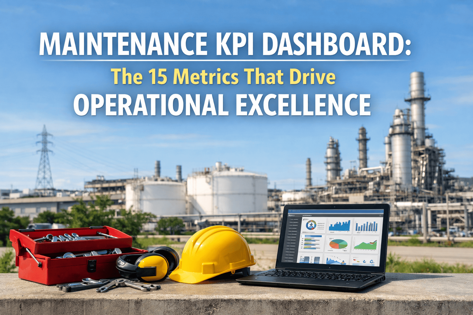
Maintenance KPI Dashboard: The 15 Metrics That Drive Operational Excellence
Master the 15 maintenance KPIs that separate world-class operations from reactive firefighting — with formulas, benchmarks, calculation methods, and a CMMS-powered dashboard framework that delivers real-time operational intelligence.
Equipment Reliability
MTBF, MTTR, OEE — real-time tracking
Work Management
PM compliance, backlog, schedule adherence
Cost Intelligence
Cost as % RAV, cost per unit, budget variance
Workforce Productivity
Wrench time, WO completion rate, overtime %
15Essential KPIs for maintenance excellence
85%+World-class OEE target
90%PM compliance benchmark
Real-TimeCMMS-automated KPI calculation
Why Most Maintenance Dashboards Fail
The problem isn't a lack of data — it's a lack of the right data, presented in the right context, to the right audience. Most maintenance reports track activity (work orders completed, hours logged) instead of outcomes (reliability improved, costs reduced). The result is a dashboard that tells you how busy the team was, but not whether the plant is getting better or worse. Effective maintenance KPI dashboards connect every metric to a business outcome — and every metric has a formula, a benchmark, and an owner. Book a Demo.
The Five Dashboard Failures That Blind Maintenance Leaders
Activity vs. Outcome
80%
Of maintenance dashboards track work orders completed instead of equipment reliability. Completing 800 WOs means nothing if MTBF is declining.
Result: Busy team, declining plant
No Benchmarks
Zero
Metrics without context are meaningless. Is 72% PM compliance good or bad? Without industry benchmarks, you can't tell — and neither can your CFO.
Result: No improvement targets
Lagging Only
Blind
Dashboards that show only lagging indicators (breakdowns, costs) tell you what already happened. Leading indicators (PM compliance, backlog) predict what's coming.
Result: Always reactive
Manual Calculation
Stale
KPIs calculated monthly from spreadsheets are 30 days old by the time anyone sees them. A CMMS calculates every metric in real-time from live work order data.
Result: Decisions on old data
Wrong Audience
Misfit
A plant manager needs OEE and cost metrics. A maintenance supervisor needs backlog and schedule adherence. One-size-fits-all dashboards serve nobody well.
Result: Dashboard ignored
The 15 Essential Maintenance KPIs
A world-class maintenance KPI dashboard is organized into four tiers that flow from equipment outcomes to financial impact. Each KPI has a formula, a world-class benchmark, and a CMMS data source. Together, they form the complete picture of maintenance performance that executives, plant managers, and maintenance supervisors need to make data-driven decisions.
Tier 1: Equipment Reliability KPIs
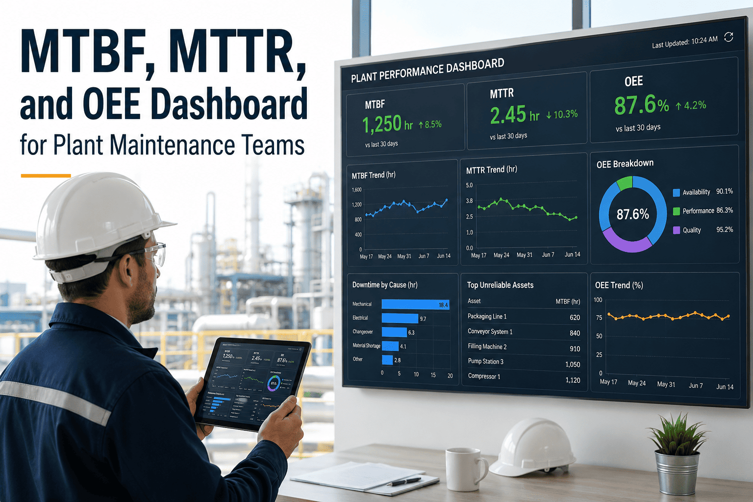
Overall Equipment Effectiveness (OEE)
Formula: Availability × Performance × Quality
✓ Availability: (Run Time / Planned Production Time) — captures downtime losses
✓ Performance: (Actual Output / Max Possible Output) — captures speed losses
✓ Quality: (Good Units / Total Units) — captures defect losses
Benchmark: World-class = 85%+ | Industry average = 60% | Below 40% = urgent intervention. CMMS calculates from downtime logs + production data.
Mean Time Between Failures (MTBF)
Formula: Total Operating Time / Number of Failures
✓ Measures equipment reliability — higher MTBF = more reliable assets
✓ Track per asset, asset class, and department for granular analysis
✓ Trending MTBF reveals whether your PM program is actually working
Benchmark: Target varies by asset type. Increasing MTBF trend = improving reliability. Decreasing = PM program ineffective or asset end-of-life.
Mean Time To Repair (MTTR)
Formula: Total Repair Time / Number of Repairs
✓ Measures maintenance responsiveness — lower MTTR = faster recovery
✓ Includes diagnosis time, parts wait time, and actual repair time
✓ High MTTR often signals parts availability or skill gap issues
Benchmark: World-class MTTR < 4 hours for critical equipment. Track by failure type to identify systemic delays (parts, skills, access).
Equipment Availability
Formula: (Total Time – Downtime) / Total Time × 100
✓ The most visible reliability metric — directly impacts production capacity
✓ Separate planned downtime (PMs, shutdowns) from unplanned downtime (failures)
✓ CMMS auto-calculates from work order start/end timestamps
Benchmark: World-class = 95%+ availability. Track unplanned availability separately — that's the metric maintenance owns.
Tier 2: Work Management KPIs
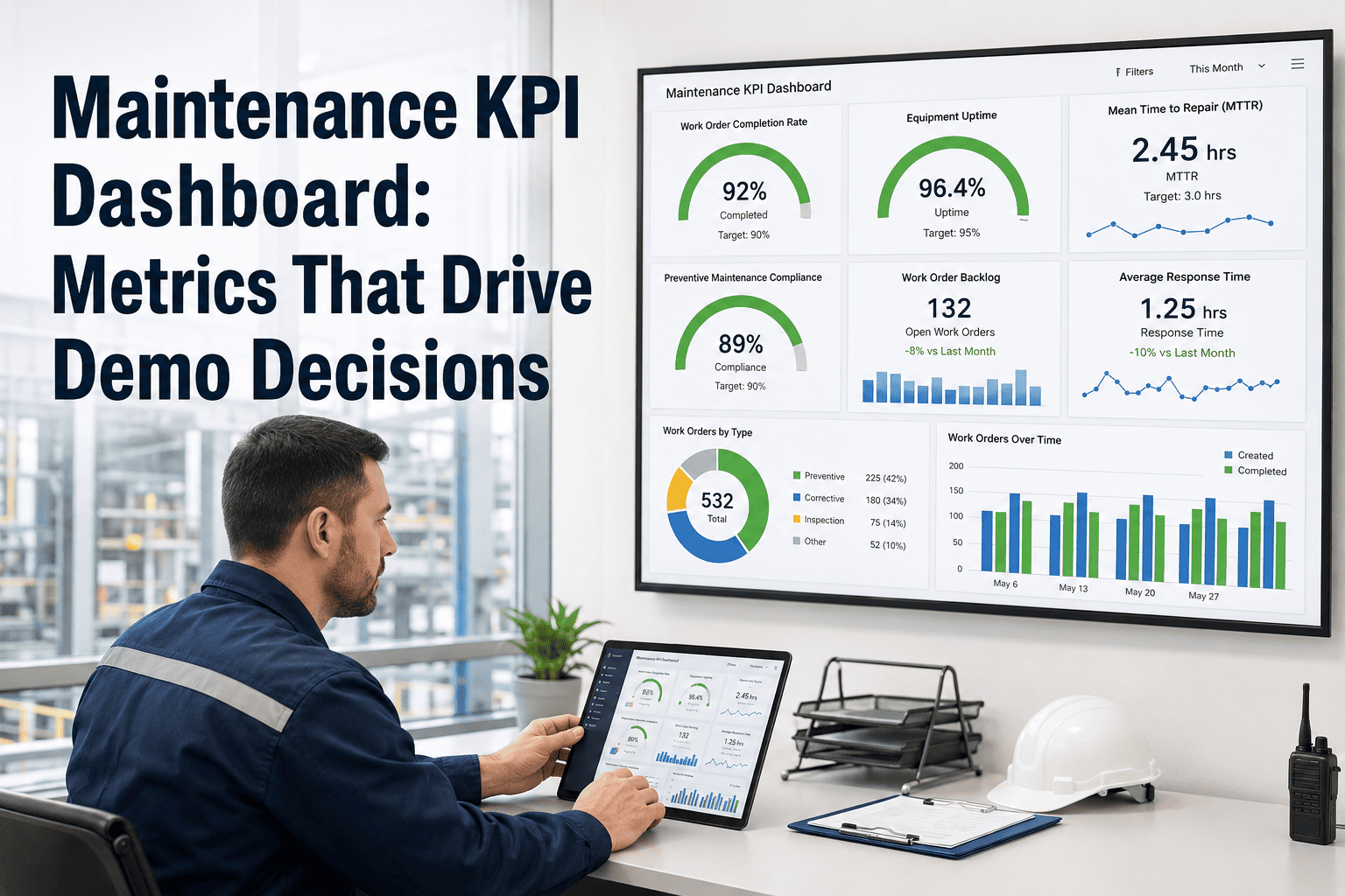
Planned Maintenance Percentage (PMP)
Formula: Planned Work Orders / Total Work Orders × 100
✓ The single best leading indicator of maintenance program maturity
✓ Planned = scheduled PMs + condition-based tasks. Unplanned = emergency/reactive
✓ Every 10% shift from reactive to planned = ~18% cost reduction
Benchmark: World-class = 85–90% planned | Average = 50–60% | Reactive plant = <30%. This is the #1 KPI for maintenance transformation.
PM Compliance Rate
Formula: PMs Completed On Time / PMs Scheduled × 100
✓ Measures execution discipline — are PMs actually being done when due?
✓ "On time" = completed within scheduled window (typically ±10% of interval)
✓ Low PM compliance is the root cause of most reliability problems
Benchmark: World-class = 95%+ | Acceptable = 90% | Below 85% = PM program is failing. CMMS auto-tracks with overdue alerts.
Schedule Compliance
Formula: Scheduled WOs Completed / Scheduled WOs Planned × 100
✓ Did we execute the weekly schedule we committed to? Measures planning accuracy
✓ Break-in work (emergency interruptions) is the primary compliance killer
✓ Track schedule breaks by reason code to identify root causes
Benchmark: World-class = 90%+ | Average = 60–70%. Low schedule compliance signals too much reactive work or poor planning.
Maintenance Backlog (Weeks)
Formula: Total Backlog Hours / Available Weekly Labor Hours
✓ Measures the queue of approved work waiting for execution
✓ Too low (<2 weeks) = under-identifying work. Too high (>6 weeks) = falling behind
✓ Trend is more important than absolute number — is backlog growing or shrinking?
Benchmark: Healthy backlog = 3–5 weeks. Provides planning buffer without creating an unmanageable queue. CMMS calculates automatically.
Every KPI, Calculated Automatically
Oxmaint CMMS calculates all 15 maintenance KPIs in real-time from your work order data — no spreadsheets, no manual formulas, no month-end scrambles. Your dashboard is always current, always accurate, always ready for leadership review.
Tier 3: Cost & Inventory KPIs
Maintenance Cost as % of RAV
Formula: Annual Maintenance Cost / Replacement Asset Value × 100
✓ The gold standard for maintenance spending benchmarking across industries
✓ RAV = current cost to replace all assets at today's prices
✓ Normalizes maintenance cost regardless of plant size or asset age
Benchmark: World-class = 2–3% of RAV | Average = 4–5% | Poor = 6%+. A plant with $200M RAV spending $10M on maintenance = 5% — room to improve.
Cost Per Unit of Production
Formula: Total Maintenance Cost / Total Units Produced
✓ Connects maintenance spending directly to production output
✓ Captures both cost efficiency AND production effectiveness in one metric
✓ The metric CFOs understand best — it speaks their language
Benchmark: Varies by industry. Trend is critical — declining cost-per-unit means maintenance is delivering more value. Track monthly.
Spare Parts Inventory Turnover
Formula: Annual Parts Consumption / Average Inventory Value
✓ Measures how efficiently spare parts inventory is utilized
✓ Low turnover = excess stock tying up capital. High turnover = risk of stockouts
✓ CMMS tracks usage per part and flags dead stock automatically
Benchmark: Target 2–3 turns per year for maintenance spares. Insurance spares (critical, slow-moving) are excluded from this calculation.
Emergency/Reactive Work Percentage
Formula: Emergency Work Orders / Total Work Orders × 100
✓ The inverse of PMP — measures the reactive burden on the maintenance team
✓ Emergency work costs 3–5x more than planned work for the same repair
✓ Track by department to identify areas still trapped in reactive mode
Benchmark: World-class = <10% emergency | Average = 30–40% | Reactive plant = 50%+. Every % point reduced saves real money.
Tier 4: Workforce Productivity KPIs
Wrench Time (Direct Work %)
Formula: Time Hands-on-Tools / Total Available Work Hours × 100
✓ Measures what % of a technician's day is spent on actual repair work
✓ Non-wrench time: travel, waiting for parts, paperwork, finding tools, meetings
✓ A CMMS improves wrench time by eliminating manual paperwork and enabling mobile WOs
Benchmark: World-class = 55–65% | Average = 25–35%. Moving from 30% to 55% effectively doubles your team's capacity without hiring.
Work Order Completion Rate
Formula: Work Orders Completed / Work Orders Opened × 100 (per period)
✓ Are we completing work as fast as it comes in? Ratio >1 = reducing backlog
✓ Track separately for PMs, corrective work, and projects
✓ Chronically below 100% = backlog growing — need capacity or efficiency gains
Benchmark: Target ≥100% sustained. Periods below 100% are normal during shutdowns — the trend over 12 weeks matters most.
Overtime Percentage
Formula: Overtime Hours / Total Hours Worked × 100
✓ High overtime signals reactive maintenance culture — emergency work drives OT
✓ Persistent OT above 5% indicates either understaffing or poor planning
✓ As planned maintenance % rises, overtime naturally falls — they're inversely correlated
Benchmark: World-class = <3% overtime | Average = 5–8% | Reactive plant = 12%+. Each 1% reduction saves ~$2,000/technician/year.
Building the Right Dashboard for Each Audience
A single dashboard cannot serve every stakeholder. The plant manager needs strategic KPIs that connect maintenance to production. The maintenance supervisor needs tactical KPIs that drive daily decisions. The technician needs operational visibility into their assigned work. A properly tiered maintenance KPI dashboard delivers the right metrics to the right audience at the right frequency. Book a Demo to see audience-specific dashboards in Oxmaint.
Dashboard Tiers by Audience
Executive / Plant Manager
Priority KPIs:
OEE (overall plant effectiveness)
Maintenance cost as % of RAV
Cost per unit of production
Equipment availability (unplanned)
Dashboard Characteristics:
Monthly trend view with targets
Benchmark comparison to industry
Financial impact quantified ($)
Exception-based — flag deviations only
Executive dashboards should answer: "Is maintenance delivering value to the business?"
Maintenance Manager
Priority KPIs:
Planned maintenance % (PMP)
PM compliance rate
MTBF / MTTR trends
Backlog weeks & emergency %
Dashboard Characteristics:
Weekly view with drill-down by area
Pareto analysis of failure modes
Schedule vs. actual comparison
Resource utilization heat map
Manager dashboards should answer: "Is the maintenance program improving?"
Supervisor / Technician
Priority KPIs:
Today's work orders & schedule
Overdue PMs by area
Parts availability status
Work order completion rate
Dashboard Characteristics:
Daily / real-time view
Mobile-optimized for field access
Action-oriented — what to do next
Simple visual status (red/yellow/green)
Technician dashboards should answer: "What do I need to do right now?"
KPI Dashboard Implementation Lifecycle
Building a maintenance KPI dashboard isn't a one-time project — it's a maturity journey. Start by establishing data collection, then build baseline metrics, add benchmarks and targets, and finally evolve to predictive analytics. Each phase builds on the previous one.
Dashboard Maturity Lifecycle
From data collection to predictive intelligence
01
Data Foundation
Deploy CMMS and establish work order discipline. Every maintenance activity captured digitally — no exceptions. Asset register complete. Failure codes standardized. This phase builds the raw data that all KPIs require.
Months 1–3
02
Baseline Measurement
Calculate initial values for all 15 KPIs. Establish current-state baselines. Identify the 3–5 KPIs with the largest gap between current performance and world-class benchmarks — these are your improvement priorities.
Months 3–6
03
Target Setting & Dashboards
Set 12-month improvement targets for each KPI. Build audience-specific dashboards (executive, manager, technician). Establish weekly/monthly KPI review cadence. Begin driving behavior change through visible metrics.
Months 6–9
04
Advanced Analytics
Activate predictive KPI trending — project where metrics will be in 90 days. Implement failure mode correlation analysis. Build automated alerts when KPIs breach thresholds. Integrate cost data for full financial visibility.
Months 9–12
05
Continuous Optimization
KPI targets refresh annually. Dashboard evolves with organizational maturity. Benchmarking against industry peers. KPIs embedded in performance reviews, capital planning, and strategic decision-making. Maintenance becomes data-driven.
Year 2+
Pre-Built KPI Dashboards, Ready Day One
Oxmaint includes pre-configured maintenance KPI dashboards for every audience — from executive OEE views to technician daily work queues. All 15 KPIs calculate automatically from your work order data with zero manual effort.
Expert Perspective: KPIs That Changed the Operation
"
We had 35 maintenance technicians and no idea how productive they were. When we implemented Oxmaint and started tracking wrench time, the first measurement was 22% — meaning 78% of a technician's day was spent on non-repair activities. Walking to stores, waiting for parts, searching for manuals, doing paperwork. We didn't need more technicians — we needed to remove the obstacles preventing the ones we had from doing their jobs. Within 12 months, wrench time hit 48%. That's the equivalent of adding 12 technicians without hiring anyone. Our PM compliance went from 68% to 94%, MTBF increased 40%, and emergency work dropped from 45% to 15%. But the number that convinced the board was maintenance cost per unit — it dropped 31%. That's a metric every executive understands. The KPI dashboard didn't just measure our performance — it transformed how we think about maintenance entirely.
— VP of Operations, Heavy Manufacturing Company
48%
Wrench time (up from 22%)
94%
PM compliance achieved
-31%
Maintenance cost per unit reduction
15%
Emergency work (down from 45%)
Operations that build structured maintenance KPI dashboards aren't just tracking numbers — they're building the intelligence infrastructure that drives continuous improvement, justifies investment, and proves the value of maintenance to the entire organization. Every facility has the data. The difference between world-class and average is whether that data is organized into the 15 metrics that actually matter. Start your free trial today and see your maintenance performance with clarity for the first time.
See Your Maintenance Performance — Clearly
Oxmaint CMMS provides the complete maintenance KPI dashboard — tracking all 15 essential metrics in real-time, with audience-specific views, automated calculations, benchmark comparisons, and threshold alerts that drive action, not just reporting.
Frequently Asked Questions
What are the most important maintenance KPIs to track first?
Start with three: Planned Maintenance Percentage (PMP), PM Compliance Rate, and Equipment Availability. PMP tells you whether your maintenance approach is proactive or reactive. PM compliance tells you whether planned work is actually getting executed. Availability tells you the result — is equipment running when production needs it? These three KPIs form a cause-and-effect chain: high PMP drives high PM compliance, which drives high availability. Once these are stable, add MTBF, MTTR, and cost metrics. Trying to track all 15 KPIs before you have reliable data collection will produce inaccurate numbers that erode credibility rather than build it.
How does a CMMS calculate KPIs automatically?
Every maintenance KPI is derived from work order data that the CMMS already collects during normal operations. When a technician opens a work order, the system timestamps it. When they close it, the system captures completion time, labor hours, and parts used. When a PM is scheduled and completed, compliance is tracked. When an asset has a failure work order, it resets the MTBF clock. The CMMS aggregates these data points across all work orders and calculates each KPI formula automatically. There's no separate data entry required — the KPIs are a natural byproduct of using the CMMS for daily work management. Oxmaint displays these calculated KPIs on real-time dashboards that update continuously as work orders are processed.
What's a good benchmark for maintenance cost as a percentage of RAV?
The industry consensus is that world-class facilities spend 2–3% of Replacement Asset Value (RAV) on annual maintenance. Average facilities spend 4–5%, and poorly maintained facilities spend 6% or more. However, context matters significantly. A new facility with modern assets should spend less than an aging plant with legacy equipment. Heavy-process industries (chemicals, refining) tend toward the higher end. The key insight is that very low maintenance spend (<2%) often indicates underinvestment that will produce reliability problems later. The optimal point is the spend level that minimizes total cost of ownership — including both maintenance costs and the production losses that result from insufficient maintenance. Track this KPI trending over time alongside MTBF and availability to ensure cost reductions aren't coming at the expense of reliability.
How often should maintenance KPIs be reviewed?
Different KPIs require different review frequencies based on their nature and audience. Daily: Work order completion rate, overdue PMs, today's schedule (supervisor/technician level). Weekly: Schedule compliance, backlog weeks, emergency work %, wrench time (maintenance manager). Monthly: MTBF, MTTR, PM compliance, planned maintenance %, equipment availability (plant manager/executive). Quarterly: Cost as % of RAV, cost per unit, inventory turnover, OEE (executive/strategic review). The most important practice is consistency — a KPI reviewed every Monday at 8am becomes a management tool. A KPI reviewed "when we get around to it" remains a report that nobody reads.
What's the difference between leading and lagging maintenance KPIs?
Leading indicators predict future performance — they tell you what's likely to happen. PM compliance, planned maintenance percentage, backlog, and wrench time are all leading indicators. If PM compliance drops from 95% to 75%, you can predict that MTBF will decline and emergency work will increase within 60–90 days. Lagging indicators measure past results — MTBF, MTTR, equipment availability, OEE, and cost metrics tell you what already happened. The most effective dashboards include both: leading indicators for early warning and course correction, and lagging indicators to confirm whether actions taken are producing results. An operation that only tracks lagging indicators is always surprised by problems. One that tracks leading indicators sees problems coming and can prevent them.