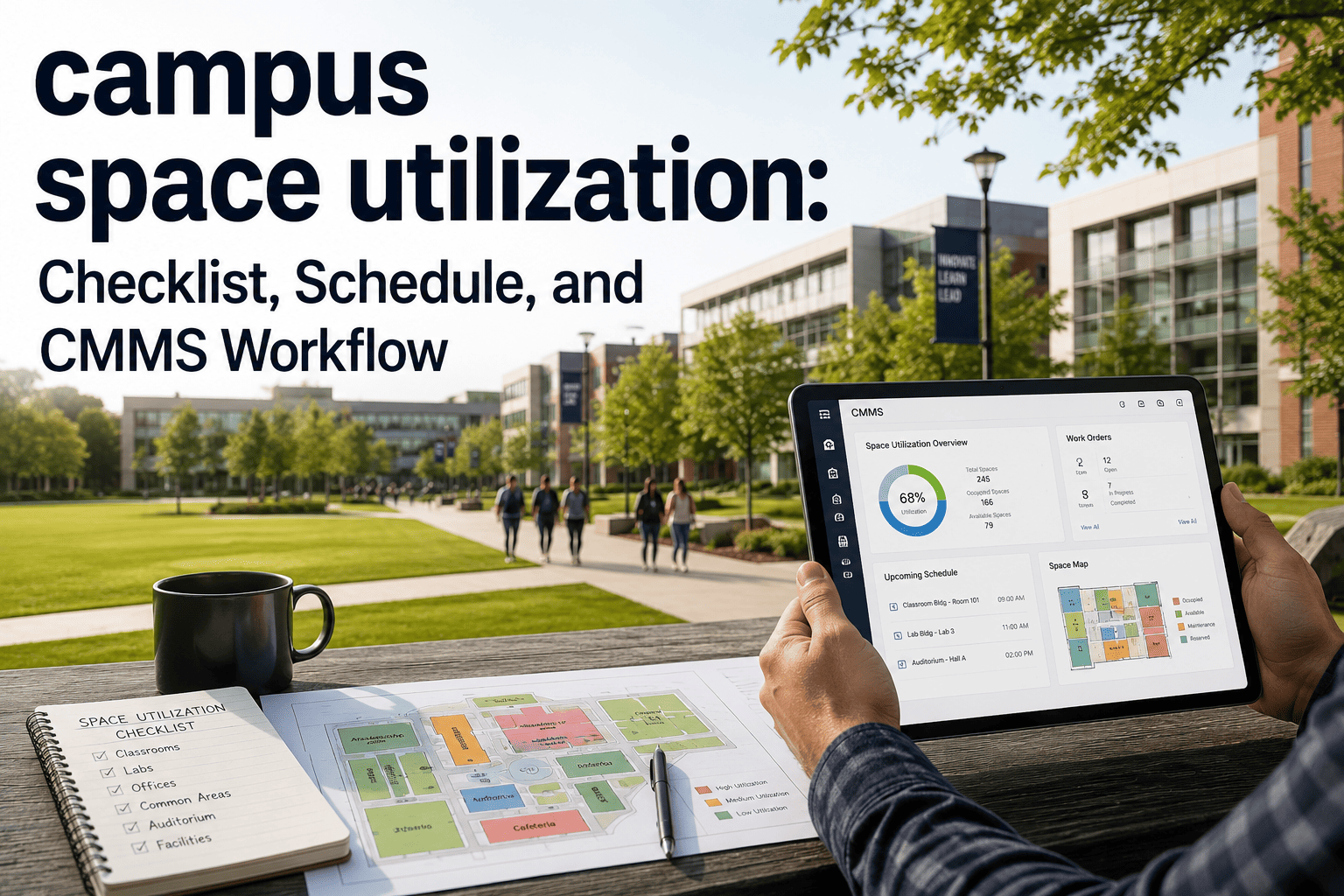
A space utilization dashboard is only useful if it shows the handful of numbers that actually change a decision. Too many school facilities teams build screens full of charts nobody acts on, while the metrics that predict wasted cost and rising work orders stay buried in spreadsheets. The goal is a single view where occupancy, scheduling, cost, and condition sit side by side — so a facilities director can see at a glance which rooms to repurpose and which buildings are quietly draining budget. This page lays out exactly what belongs on that dashboard and why each metric earns its place. You can book a 30-minute demo to see the live version.
What to Track in a Campus Space Utilization Dashboard for School Facilities
The metrics that turn occupancy data into action — occupancy, scheduled hours, cost per square foot, and condition, all on one screen your board and your technicians both understand.
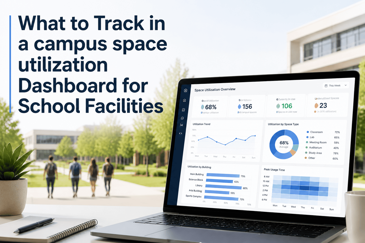
The Dashboard at a Glance
This is the core view. Six tiles, each tied to a decision a facilities team makes every week — not a wall of charts, but the signal that tells you where to look first.
The Six Metrics — and Why Each One Matters
Every tile on the dashboard answers a specific question. Here is what each metric measures, the benchmark to watch, and the decision it drives.
| Metric | What It Tells You | Benchmark |
|---|---|---|
| Overall utilization | Share of available room-hours actually used | Target near 70% |
| Peak window load | Where demand concentrates in the day | Spread load off the 10–2 peak |
| Scheduled vs available | Booked hours against the weekly window | Roughly 32 hours/week available |
| Cost per square foot | Upkeep cost normalized by area | $5.20–$8.40 for higher ed |
| Reactive vs planned | How much work is emergency vs scheduled | Aim for 80% planned |
| Facility Condition Index | Deferred maintenance vs replacement value | Above 0.10 triggers capital review |
Stop building dashboards nobody acts on.
OxMaint pulls occupancy, scheduling, cost, and condition into one live view — pre-built for school facilities, so the metrics that matter are on screen from day one.
One Screen, Two Audiences
A good dashboard speaks to the board and the technician from the same data. The trick is separating the slow-moving strategic numbers from the fast-moving operational ones.
Frequently Asked Questions
Build the dashboard your facilities team will actually use.
OxMaint turns occupancy, scheduling, cost, and condition into one clear screen — board-ready and technician-ready from the same source of truth.