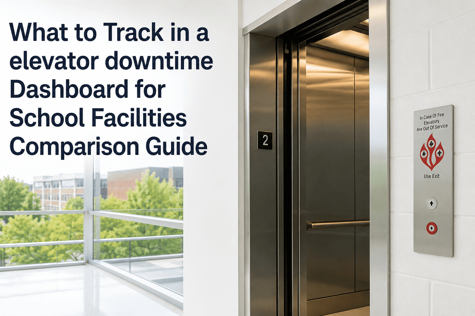
When a school elevator goes out of service, the conversation in the front office is rarely about the motor or the controller — it is about which students cannot reach the cafeteria, the gym, or a second-floor classroom until it is fixed. Most districts still track that outage the way they track a leaking faucet: a phone call, a vendor visit, and a closed ticket once service resumes, with no record of how long the car was down or whether this is the third callback on it this year. A dashboard built specifically for elevator downtime turns that scattered history into measurable reliability and compliance data districts can actually act on. Teams ready to see this running against their own building list can start a free trial or book a demo.
What to Track in a School Elevator Downtime Dashboard
Most districts log an elevator outage as a phone call and a closed ticket. A downtime dashboard turns that into measurable reliability, vendor accountability, and ADA-defensible records — here is exactly what belongs on it.
The Six Numbers Every Elevator Downtime Dashboard Should Show
Not all downtime is equal, and a dashboard that only shows whether the car is "up" or "down" right now misses the pattern that actually predicts the next failure. These six metrics turn individual vendor calls into a reliability and compliance record a district can defend.
Average operating hours a car runs before an unplanned outage. A flat or declining trend signals a car that needs deeper inspection, not just another callback.
Hours from the outage being reported to the car being verified back in service. This is the number that should be measured against your vendor's contracted response time.
A single rolled-up reliability score built from MTBF and MTTR, calculated per car and per building, so leadership can compare elevators without reading raw work order logs.
The share of repair visits followed by a second call for the same fault within a set window. A high callback rate means a vendor is treating symptoms, not the root cause.
Downtime on elevators flagged as the only accessible route, tracked separately from non-critical cars, with the alternate access notice logged alongside it.
Percentage of scheduled preventive maintenance and annual code inspections completed on time, with current certificate status attached to the same record.
Metrics Without a System Behind Them Just Become Another Spreadsheet
Knowing that MTBF and callback rate matter is the easy part. Capturing them automatically, from the same work order a technician already closes, is what keeps the dashboard accurate six months from now instead of one. Start a free trial to connect your elevator inventory, or book a demo to see the metrics calculated from a sample building.
Formulas, and What a Healthy Number Looks Like
Formulas matter less in isolation than they do compared over time, by car, and against the rest of the building list. This table is the reference most facility teams pin to the wall during their first dashboard build.
| Metric | What It Measures | Formula | Healthy Signal | Captured From |
|---|---|---|---|---|
| MTBF | Average run time before an unplanned outage | Operating hours ÷ failures | Trending up, or flat at minimum | Work order open timestamps |
| MTTR | Average time to restore service | Repair hours ÷ failures | Same-day for ADA-required cars | Work order open-to-close time |
| Availability | Combined uptime reliability score | MTBF ÷ (MTBF + MTTR) | High and stable across the term | Calculated from MTBF and MTTR |
| Callback Rate | Repair visits that did not fix the cause | Repeat visits ÷ total visits | Low and falling | Linked work orders, set window |
| ADA Outage Duration | Downtime on ADA-required cars only | Outage minutes, flagged cars | Logged with alternate access plan | ADA-flagged asset records |
| PM Compliance | Scheduled maintenance completed on time | Completed ÷ total scheduled | Consistently near full completion | PM schedule and inspection log |
Logbook Tracking vs an Automated Downtime Dashboard
Four Views Every Elevator Downtime Dashboard Needs
A dashboard with twenty widgets and no organizing logic is just a busier spreadsheet. These are the four views facility teams actually check during a normal week and during an active outage, built from the same work order data already captured for every other piece of equipment in the building. Book a demo to see these four views set up against your own elevator inventory.
Every elevator across every building shown as in service, out of service, or under inspection, updated the moment a technician opens or closes a work order.
MTBF, MTTR, and Availability charted per car and rolled up by building, so a slow decline is visible months before it becomes a full outage.
Inspection certificate status, PM completion percentage, and ADA outage log shown together per elevator, ready before a reviewer ever asks for it.
Response time against the contracted SLA, callback rate, and visit completion history per vendor, turning a service contract into a number you can act on.
Six Things Most Elevator Tracking Spreadsheets Miss
When the only wheelchair-accessible elevator in a building is tracked the same way as a freight lift, an outage that should trigger an immediate accommodation plan looks like routine maintenance instead.
A vendor returning twice in three weeks for the same door sensor fault should show up as one unresolved problem, not two unrelated tickets that hide the pattern.
Recording an outage as "down Tuesday" instead of actual timestamps erases the data needed to calculate MTTR, and makes vendor SLA compliance impossible to verify.
An annual inspection that flags a deficiency is only half the record. Without a tracked work order tied to it, there is no proof the issue was corrected before the next review.
Most elevator contracts specify a response time, but few districts measure whether it was met on the last twenty calls, so underperformance goes unnoticed until an outage drags on.
A status board shows whether the elevator is running right now. It rarely shows whether this car has failed four times this semester, the pattern that should drive a replacement decision.
Outcomes Districts Report After Building This Dashboard
Average reduction in time needed to assemble outage and inspection records for a state or OCR review
Reported reduction in ADA-related legal exposure after moving from paper logs to dashboard-tracked records
Typical reduction within one quarter once repeat-fault elevators are caught by callback rate tracking
Time needed to produce a full downtime and inspection history once it is captured automatically
Frequently Asked Questions
Does ASME A17.1 require schools to track downtime, or just pass an annual inspection?+
What counts as a healthy MTTR for a school elevator?+
How does a downtime dashboard help if OCR opens an ADA investigation?+
Can one dashboard track elevators serviced by different vendors across buildings?+
What happens when an elevator fails its annual inspection?+
Every Elevator Outage Should Leave a Number Behind, Not Just a Memory
Districts do not need more dashboards, they need the right six numbers, captured automatically from the work orders already created every time an elevator goes down — no separate spreadsheet, no end-of-year scramble to reconstruct a year of outages from memory and email.