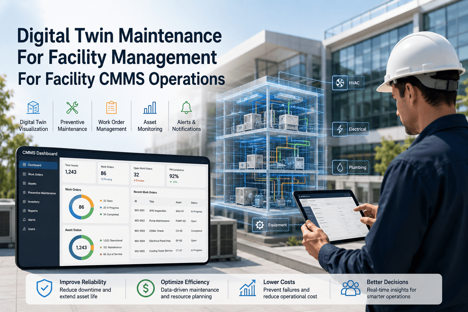
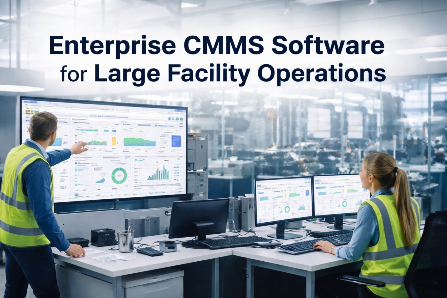
Digital Twin Maintenance For Facility Management For Maintenance Dashboard

By Lewis Abbott on June 24, 2026

digital-twin-maintenance-for-facility-management-for-maintenance-dashboard

Most facility teams can tell you what broke last week, but almost none can tell you what is about to break next week. The reason isn't a lack of effort — it's that BMS trends, SCADA logs, IoT sensor feeds and CMMS work order history all sit in separate systems that were never built to talk to each other. A digital twin maintenance dashboard exists to close that gap: one live model of every major asset, fed by real sensor and work order data, that turns scattered signals into a single view of what actually needs attention today. Facility managers who get this right stop reacting to failures and start scheduling around them instead. See what a live dashboard looks like in a 30-minute walkthrough. The rest of this page breaks down what belongs on that dashboard, what it replaces, and how fast a facility team can realistically get one running.

Digital Twin Maintenance Dashboard · Facility CMMS

One Live Model Of Your Building, Instead Of Five Disconnected Reports

A digital twin dashboard pulls asset condition, energy use, alerts and work order status into one screen, so facility managers stop hunting across BMS, spreadsheets and SAP just to answer "what needs fixing today."

Industry Signal

Why Facility Teams Are Moving Maintenance Onto A Digital Twin Now

31%
of digital twin deployments are now built specifically around predictive maintenance use cases
~30%
average HVAC energy reduction reported by facility portfolios after twin-based monitoring rollout
20–30%
typical efficiency gain once twin data starts feeding maintenance planning directly
$4.18B
size of the building-twin market in 2026, growing fastest in facility and asset operations
Dashboard Anatomy

What Should Actually Be On A Digital Twin Maintenance Dashboard

Most "digital twin" dashboards on the market are pretty 3D models with no maintenance logic behind them. A useful one is built around six panels that map directly to decisions a facility manager has to make every day.

01
Asset Health Score
A single rolling score per asset, built from sensor drift, age and failure history.
02
Live Alert Feed
Threshold breaches the moment they happen, not after the next inspection round.
03
Energy & Utilization
Consumption by zone and equipment, so spend is tied to an actual cause.
04
Maintenance Backlog
Open work orders ranked by the asset's twin-derived risk, not just age.
05
Spares Linked To Twin
Parts availability checked automatically against assets showing early failure signs.
06
Cross-Site Benchmark
Same asset class compared across buildings to catch outliers fast.
Where The Savings Show Up

Twin-Driven Maintenance Moves The Needle In Four Specific Places

Reactive work orders

↓ 35%
Energy consumption

↓ 28%
Unplanned downtime

↓ 22%
Maintenance labor hours

↓ 18%
Side By Side

Reactive Walk-Rounds Versus A Digital Twin Dashboard

CriteriaWithout A Digital TwinWith A Twin Dashboard
Asset status visibilityHours-old, from the last walk-roundContinuous, updated as sensors report
Fault detectionFound after the asset has already failedFlagged before it crosses a failure threshold
Energy reportingReviewed once a month from the utility billTracked live, by zone and by equipment
Maintenance schedulingFixed calendar, ignores actual conditionTriggered by condition data from the twin
Spares readinessManual shelf check when something breaksChecked against predicted failure timing
Expert Review

A digital twin dashboard is only as good as the sensor coverage and work order discipline feeding it — a beautiful 3D model with patchy data is worse than a plain spreadsheet, because it looks trustworthy when it isn't. The teams that get real value start with two or three high-failure-cost asset classes, prove the alerts hold up against real breakdowns for a month, then expand. Skipping that validation step is the single biggest reason digital twin pilots get abandoned within a quarter.

Facility Reliability Lead · OxMaint Implementation Advisory
14-Day Pilot · No Credit Card

See Your Own Assets On A Live Dashboard Before You Commit To Anything

OxMaint connects to your existing sensors, BMS and CMMS data to build a working asset health view in days, not months.

OxMaint Capabilities

What Powers The Dashboard Behind The Scenes

Live Asset Health Scoring
A continuously updated score per asset, built from sensor trends and failure history.
Alert-To-Work-Order Automation
A threshold breach opens a prioritized work order automatically, no manual triage step.
Energy & Utilization Analytics
Consumption broken down by zone and equipment, tied back to specific assets.
Mobile Technician Push
Field teams get the alert and asset context on their phone the moment it fires.
Historical Trend Library
Every asset's condition history stays searchable for audits and capital planning.
Cross-Site Benchmarking
Compare the same asset class across buildings to spot outliers and copy what works.
Frequently Asked Questions

Digital Twin Maintenance Dashboards — Common Questions

Does "digital twin" mean we need a full 3D model of the building?
No. A useful maintenance dashboard is a data twin, not a visual one — it needs live readings, asset history and failure logic, not 3D rendering. Many facility teams get real value from asset-level data twins long before any 3D model exists. See a working data twin setup.
Do we need sensors on every asset before this is worth doing?
No, and trying to instrument everything at once is the most common reason pilots stall. Start with the two or three asset classes that cause the most downtime or callouts, prove the alerts hold up, then expand coverage in stages. Talk through your asset priority list.
How is this different from the dashboard already built into our BMS?
A BMS dashboard shows raw setpoints and alarms for HVAC and controls. A maintenance dashboard sits a layer above that, combining BMS alarms with work order history, spares status and technician availability so the data actually drives a maintenance decision. Compare the two side by side.
Can the dashboard create work orders on its own, or just display data?
Both, depending on the rule set you approve. Most teams start with the dashboard suggesting a work order for review, then move specific high-confidence alerts to fully automatic creation once they trust the data. See the automation rules in a live demo.
How long does it take to get a working dashboard live?
A focused pilot covering two or three asset classes is typically running within two to three weeks, since it reuses sensor and CMMS data you already have rather than waiting on new hardware. Full portfolio rollout follows once the pilot data proves reliable. Start a free pilot this week.
Free Trial · No Credit Card · Works With Your Existing Sensors

Stop Reporting On Failures. Start Seeing Them Coming.

Book a 30-minute walkthrough and we'll map your own assets onto a live digital twin dashboard before you decide on anything.


Share This Story, Choose Your Platform!