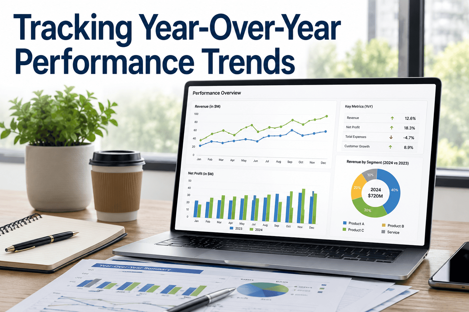
Year-over-year tracking is the discipline that separates fleets making real operational progress from those simply reacting to month-to-month noise. Comparing 12–15 core KPIs against the same period one, two, and three years prior reveals whether maintenance discipline is compounding or quietly degrading beneath acceptable-looking averages. A fleet that cut maintenance spend 8% for two consecutive years while unplanned breakdowns crept up 20% is the classic pattern — under-investing in PM today to pay a compounded price in year three. This guide walks through the KPIs, the multi-year patterns to watch, and how to set actionable targets with a baseline. Ready to see your own three-year trend? Start Free Trial and the YoY dashboard configures itself from your existing work orders.
Are you improving — or just averaging out the noise?
Month-to-month variation hides the truth. A three-year rolling comparison across 12–15 core fleet KPIs exposes whether your maintenance discipline is compounding gains or quietly eroding underneath acceptable-looking averages.
12–15 metrics that define fleet health
Every YoY dashboard should track the same core KPI set against the prior three years. Below is the complete list grouped into four operational domains — each metric shown with both absolute value and percent change versus the same period one, two, and three years prior.
- PM compliance rate%
- Unplanned breakdown frequencyper 10K mi
- MTTR (mean time to repair)hours
- Downtime hoursmonthly
- DVIR completion rate%
- Cost per mile — total$
- CPM — fuel / maint / tires / insurance$ split
- Fleet MPGmpg
- Idle time percentage%
- Utilization percentage%
- Driver safety events per 100 micount
- Incident frequencyper 100K mi
- CSA BASIC scores (all categories)percentile
- Driver retention rate%
- Technician retention rate%
Three-year trends reveal what monthly averages hide
Some failure patterns only surface across multi-year windows. Below are the three diagnostic scenarios that YoY tracking catches early — each one invisible in a 30-day or even 90-day view, but unmistakable across a three-year rolling comparison.
The PM under-investment trap
Maintenance spend drops 8% YoY for two consecutive years while unplanned breakdown frequency creeps up 20%. The savings look real on the monthly P&L — but the fleet is systematically deferring PM and will pay the compounded price in year three as cascading failures hit.
Aging-equipment efficiency decay
PM compliance holds steady at 92%+ but fleet MPG declines 0.4 mpg over 36 months. Nothing changed in driver behavior or routes — the equipment itself is approaching replacement threshold. Without YoY context, the MPG drop gets attributed to fuel quality or seasonality.
Retention-driven compliance drift
Technician retention falls from 84% to 71% over two years while PM compliance slowly erodes from 95% to 88%. New hires take 6–9 months to reach full PM throughput. The YoY overlay makes the causal link visible; the monthly view just shows a "minor" compliance dip.
A 180-truck regional fleet, three years on one dashboard
Consider a 180-asset regional carrier spending roughly $180K/month on maintenance. The table below shows what a three-year YoY comparison looks like when the data is laid bare — and how the patterns from the previous section manifest in real numbers.
| KPI | Year 1 | Year 2 | Year 3 | 3-Yr Trend |
|---|---|---|---|---|
| Cost per mile (total) | $2.18 | $2.12 | $2.15 | Reversing |
| Maintenance spend / month | $184K | $169K | $180K | Rebounding |
| PM compliance rate | 94% | 89% | 85% | Declining |
| Unplanned breakdowns / 10K mi | 0.42 | 0.51 | 0.68 | Compounding |
| Fleet MPG | 6.8 | 6.6 | 6.4 | Decaying |
| Technician retention | 86% | 78% | 72% | Eroding |
| DVIR completion rate | 97% | 96% | 95% | Stable |
Year 2 looked like a win — CPM fell six cents and maintenance spend dropped $15K/month. But the YoY dashboard shows the drop came from deferred PM, not efficiency. By Year 3, breakdowns are up 62% over the baseline, technician turnover is compounding, and MPG decay signals aging equipment. The fleet is now paying $11K/month more than Year 2 to fix what PM would have prevented at a fraction of the cost.
From vague targets to actionable baselines
A target like "reduce cost per mile 5%" is meaningless without a known baseline and trajectory. The YoY framework forces every goal to carry a starting point, a current trajectory, and a specific endpoint — turning aspirations into measurable commitments.
Baseline anchored
Every target starts from a known 12-month average — not a guess. The YoY view provides the defensible number.
Trajectory visible
Is the metric already improving, flat, or declining? A 5% cut on a flat line is very different from 5% on a worsening curve.
Variance to plan
The Oxmaint overlay shows actual versus planned each month, so course correction happens in week 6, not quarter 4.
Compounding guardrails
If CPM drops but breakdowns rise, the YoY cross-metric view flags the trade-off before it becomes a year-three crisis.
Three-year rolling comparisons with goal-tracking overlays
In Oxmaint, the YoY dashboard runs automatically on all core KPIs the moment your work-order data flows in. Three-year rolling comparisons, variance-to-plan overlays, and cross-metric pattern alerts come standard — no spreadsheet exports, no manual normalization, no end-of-quarter scrambling.
12–15 KPIs tracked by default
PM compliance, breakdown frequency, MTTR, downtime, CPM (total + component split), MPG, idle time, safety events, incidents, DVIR, CSA BASICs, driver and technician retention, utilization. All pre-wired to your existing work orders and DVIR feeds.
Three-year rolling comparison
Every KPI shows absolute value and percent change versus the same period one, two, and three years prior. Seasonal noise cancels out; structural trends become impossible to miss.
Goal-tracking overlays with variance to plan
Set a target like "CPM from $2.15 to $2.05" and the dashboard plots actual versus planned every month. Green when on track, gold when drifting, red when off-plan — with the underlying drivers one click away.
Cross-metric pattern alerts
When one KPI improves at the expense of another — maintenance spend drops but breakdowns rise, or MPG holds but idle time climbs — the system flags the trade-off before it compounds into a year-three reckoning.
Stop guessing. Start tracking the trend that actually matters.
Your three-year comparison configures itself from existing work orders in under 48 hours. See the patterns monthly averages are hiding from you.
Year-over-year fleet tracking, answered
The five questions fleet managers ask most often when setting up a YoY performance dashboard for the first time.
Why three years instead of just year-over-year?
A single year-over-year comparison can be distorted by one-time events — a bad winter, a fleet acquisition, a parts shortage. Three years of rolling data smooths out anomalies and reveals whether a trend is structural or seasonal. Patterns like PM under-investment or aging-equipment efficiency decay only become visible across a 36-month window.
What if I don't have clean data for the prior years?
Most fleets have enough work-order history in their existing CMMS or telematics system to reconstruct at least two prior years. Oxmaint imports and normalizes historical data during onboarding — gaps are flagged, not hidden. You can Book a Demo to see a data-readiness assessment for your specific systems.
How often should I review the YoY dashboard?
Monthly review with the full leadership team, quarterly deep-dive with operations and maintenance leads. The monthly cadence catches drift early; the quarterly review examines cross-metric patterns and adjusts goal-tracking overlays. Waiting for an annual review defeats the purpose — by then, year-three problems are already baked in.
Can YoY tracking predict when to replace aging assets?
Yes — declining MPG with steady PM compliance is the clearest replacement signal. When fuel efficiency drops 0.3–0.5 mpg over 24–36 months while maintenance holds flat, the equipment has crossed its economic threshold. The YoY view also tracks rising cost-per-mile on specific asset classes, making the replacement business case quantitative rather than intuitive.
How does Oxmaint handle seasonal variation in the comparison?
The YoY dashboard compares each period to the exact same period in prior years — January versus January, Q2 versus Q2. This neutralizes seasonality by design. A 15% winter MPG drop that happens every year shows as flat; a 15% drop that only happened this year shows as a genuine decline requiring investigation.
See your three-year trend in 48 hours
The YoY dashboard configures itself from your existing work orders. No migration, no consultants, no spreadsheet exports. Just the patterns monthly averages have been hiding.
Free 14-day trial · No credit card



.png)