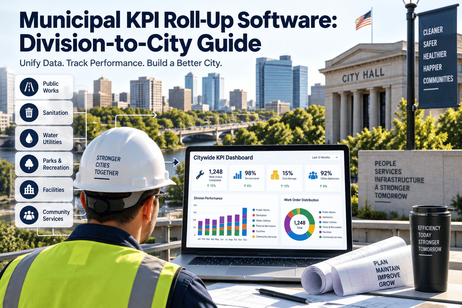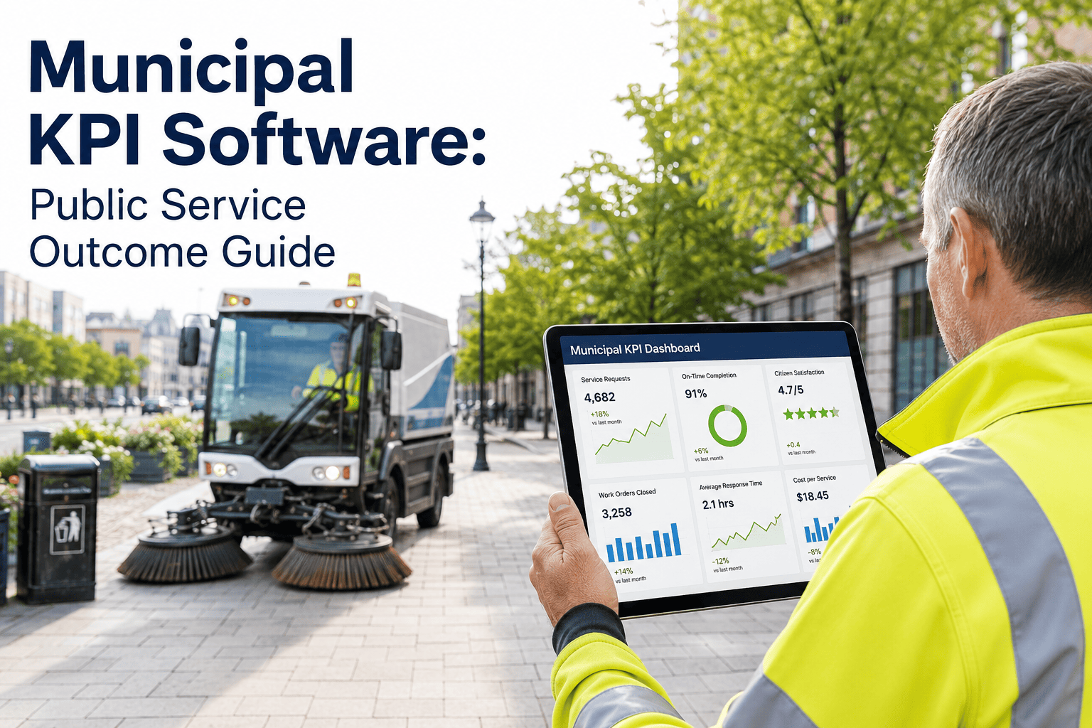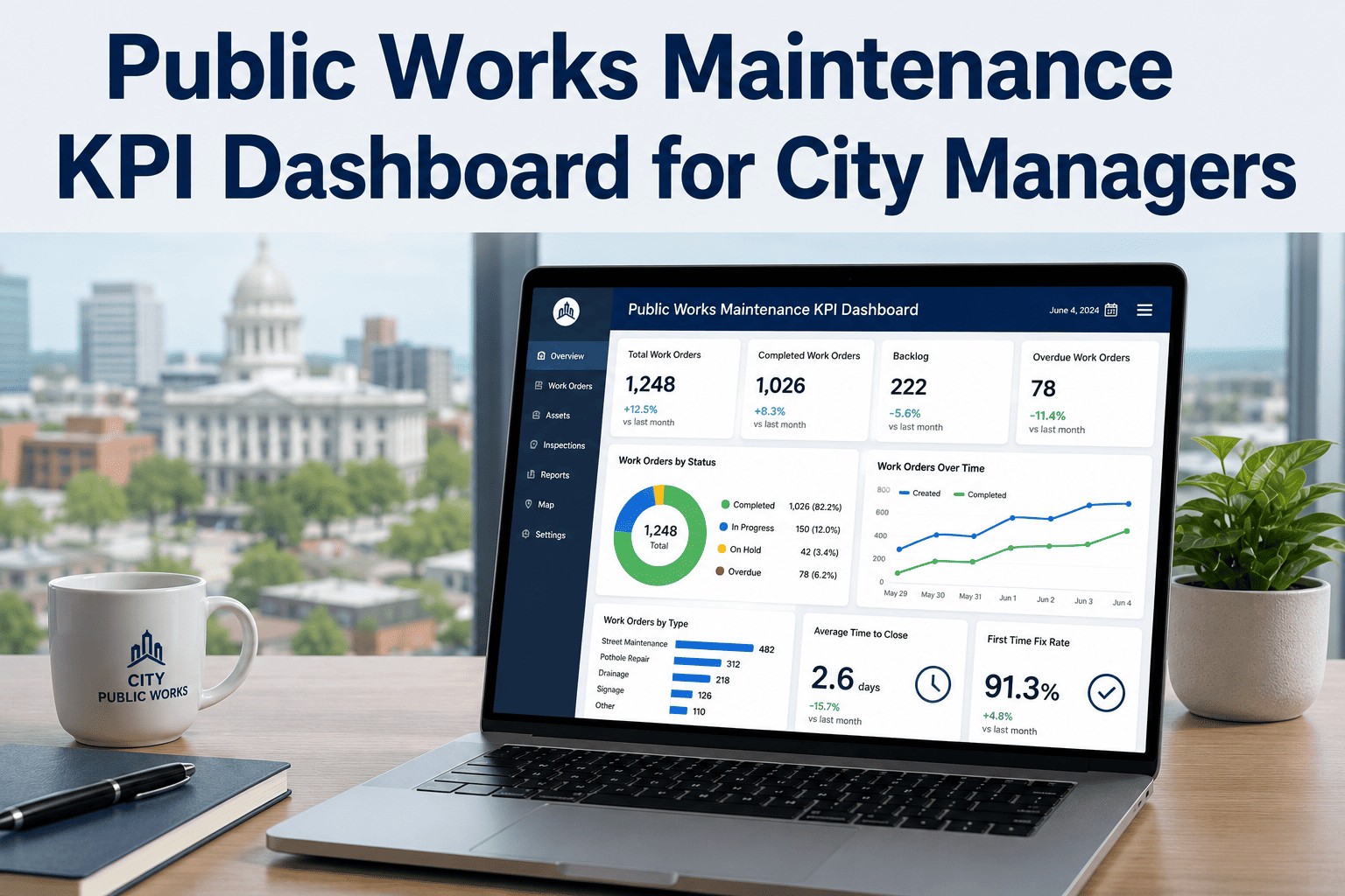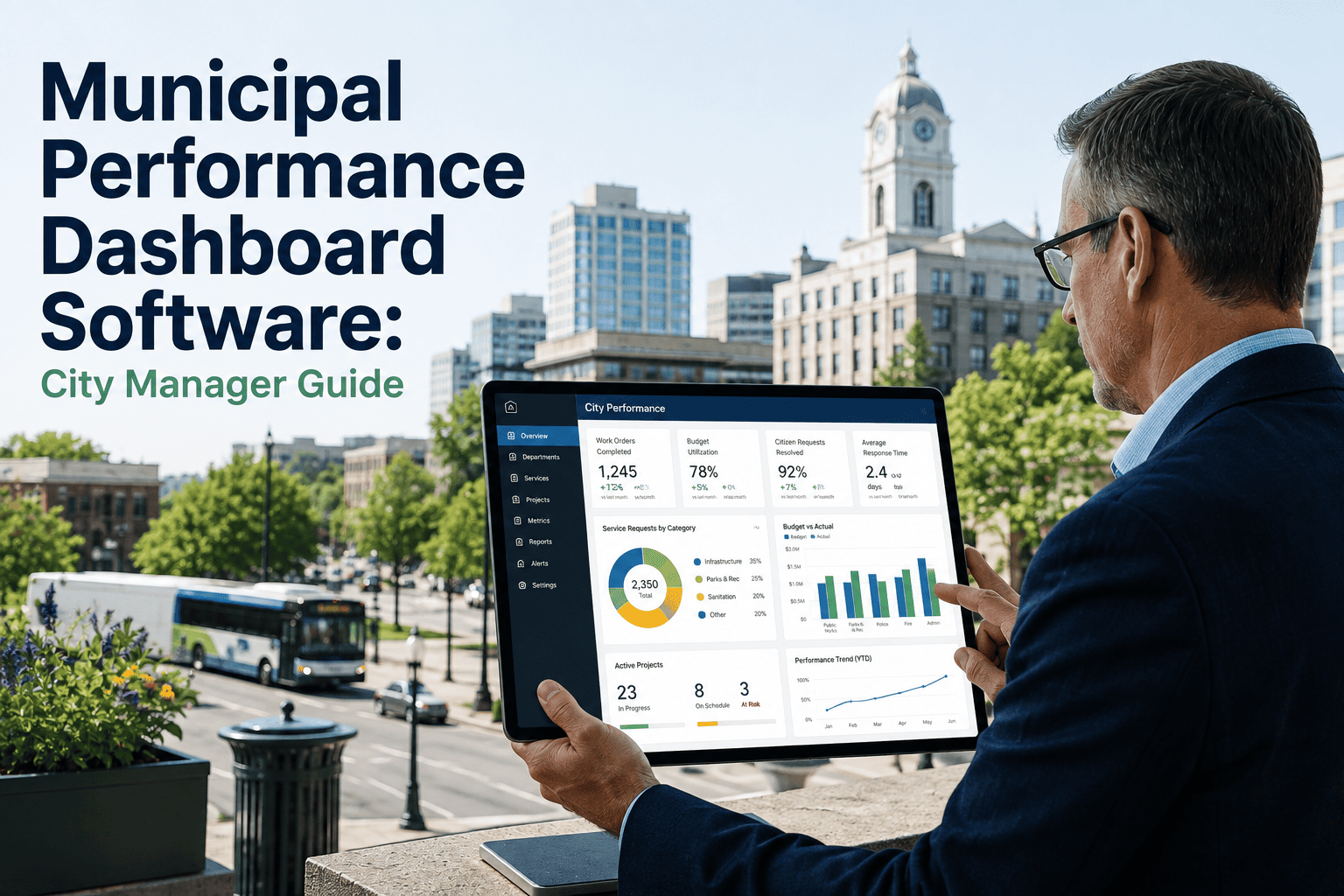
Every city manager knows the Monday morning scramble. Before the leadership meeting, someone has to call public works for pothole counts, email parks for mowing completion rates, pull last week's work order numbers from a spreadsheet somebody else maintains, and hope the utilities director remembers to send water main break totals before the meeting starts. None of it is wrong exactly — it is just late, disconnected, and rebuilt from scratch every single week. A real municipal performance dashboard replaces that scramble with one live view that already has Monday's numbers ready on Friday afternoon. This guide covers what that dashboard should actually show, how cities structure it across departments, and how a connected CMMS makes the weekly review automatic instead of a standing administrative burden. If your team still assembles the Monday report by hand, start a free trial with OxMaint to see what an always-current city dashboard looks like.
Municipal Performance Dashboard Software: The Every-Monday City Manager View of Public Works, Parks, Streets, and Utilities
Cities that run a disciplined weekly performance review consistently outperform ones that don't — not because the meeting is magic, but because it forces the data to be current, comparable, and owned. Here is how to build that dashboard without adding a second full-time reporting job to anyone's week.
Why the Weekly Review Meeting Is Only as Good as the Data Behind It
The idea behind a weekly performance review is not new. Baltimore's CitiStat program proved more than two decades ago that bringing department heads into a room with current data changes behavior — the city saved over 13 million dollars in its first year alone, largely by finally being able to see absenteeism and overtime patterns that had been invisible in disconnected department records. The model worked well enough that more than a dozen other cities adopted their own version of it.
What breaks the model in most cities today is not the meeting format — it is the data pipeline feeding it. When public works tracks work orders in one system, parks tracks maintenance in a spreadsheet, and utilities tracks compliance in a third platform, someone has to manually reconcile all of it before every single review. That reconciliation work is real labor, it introduces errors, and it means the "current" data presented Monday morning is often actually last Wednesday's data, quietly going stale while everyone treats it as live. A dashboard built on a single connected data source removes that translation step entirely, so the weekly review runs on numbers that are actually current rather than numbers someone had time to compile.
There is a second, quieter cost to the manual version of this process: the staff time spent building the report every week never shows up on anyone's dashboard, but it is real. A department analyst pulling numbers from three systems into a slide deck every Monday is not doing that instead of something else — they are doing it instead of the analysis work a performance program is actually supposed to produce. Automating the compilation step does not just make the meeting better, it frees the people who used to build the report to spend that time interpreting it instead.
Three Dashboards, One Underlying Data Source
Not every audience needs the same view of the same data. The most effective municipal dashboards split into three layers, each pulling from the same live source so the numbers never disagree with each other.
What a City Manager's Dashboard Should Actually Show Every Monday
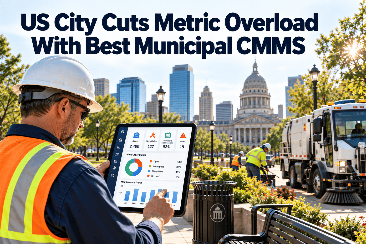
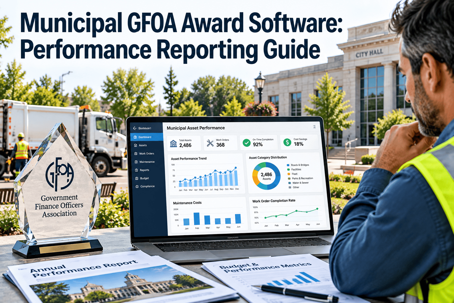
A traffic-light scorecard format — green for on target, yellow for needs attention, red for below target — turns a page of numbers into something a city manager can scan in under two minutes and know exactly where to ask questions.
Every row on a real dashboard links back to the underlying work orders and asset records, so a red status is never just a number — it is a starting point for the exact conversation the weekly review exists to have. A department showing red does not need to defend itself with a story; the drill-down already shows exactly which work orders, which crews, and which assets are driving the number, which is what turns a status meeting into a problem-solving meeting instead of a blame exercise.
The Four KPI Pillars Behind Every Department Scorecard
Effective municipal KPIs organize around four dimensions, and each department should keep its scorecard to five or eight metrics total rather than trying to track everything at once — more than that and nobody scans it consistently. Mapping every metric back to a strategic plan objective, a budget line, and a responsible owner before collecting the data means that when a number moves, the link to a resource decision is immediate instead of requiring a separate meeting just to figure out what the metric was supposed to mean.
What Changes When Dashboard Data Collection Is Automated
| Factor | Manual Weekly Compilation | Automated Dashboard |
|---|---|---|
| Data Currency | Often several days old by meeting time | Live, updated as work orders close |
| Staff Time Required | Hours per department every single week | Near zero — generated automatically |
| Cross-Department Consistency | Each department defines metrics differently | Shared definitions across every department |
| Drill-Down Capability | Requires a follow-up request and a wait | Click through to the underlying work order instantly |
| Historical Trend View | Rarely maintained beyond the current quarter | Automatic trend line across every reporting period |
A Dashboard Changes the Meeting Only if It Changes the Tone Too
Early data-driven review programs learned this lesson the hard way. Baltimore's original CitiStat sessions were, by the accounts of people who sat through them, tense affairs where department heads walked in unsure what they would be asked and treated every red number as a personal test. That dynamic produced short-term compliance but not lasting improvement, because staff spent more energy managing the meeting than fixing the underlying problem.
The programs that lasted moved from a "gotcha" model to a collaborative one — the data still surfaces every problem, but the meeting exists to solve it together rather than assign blame in front of the room. A dashboard makes that shift easier, not harder, because when the numbers are trusted and current, the conversation moves faster to solutions instead of arguing about whether the data is even right.