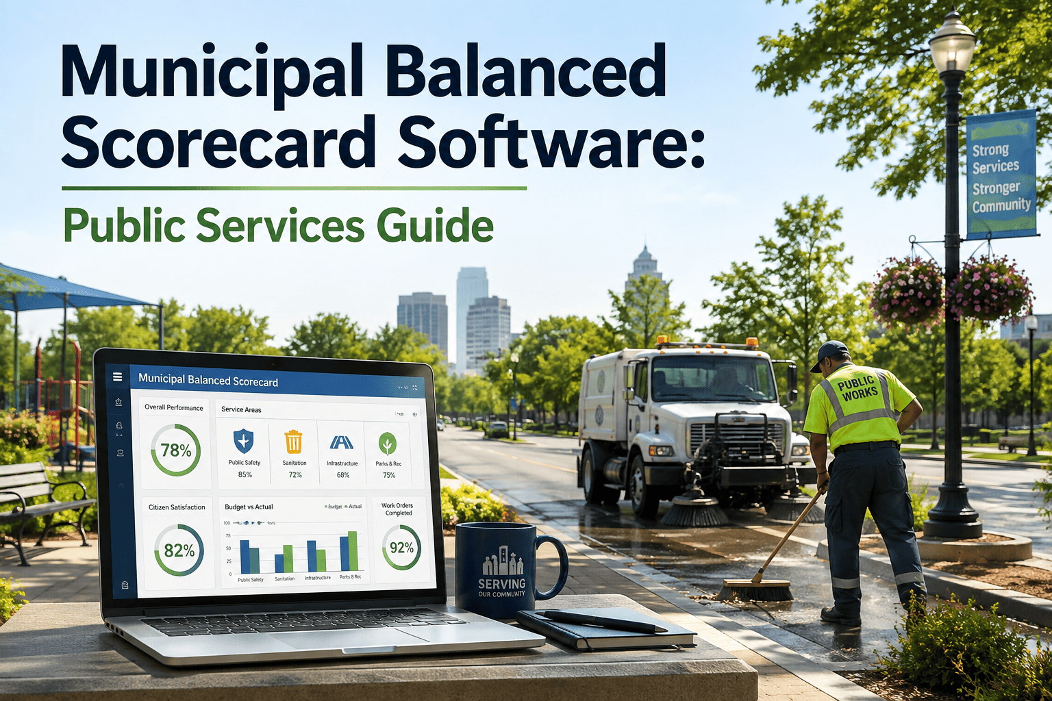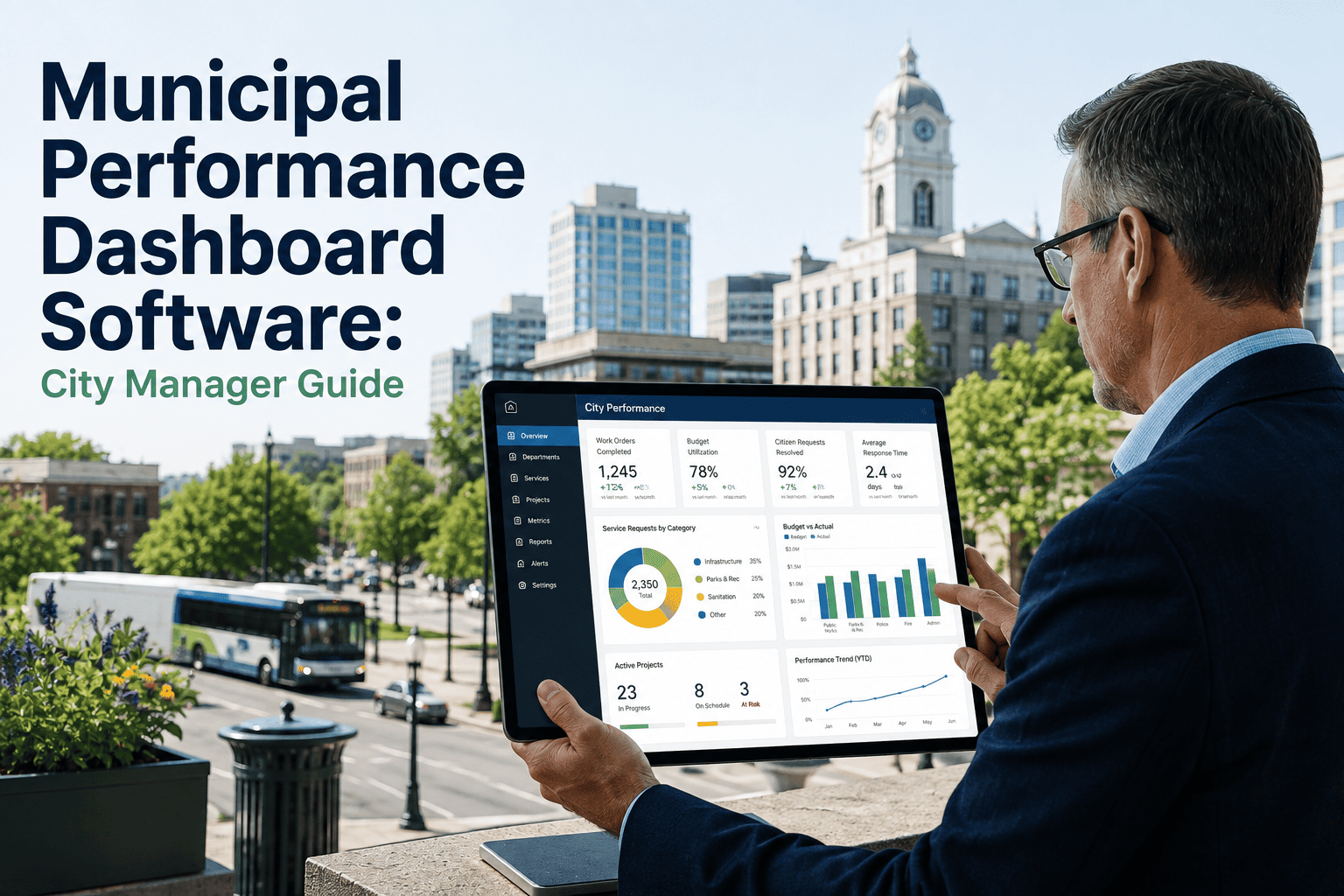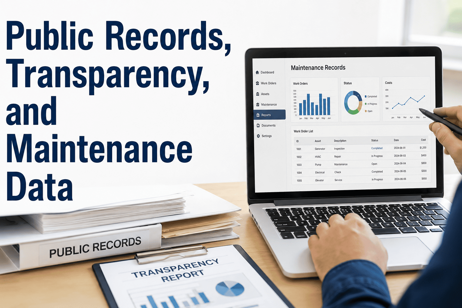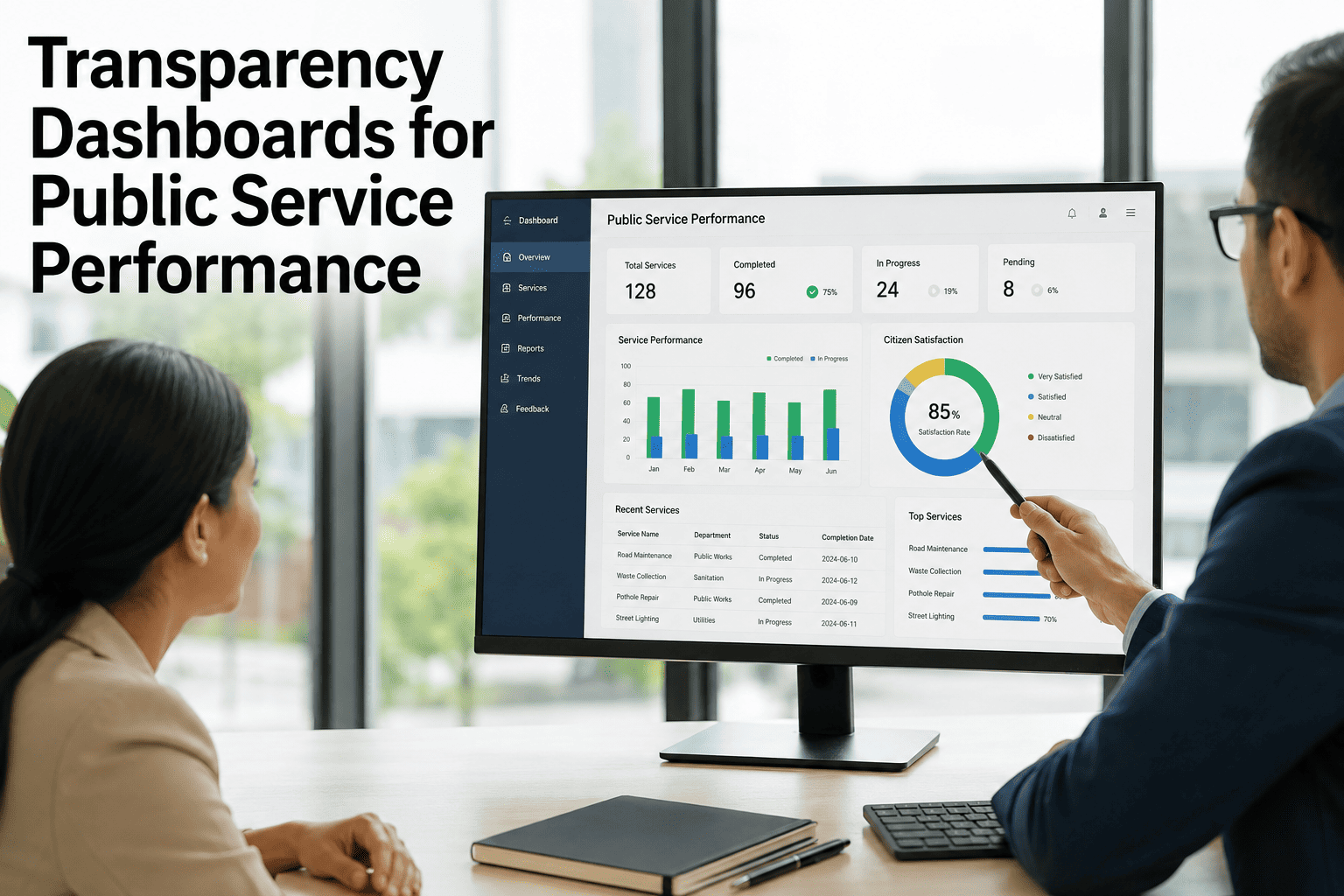
A transparency dashboard for government performance turns scattered operational data into clear, accountable metrics that citizens and elected officials can trust. Public agencies that publish real-time service performance data on a municipal performance dashboard see measurably higher citizen satisfaction and fewer FOIA requests, because the numbers are visible before anyone has to ask. Whether you manage fleet maintenance, facilities, water utilities, or public works, a well-designed public service dashboard bridges the gap between back-end CMMS data and front-end public confidence. This guide walks through metric selection, dashboard design, real-time integration, and the reporting approach that converts maintenance operations into trust-building content — and shows how teams using Start Free Trial platforms like OxMaint surface live asset data without manual exports.
What if citizens could see exactly how their tax dollars keep services running?
A government transparency dashboard eliminates the guesswork. When a municipal fleet publishes uptime, work-order completion rates, and preventive-maintenance compliance in real time, public trust rises and complaint volume drops. OxMaint turns your maintenance data into a live public performance dashboard — no spreadsheets, no manual reporting, no FOIA backlog.
Which public service metrics belong on a government transparency dashboard?
The right metrics answer the question citizens actually ask: "Are my services working, and is my money being spent well?" A public service metrics dashboard should balance operational performance, financial accountability, and service-level outcomes — typically 8–12 headline KPIs, not 40.
Asset Uptime & Availability
Percentage of fleet vehicles, generators, pumps, and HVAC systems available for service vs. down for repair. Target: 95%+ for critical assets. Pulled automatically from work-order close-out data in OxMaint.
Work-Order Completion Rate
Completed work orders divided by assigned work orders within the reporting period. Citizens see how many service requests were resolved and the average resolution time — a direct satisfaction driver.
Preventive Maintenance Compliance
Percentage of scheduled PM tasks completed on time. High PM compliance (90%+) correlates with 30–50% fewer emergency breakdowns — the single most powerful number for justifying maintenance budgets to council.
Mean Time to Repair (MTTR)
Average hours from work-order open to asset back in service. Trending MTTR down month-over-month proves that maintenance operations are improving, not just staying steady.
Maintenance Cost per Asset
Total labor + parts cost divided by asset count, benchmarked against industry standards. Shows taxpayers that the agency is cost-conscious and that preventive maintenance is cheaper than reactive firefighting.
Service Request Response Time
Hours from citizen-reported issue (pothole, streetlight outage, water leak) to first technician dispatch. A 24-hour target is common; publishing actual performance against the target builds accountability.
How to design a municipal transparency dashboard that citizens actually understand
A public data dashboard fails when it is built for engineers instead of citizens. The most effective government open data dashboards follow four design rules that make operational data legible to non-technical audiences in under 10 seconds.
Lead with 3–5 headline numbers, not 40 charts
Citizens scan, they do not study. Put the 3–5 most meaningful KPIs — uptime, on-time PM %, resolved service requests, cost per asset — in large tiles at the top. Everything else is a drill-down. Research on municipal dashboard engagement shows that pages with fewer than 6 primary metrics have 3x longer dwell time than cluttered equivalents.
Use plain-language labels, not maintenance jargon
"Asset Availability" beats "OEE." "Preventive Maintenance On-Time Rate" beats "PM Compliance." "Service Requests Resolved This Month" beats "Closed WOs." Every label should make sense to a resident who has never seen a CMMS. Include a one-sentence definition under each metric for full transparency.
Show trends, not just snapshots
A single number without context is meaningless. "92% uptime" is good or bad depending on whether last month was 88% or 97%. Pair every headline KPI with a 12-month sparkline or bar chart so the direction is instantly visible. Upward trends in PM compliance and downward trends in MTTR tell a story of continuous improvement.
Refresh data in real time, not quarterly PDFs
A static PDF published every quarter signals that the agency is managing optics. A live dashboard that updates as work orders close signals that the agency is managing operations. OxMaint pushes real-time data to your government dashboard via API, so the number a citizen sees at 2 PM reflects the work order a technician closed at 1:45 PM.
From spreadsheet chaos to a live citizen dashboard: a 6-month rollout
Consider a mid-sized city fleet department managing 340 vehicles and 80 facility assets, spending roughly $1.2M annually on maintenance. Before automation, reporting meant a maintenance clerk spent 12 hours per week manually compiling a spreadsheet for the monthly council meeting — and the data was already 3 weeks stale by the time it was presented.
Asset registry & data cleanup
All 420 assets imported into OxMaint with criticality ratings, warranty end dates, and PM schedules. Historical work orders back-loaded for baseline metrics. Result: a single source of truth replacing 7 spreadsheets.
Mobile work orders go live
Technicians start closing work orders on mobile devices in the field. PM compliance rises from 61% to 78% within four weeks because overdue tasks are now visible and pushed automatically, not buried in a paper binder.
Internal KPI dashboard launched
Maintenance manager reviews a live dashboard in the Monday stand-up instead of the weekly spreadsheet. Unplanned downtime drops 22% as the team shifts from reactive to preventive scheduling. MTTR falls from 8.4 to 5.9 hours.
Public-facing transparency dashboard published
Six headline KPIs — fleet availability, PM on-time %, service requests resolved, avg. response time, maintenance cost per asset, and YoY downtime trend — go live on the city website via OxMaint's public API. FOIA requests for maintenance records drop 40% in the first quarter.
Council budget approval with data
The maintenance manager presents the next fiscal year budget using 6 months of live trend data. Council approves a $180K increase for predictive-maintenance sensors because the dashboard proves that every $1 spent on PM saves $4 in reactive repairs. Citizen satisfaction survey shows a 19-point jump in "trust in city services."
How OxMaint powers your government transparency dashboard
OxMaint is not just a CMMS — it is the data engine behind your public sector dashboard. Every work order, PM task, asset update, and inventory transaction flows into a real-time analytics layer that can feed both internal operations and citizen-facing transparency portals through a secure API.
Real-Time Data API for Public Dashboards
OxMaint's REST API pushes live work-order status, asset uptime, and PM compliance to your municipal transparency dashboard every 60 seconds. No manual exports, no stale PDFs. Citizens see what your technicians see — filtered for public consumption.
Automated PM Compliance Tracking
OxMaint auto-generates PM work orders based on meter readings, calendar intervals, or condition triggers. Compliance is calculated and published automatically — the same number your council sees is the number your technicians live by.
AI-Powered Predictive Maintenance
OxMaint's AI engine analyzes vibration, temperature, and usage patterns to predict asset failures 7–21 days before they happen. Predictions flow into your dashboard as "at-risk assets" — a forward-looking metric that proves the agency is proactive, not reactive.
Audit-Ready Compliance & Reporting
Every work order, parts issuance, and asset history is timestamped and immutable. Generate FMCSA, EPA, or internal audit reports in one click. The same data structure that powers your public dashboard ensures you are always inspection-ready.
Public sector dashboard performance: reactive vs. OxMaint-powered
The gap between agencies still managing maintenance on spreadsheets and those using an integrated CMMS dashboard is measurable. Below is a side-by-side comparison based on typical mid-sized municipal fleet and facilities operations before and after implementing OxMaint.
| Performance Metric | Spreadsheet / Reactive | OxMaint Dashboard |
|---|---|---|
| PM compliance rate | 55–65% | 90–96% |
| Unplanned downtime (hours/month) | 120–180 hrs | 40–70 hrs |
| Reporting labor (hrs/week) | 10–15 hrs manual | 0 hrs (automated) |
| Data freshness on public dashboard | 3–4 weeks stale | Real-time (60-sec refresh) |
| FOIA requests for maintenance records | 15–25/quarter | 6–10/quarter |
| Mean time to repair (MTTR) | 7–9 hours | 4–6 hours |
| Audit preparation time | 3–5 days | Under 30 minutes |
| Citizen satisfaction with service transparency | 42–48% positive | 71–79% positive |
See OxMaint on your assets — book a 30-minute demo
We will connect your asset list, show you a live transparency dashboard with your own data structure, and map the exact rollout plan for your agency. No slides, no generic pitch — just your operations, visible in real time.
Government transparency dashboard: frequently asked questions
What is a government transparency dashboard?
A government transparency dashboard is a public-facing web page that displays real-time or regularly updated performance metrics showing how well a public agency is delivering services. For maintenance and reliability teams, it typically shows asset uptime, work-order completion rates, preventive-maintenance compliance, service-request response times, and cost-per-asset data sourced directly from the agency's CMMS. The goal is to give citizens and elected officials visibility into operations without requiring FOIA requests or waiting for quarterly reports. You can Start Free Trial of OxMaint to see how your maintenance data populates a live dashboard in minutes.
How much does it cost to build a municipal performance dashboard?
Building a municipal performance dashboard from scratch using custom development typically costs $40,000–$120,000 plus ongoing maintenance. Using a CMMS platform like OxMaint that includes built-in analytics and a public API reduces that to a monthly subscription of $45–$150 per user, with the dashboard layer included. The real cost driver is not the software but the data quality — if your maintenance records live in spreadsheets, you will spend more cleaning data than deploying the dashboard.
What data should a public service dashboard include?
A public service dashboard should include 5–8 headline metrics that citizens care about: asset/fleet availability, preventive-maintenance on-time percentage, service requests resolved and average response time, maintenance cost per asset, and year-over-year downtime trends. Avoid publishing sensitive operational details like technician names, specific asset locations for security-critical infrastructure, or real-time dispatch data. OxMaint lets you configure exactly which fields are exposed to the public API so you control the transparency boundary.
How do you integrate real-time CMMS data into a public dashboard?
Integration works through a REST API that pushes work-order status changes, asset updates, and KPI calculations from the CMMS to the public-facing dashboard at defined intervals — typically every 60 seconds. OxMaint provides a documented API endpoint that your web team or GIS portal can consume. No manual data export, no scheduled batch jobs. The dashboard reads live from the same database your technicians write to when they close a work order in the field. To see the integration architecture, Book a Demo and we will walk through it on your asset structure.
Do citizens actually look at government open data dashboards?
Yes — when they are easy to find and easy to understand. Municipalities that publish well-designed public performance dashboards report 25–40% reductions in FOIA requests within the first year, which indicates citizens are finding the data they need without filing formal records requests. The key is design: dashboards with fewer than 6 headline metrics and plain-language labels get 3x more engagement than cluttered, jargon-heavy alternatives. Promoting the dashboard link on utility bills and the city homepage is essential for adoption.
Turn your maintenance data into public trust
Every work order your technicians close is a data point citizens deserve to see. OxMaint makes it automatic — real-time data flows from the field to your public dashboard without a single manual export. Start your free trial today, or book a 30-minute demo and we will show you a live transparency dashboard built around your assets.
Free 14-day trial · No credit card