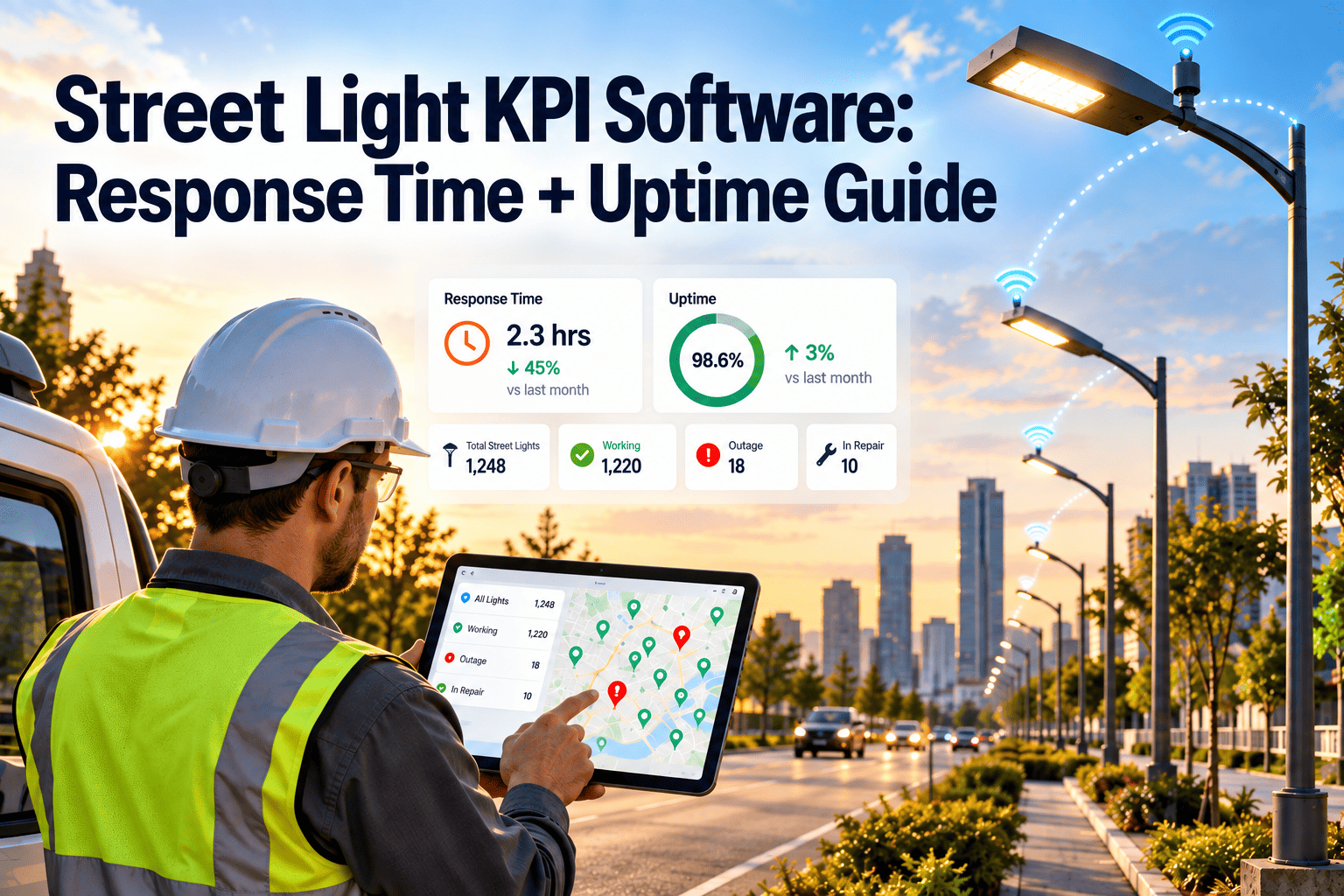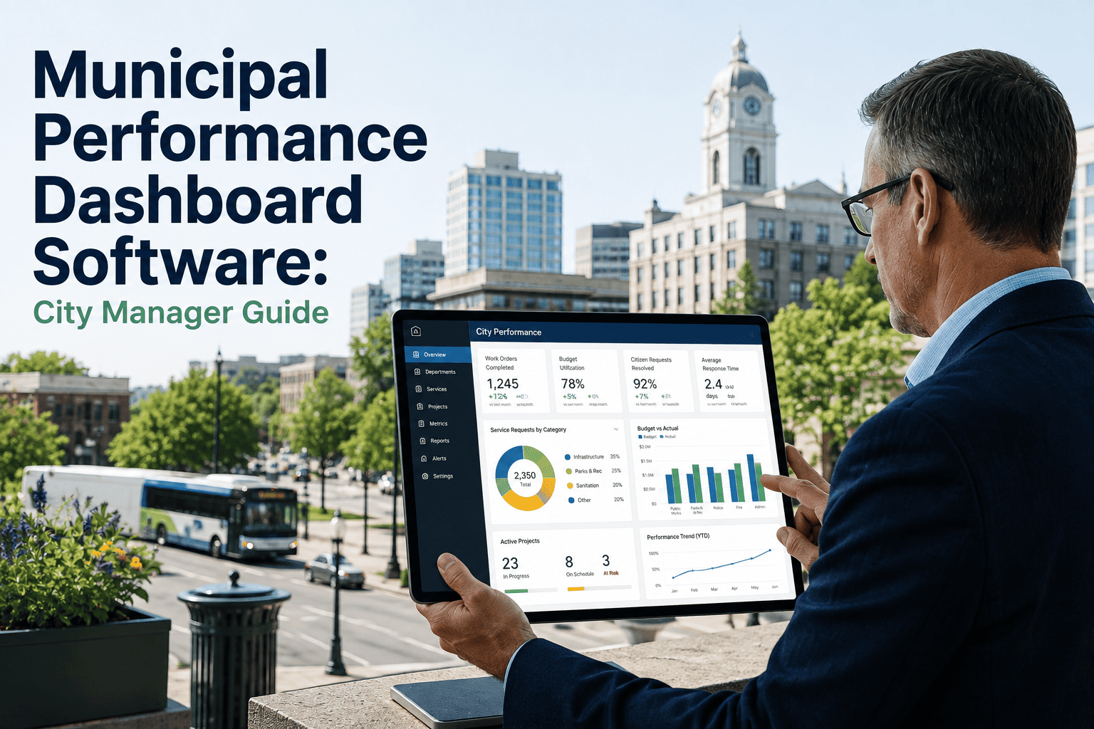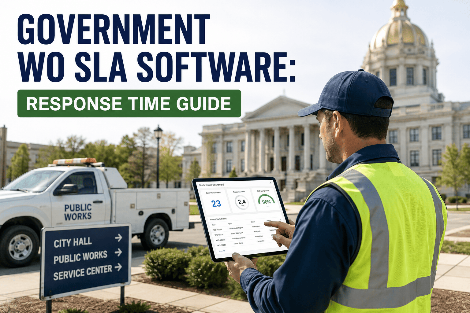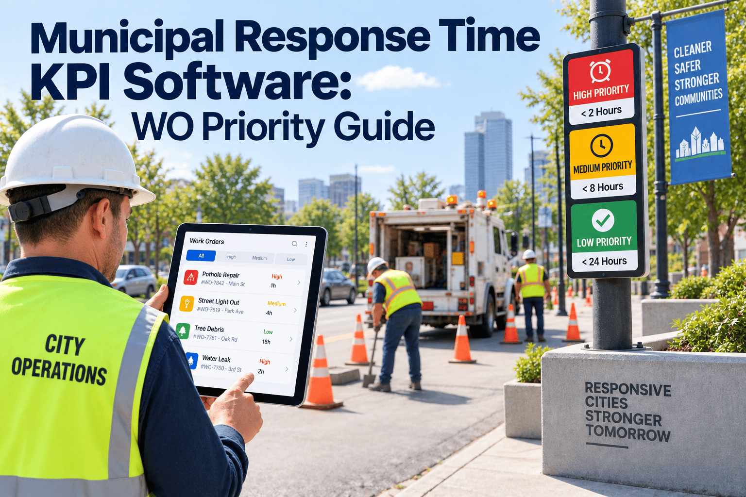
When a resident calls city hall about a broken traffic signal, a water main leak, or a pothole two blocks from an elementary school, the clock that matters is not the department's average — it is whether that specific request, at that priority level, got a crew moving in time. Most municipal work order systems report one blended response-time number, and that number can look perfectly healthy while emergency-tier requests are quietly missing the service level residents were promised. A department can close hundreds of routine tickets on schedule and still face a council inquiry because three P1 water main breaks sat unassigned for six hours the same month. Response time only becomes a meaningful signal once it is broken out by priority tier — emergency, urgent, routine, and preventive maintenance — and measured against the SLA target that citizens, council members, and 311 systems actually expect. OxMaint tracks response time by priority automatically across every work order your crews touch, so the number reported to council reflects what residents actually experienced.
See Response Time By Priority, Not Buried In One Average
OxMaint splits every work order by priority tier — emergency, urgent, routine, and PM — and reports response time against each tier's own SLA target, so council reporting shows exactly where service levels are holding and where they are slipping.
Why One Blended Average Hides Your Real SLA Risk
Ask most public works directors for their response time and they will hand over a single figure — an average across every work order closed that month, regardless of whether the request was a downed traffic signal or a squeaky park gate. That number is easy to report and almost useless for accountability, because it treats a six-hour wait on a sewer backup the same as a six-hour wait on a graffiti removal request. Folding emergency and routine requests into one blended average masks exactly the kind of P1 gap that creates safety and compliance liability. A department can be averaging three hours overall while its actual emergency-tier requests are running closer to nine, simply because the volume of fast-closing routine tickets pulls the blended number down.
This is not a theoretical problem. It shows up the moment a council member pulls one specific incident and asks why it took as long as it did, and a director whose only evidence is a monthly average has no way to answer beyond "that was an outlier." A director with tier-based data can pull up the exact SLA clock for that request, show whether it fell inside or outside the target for its priority, and explain the specific reason if it did not. The fix is not a better average, it is separating the metric entirely. Emergency requests — active leaks, downed lines, blocked emergency access, signal outages at busy intersections — need their own SLA clock, their own escalation trigger, and their own reporting line. Urgent requests, the kind that are not immediately dangerous but will become expensive or hazardous if ignored for days, need a second clock with a longer but still firm target. Routine requests and scheduled preventive maintenance cycles need a third, because holding a pothole repair to the same clock as a gas leak either wastes crew capacity or quietly erodes the urgency standard for everything else. Reviewing actual response times against that target, and debriefing any exceedance right after it happens, is what keeps emergency response genuinely prioritized rather than prioritized only on paper.
A department consistently landing in the poor band on emergency-tier requests is not short-staffed for a week, it has a dispatch or escalation gap that direct visibility fixes faster than adding headcount ever will.
Citizen Expectations Have Moved Faster Than Most Reporting Tools
Residents no longer compare a city's response time against last year's city budget report, they compare it against a food delivery app that shows a driver on a live map. That comparison is not entirely fair to a public works crew juggling forty open requests across a service area, but it is the expectation departments are being measured against anyway, and 311 platforms have made the gap visible in a way spreadsheets never used to. A resident who submits a pothole request through a 311 app can often see the status of that single ticket update in real time, which means a department that cannot produce its own accurate, tier-based response numbers is at a real disadvantage in any public conversation about performance.
This shift also changes what counts as a defensible answer at a council meeting. A director who can say "our emergency-tier average this quarter was one hour forty minutes against a two-hour target, and our two exceedances were both weather-related and documented" is in a fundamentally stronger position than one who can only produce a single blended number for the whole department. The first answer is built on data that was captured automatically and tied to a specific SLA. The second is built on an average that nobody can fully explain when a council member asks a follow-up question. Municipalities that move early on tier-based reporting are not just improving service, they are protecting themselves against the moment an isolated incident becomes a public records request.
What Actually Drives Missed Response-Time Targets
Most departments that miss their response targets are not missing them because crews are slow. The gap almost always sits upstream of the wrench — in how a request gets classified, routed, and escalated before a technician ever sees it. Identifying which of these four patterns is driving a specific miss is far more useful than reacting to the overall percentage.
Get Alerted Before an Emergency Ticket Breaches Its SLA
OxMaint applies a separate SLA clock to every priority tier and automatically escalates any request approaching its deadline, so supervisors act before a breach instead of explaining one after the fact.
Response Time by Priority Tier — Sample City Comparison
Reporting one city-wide average hides which priority tier is actually at risk. Breaking the same data out by tier, as shown below, is what lets a director walk into a council meeting with an answer instead of an excuse, because each row can be traced back to individual work orders rather than a single number nobody can explain on request.
Notice in the sample below that the department's emergency-tier requests are performing well against target while the urgent tier is the one quietly running over. That is a common pattern: emergency requests get immediate attention because they are visibly urgent, while the urgent tier — the requests that are not dangerous today but will be if ignored — gets deprioritized in favor of whatever feels most pressing in the moment. A tier-based report is the only way to catch that drift before the urgent tier becomes tomorrow's emergency tier.
| Priority Tier | SLA Target | Requests Logged | Avg Response Time | Status |
|---|---|---|---|---|
| Emergency (P1) | 2 hours | 46 | 1.7 hrs | Good |
| Urgent (P2) | 24 hours | 212 | 29 hrs | Watch |
| Routine (P3) | 5 business days | 484 | 4.1 days | Good |
| Preventive Maintenance | Scheduled cycle | 160 | Within cycle | Good |
From Citizen Request To Crew Dispatch: How Priority Tracking Works
Getting from a blended average to tier-by-tier accountability does not require a new intake process, it requires the existing request flow to carry a priority tag from the moment it enters the system through the moment the work order closes. Departments that try to retrofit this manually usually give up within a month, because someone has to remember to tag every incoming request by hand, and the tagging quality degrades the moment that person goes on leave. The steps below describe what the flow looks like once the tagging, clock-starting, and escalation happen automatically instead.
Our old dashboard showed one response-time number and it looked fine every single month. Once we split it by priority tier, we found our emergency-tier average was nearly double our target and nobody knew, because routine requests were dragging the blended number down. We fixed dispatch escalation within a quarter once we could actually see the gap.
That kind of discovery is common once a department starts looking at priority tiers separately rather than trusting a single blended figure. It rarely requires more crew capacity to fix — it usually requires a dispatch rule that is enforced automatically instead of relying on whoever happens to be on shift that day to remember the priority matrix correctly. Departments that make this shift tend to see the biggest improvement in the first quarter, simply because visibility alone changes how requests get routed before any process redesign happens.
Frequently Asked Questions
None of this requires ripping out the systems a department already relies on. 311 platforms, citizen request portals, and field crew tools can all keep doing exactly what they do today — the change is in how the data from those sources gets tagged, timed, and reported once it lands in one place. A department that has struggled for years to give council a straight answer on response time is usually not short on data, it is short on a way to organize that data by the priority tier residents actually care about. Once the tiers exist as a consistent structure, the reporting problem that once took days of manual spreadsheet work becomes a dashboard that any director can pull up before a meeting starts, with every number traceable back to the individual work orders behind it.
Track Response Time By Priority Across Every Request Your Department Handles
OxMaint tags every work order with a priority tier at intake, escalates it automatically as it nears its SLA deadline, and reports performance tier by tier, so council presentations reflect what residents actually experienced.