Somewhere in most city halls sits a spreadsheet, binder, or dashboard tracking well over a hundred metrics — permits issued, permits requested, permits declined, work orders opened, work orders closed, and dozens of near-duplicate variations nobody remembers approving. None of it is wrong exactly, but it is too much for a council member to read before a budget hearing, too much for a department head to act on before month-end, and too much for a resident to make sense of on a transparency page. Cities that fix this do not build another dashboard on top of the pile; they cut. Local government research keeps landing on the same conclusion: fewer, better-chosen KPIs change more decisions than a wall of data ever will, which is exactly what we build toward with CMMS-based reporting at oxmaint.ai.
Municipal Performance Reporting — 2026 Guide
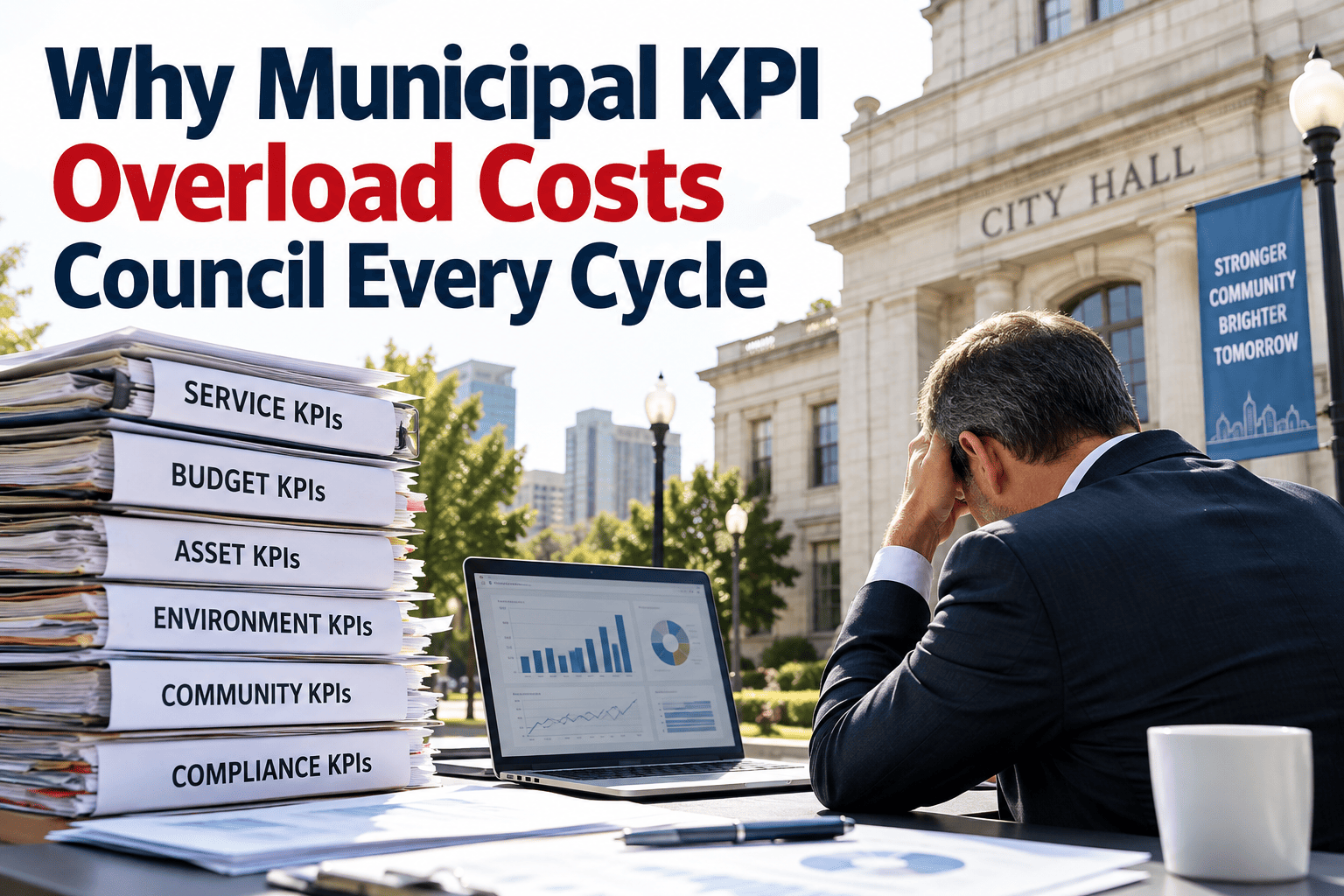
Why Municipal KPI Overload Costs Council Every Cycle
Tracking more metrics was supposed to mean better decisions. Instead, most cities end up with dashboards so wide that council skims them, department heads ignore them, and residents never see them. This guide walks through why KPI overload happens, what an outcome-linked framework looks like instead, and how to get there without losing accountability.
From 340 Metrics to 20 That Actually Get Read
The pattern shows up in city after city: a performance program starts small, then every department adds "just one more" measure until the master list balloons past three hundred line items. Nobody chose overload on purpose — it accumulated, one well-intentioned metric at a time. Getting back to something usable is not about deleting data; it is about sorting what belongs in front of council from what belongs in a department's own operational review. The narrowing below is not a one-time cleanup exercise either — it is the shape a healthy reporting program keeps every single cycle, with fresh raw data flowing in at the wide end and only the metrics that changed a decision reaching the top.
340+
Raw metrics scattered across departments, spreadsheets, and legacy systems
60-80
Operational KPIs kept for department-level monthly review
20
Outcome-linked KPIs presented to council and residents
15+KPIs per department is the point where metric fatigue sets in
5-8Recommended core KPIs per department for regular review
71 to 87%Service level score change reported after an 18-month KPI reset
MonthlySuggested review cadence for operational KPI dashboards
Why the Overload Happens in the First Place
KPI overload is rarely a data problem. It is a design problem — nobody drew a line between what leadership needs to steer the city and what staff need to run a shift. The same handful of root causes shows up whether the city has ten thousand residents or ten million, and recognizing which one is driving your own backlog of unread reports is usually the fastest way to start fixing it.
Every Department Adds, Nobody Removes
New initiatives arrive with new metrics attached, but old ones are rarely retired, so the master list only ever grows longer.
Outputs Get Mistaken for Outcomes
Miles paved, permits processed, and calls answered describe activity, not whether residents are actually better served.
One Dashboard Tries to Serve Everyone
A frontline supervisor's technical detail and a council member's strategic summary end up crammed into the same report, satisfying neither.
Reporting Lags Behind the Fiscal Year
A performance report published months after the period it covers describes history, not a decision leadership can still act on.
Stop Reporting Everything. Start Reporting What Matters.
Oxmaint pulls the operational data your departments already generate and turns it into the outcome-linked KPIs council actually reads — automatically, every cycle.
The Four Pillars of a Framework That Holds Up
A KPI list becomes a framework once every metric on it can answer a simple question: which of these four things does this number tell us about? Metrics that cannot answer that question are usually the ones safe to move out of the council-facing report.
Efficiency
Cost per service unit, cycle time, and resource utilization — how well the city turns budget into completed work.
Effectiveness
Whether the intended result actually happened — response windows met, backlog trending down, asset condition improving.
Quality
Rework rates, repeat complaints, and compliance findings that reveal whether work done once was done right.
Citizen Experience
Satisfaction survey results and plain-language response metrics that translate operations into what residents actually feel.
Match Each Audience to Its Own Level of Detail
Overload often disappears the moment a city stops trying to serve council, department heads, and frontline staff with one identical report. Each audience needs a different altitude of the same underlying data — not a different truth, just a different zoom level.
Council & Residents
3-5 outcome KPIs
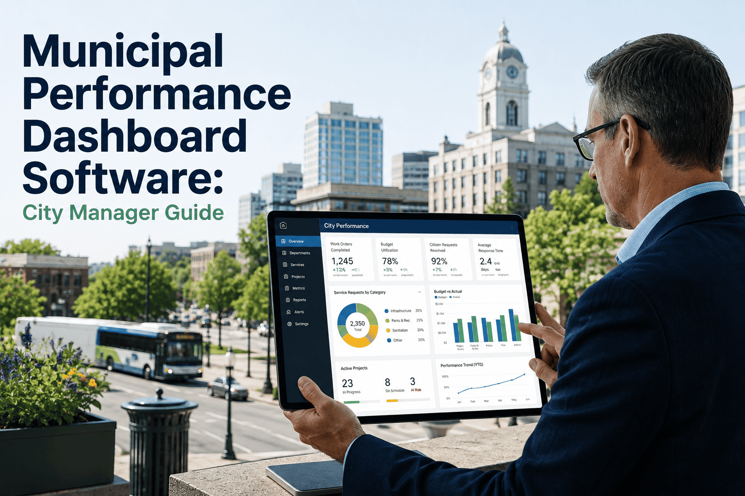
Plain-language, trend-focused numbers tied directly to strategic priorities and published on a public dashboard.
Department Leadership
8-12 operational KPIs
Monthly review metrics covering backlog, budget consumption, and service response across the department's core functions.
Frontline Supervisors
Full technical detail
Asset-level, shift-level, and crew-level data used daily to run the work, feeding upward into the tiers above it.
Three Questions That Cut Any KPI List in Half
Before adding another dashboard, most departments can shrink their existing list simply by running every metric on it through three questions. Anything that fails all three is a candidate to move out of the council-facing report and into a department's own working files, not to be deleted outright.
Does It Tie to a Strategic Priority?
If a metric cannot be linked to a council-adopted goal, it belongs in departmental tracking, not the top-level report.
Has It Ever Changed a Decision?
A number nobody has ever acted on, no matter how interesting, is not earning its place on a limited council agenda.
Can a Resident Understand It in One Sentence?
If explaining the metric requires a footnote, it is describing an operation, not an outcome, and belongs a tier lower.
Overloaded Dashboard vs. Outcome-Linked Framework
The two approaches use the same underlying data. The difference is what gets surfaced, how often it is reviewed, and whether anyone outside the department can actually understand it.
| Reporting Element | Overloaded Dashboard | Outcome-Linked Framework |
| Metrics shown to council |
Dozens, mixed with raw operational data |
3-5 per priority, trend-focused |
| Update frequency |
Static report, months out of date |
Live monthly dashboard |
| Language used |
Technical, department-specific jargon |
Plain-language, resident-friendly framing |
| Accountability loop |
Data collected, rarely reviewed or actioned |
Reviewed monthly, tied to follow-up actions |
| Source of the numbers |
Manual exports from disconnected systems |
Generated automatically from CMMS work order data |
We didn't collect any new data to fix this. The numbers were already sitting in our maintenance system. What changed was cutting our reporting down to the handful of metrics that actually moved the needle and reviewing them every month instead of once a year. Within about a year and a half, our overall service level score climbed from the low seventies into the high eighties, simply because people started paying attention to the right numbers and were held accountable for them.
— City Manager, municipality with an award-recognized performance program
Frequently Asked Questions
How many KPIs should a municipal department actually track?
Most guidance settles around 5-8 core KPIs per department for regular review, with anything past 15 tending to cause metric fatigue where no single indicator gets real attention. See how this maps to a live dashboard at
oxmaint.ai.
Why does KPI overload hurt council decision-making specifically?
Council members are reviewing performance across every department at once, so a report built for one department's technical detail becomes unreadable at the scale of a full council agenda, and the useful signal gets lost in the noise.
Can we cut our KPI list without losing accountability?
Yes — the detailed metrics do not disappear, they move to department-level and frontline reporting tiers, while only the outcome-linked summary rises to council.
Book a demo to see how the tiering works in practice.
Should council-level KPIs differ from department-level KPIs?
Yes. Council needs a small set of outcome-focused numbers tied to strategic priorities, while department leadership needs a wider operational set reviewed monthly to manage day-to-day performance.
How does a CMMS help fix an overloaded KPI framework?
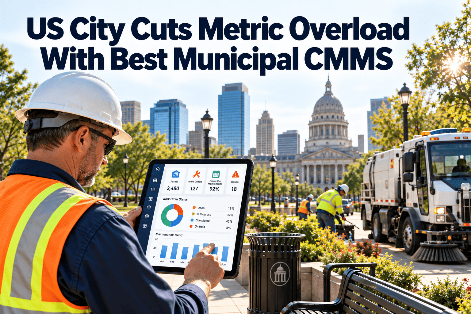
A CMMS already holds the work order, asset, and response-time data most cities are manually exporting into spreadsheets, so it can generate the tiered, outcome-linked dashboards automatically instead of adding another reporting task to staff.
Build a KPI Framework Council Will Actually Use
Move from a scattered metric list to a tiered, outcome-linked framework your council, departments, and residents can all trust.