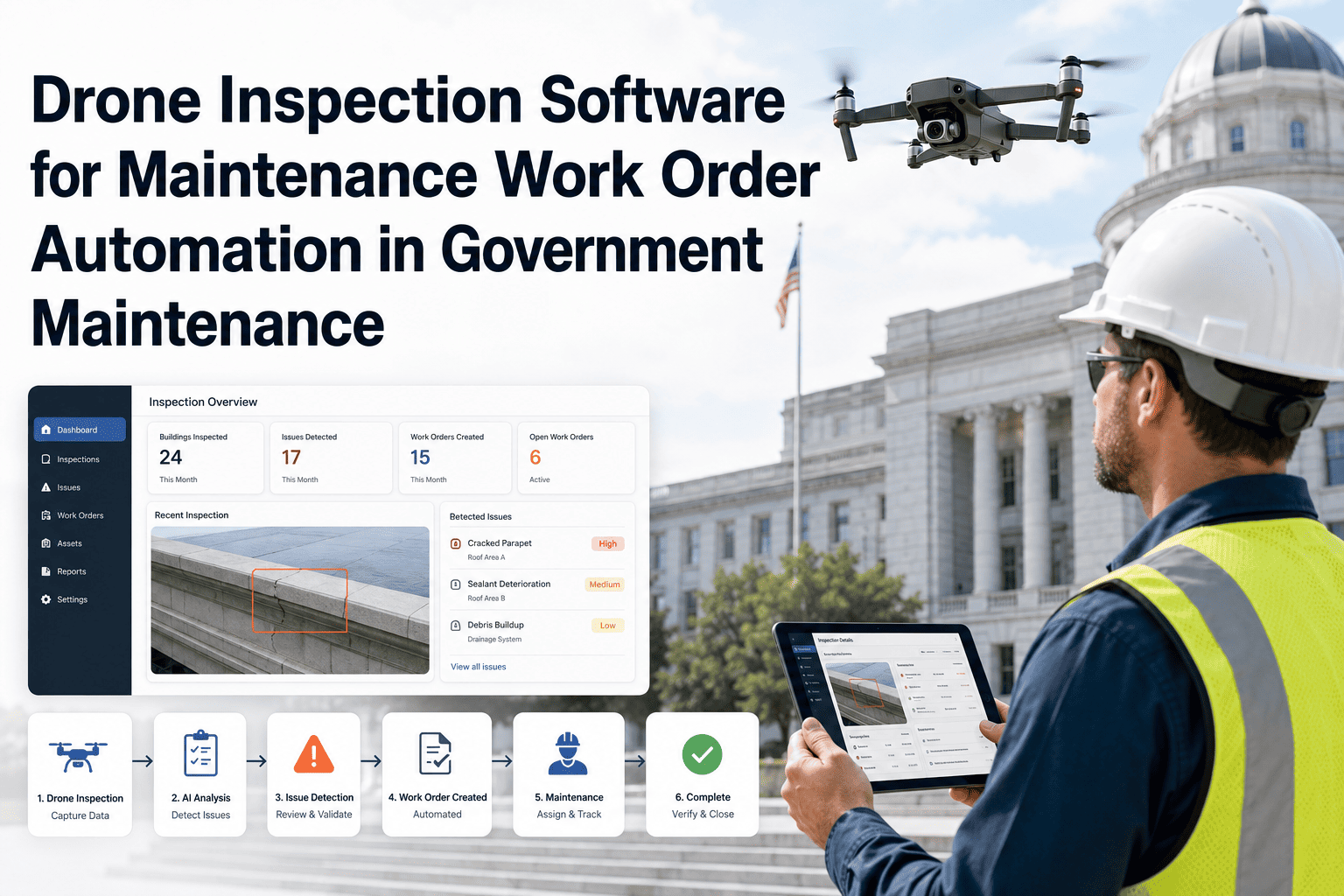
Government maintenance supervisors are often making budget, staffing, and prioritization decisions based on data that tells them what happened months ago — not what is happening now. Inspection reports sit in field technicians' tablets, work order data lives in a CMMS that no one checks between scheduled reviews, and AI vision findings accumulate in a vendor portal that only one person has login access to. The result is that the visual evidence closest to the actual condition of public assets never reaches the dashboards where decisions are made. Connecting OxMaint's visual maintenance data to live government reporting dashboards bridges this gap — giving leadership and planning teams the real-time asset condition picture they need to allocate resources before failures become emergencies.
Why Visual Maintenance Data Must Flow into Government Dashboards
Data that stays in field devices and vendor portals doesn't inform decisions. Here is why making visual maintenance data visible at the reporting level changes how government teams operate.
Where Visual Maintenance Data Gets Stuck Today
Detections logged in vendor dashboards. Accessible to one system admin. Not connected to work orders. No visibility for maintenance supervisors or planning teams.
Inspection photos taken. Stored in individual device gallery or inspection app. Not synced to asset records. Photos lost when device is replaced.
Work orders created with text descriptions. Photo evidence not attached or attached inconsistently. Reporting dashboard shows work order counts — not condition trends.
Receives KPIs based on completed work orders — no visual evidence, no condition trends, no early warning of deteriorating assets.
See Asset Condition Trends in Your Dashboard — Not Three Months Later
OxMaint pulls AI vision findings, inspection photos, and defect trends into a unified government maintenance dashboard — giving leadership the visual picture behind the work order numbers.
What Visual Maintenance Data Looks Like When It Flows Properly
Defect frequency by asset, zone, and defect type — updated as AI camera findings and inspection completions flow in. Trend lines show which asset classes are deteriorating faster than inspection cycles can address.
How many AI-detected findings became work orders, were verified, and were closed. Low conversion rates signal workflow gaps. High false positive rates signal camera calibration issues. Both are invisible without connected reporting.
Photo evidence attached to each asset record across inspection periods — enabling side-by-side comparison of condition change over time, accessible to planners and budget teams without IT involvement.
Open work orders segmented by defect type, asset class, and age. Visual defect context shows which backlog items represent safety risks versus cosmetic maintenance — enabling defensible prioritization decisions.
Which assets have been inspected within the required period, which are overdue, and which have open findings not yet linked to work orders. Presented as a geographic or zone-based coverage view, not a flat list.
Assets that have generated defect findings or work orders above a threshold frequency — automatically surfaced in the dashboard for supervisor review. The visual history behind each flag shows what the asset looks like, not just how many times it failed.
How Connected Visual Data Changes Government Maintenance Decisions
| Decision Type | Without Visual Data in Dashboard | With Connected Visual Data |
|---|---|---|
| Budget prioritization | Based on work order count and spend history | Based on defect severity trends and condition progression |
| Crew deployment | Reactive — dispatched after supervisor call | Proactive — AI alert queue shows where crews are needed |
| Capital replacement timing | Based on age or single inspection report | Based on visual defect trend across multiple inspection cycles |
| Council reporting | Work orders completed and spend summary | Asset condition trends with photo evidence — accessible to non-technical audience |
| Regulatory compliance review | Manually compiled from multiple systems | Single dashboard export with full inspection history and evidence chain |
The shift from work order reporting to visual condition reporting is the most significant operational improvement I have seen government maintenance teams make in the past decade. Work order dashboards tell you how busy your team is. Visual condition dashboards tell you whether your assets are getting better or worse. Those are two entirely different questions, and only the second one helps you justify a budget increase, prioritize a capital replacement, or defend a maintenance decision to a regulator. When AI vision data and field inspection photos are flowing directly into the planning dashboard — not sitting in a vendor portal somewhere — you have the foundation for genuinely evidence-based government asset management.
Frequently Asked Questions
What technical integration is needed to get AI vision data into a CMMS dashboard?
The integration typically works through a combination of API webhooks (AI camera system pushes detection events to the CMMS when a finding occurs) and scheduled data syncs (for historical trend aggregation). The CMMS then surfaces this data in its reporting module using the same asset and work order data model it already maintains. No custom development is required when both systems support standard REST API integration, which is the case for OxMaint and most modern AI vision platforms. The key prerequisite is that assets in the AI camera system are identified using the same asset IDs used in your CMMS — without that match, data flows in but cannot be attributed to specific assets. Book a demo to see the integration architecture in detail.
How do you make visual maintenance data dashboards accessible to council members or oversight bodies who are not CMMS users?
The standard approach is read-only report links — publicly accessible or password-protected dashboard views that show selected metrics without requiring a CMMS login. These can be configured to show condition trend summaries, inspection coverage status, and open finding counts by zone, with photo evidence accessible on click. For formal reporting to council or oversight bodies, scheduled PDF exports that include photo evidence alongside KPIs provide a format that travels well in email and meeting presentations. OxMaint supports both approaches, and the audience-appropriate view can be configured by a system administrator without developer involvement.
How should visual data dashboards be structured for government maintenance teams with multiple asset classes?
Multi-asset-class government teams benefit from a layered dashboard structure: a top-level view showing overall portfolio condition and compliance status, second-level views segmented by asset class (roads, bridges, water infrastructure, buildings), and third-level drill-downs to individual asset condition histories with photo evidence. The top level is designed for leadership and council; the second level for department supervisors; the third level for planners and field crews. Configuring OxMaint's dashboard hierarchy to match this organizational structure ensures each audience sees the information relevant to their decisions without information overload. Start a free trial to explore the dashboard configuration options.
What performance indicators should government maintenance teams track in a visual data dashboard that they are not currently tracking?
The most undertracked metrics for government maintenance teams with AI vision and photo-based inspection are: defect recurrence rate by asset (the percentage of assets where the same defect type reappears within 12 months), AI detection-to-work-order conversion rate (the percentage of AI alerts that result in confirmed work orders versus false positives or deferred items), visual evidence coverage rate (the percentage of work orders that have at least one attached photo), and condition trend velocity (the rate at which asset condition scores are changing across the portfolio). These metrics reveal systemic workflow gaps that work order count and spend tracking miss entirely.
How frequently should visual maintenance data dashboards be updated for government planning purposes?
Dashboard refresh frequency should match the decision cadence of each user level. Real-time or hourly updates are appropriate for operational dashboards used by supervisors managing active work queues and AI alert streams. Daily refreshes are sufficient for planning dashboards used by maintenance managers reviewing crew allocation and backlog status. Weekly or biweekly aggregations are appropriate for leadership and council reporting views, where trend direction matters more than minute-by-minute accuracy. Configuring refresh rates by dashboard tier prevents the performance overhead of real-time aggregation across large asset portfolios while ensuring each audience receives data fresh enough for their needs. Book a demo to see how OxMaint handles multi-tier dashboard refresh configuration.
Bring Visual Maintenance Evidence Into the Dashboards That Drive Government Decisions
OxMaint connects AI vision findings, inspection photos, and defect history to government-ready dashboards that give leadership, planners, and field supervisors the visual context behind every KPI.