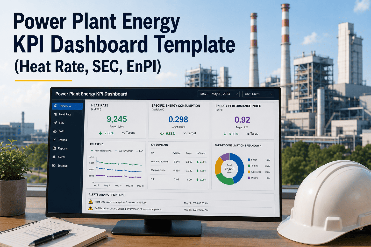
A power plant's heat rate is the single number that tells you how efficiently you are converting fuel into electricity — and most plants are tracking it in a spreadsheet that nobody updates consistently, or in a reporting tool that management sees monthly while operators see nothing at all. A 1% improvement in heat rate at a 500 MW coal plant is worth millions of dollars annually in fuel savings. That improvement starts with a dashboard that shows every operator and engineer the right KPIs — heat rate, specific energy consumption, kWh/MWh ratios, and EnPI performance — in real time against meaningful targets. When those numbers are buried in a monthly report, the opportunity to act has already passed. If your team is ready to move from retrospective reporting to live operational intelligence, Oxmaint's CMMS connects your energy KPI dashboard to asset records, maintenance history, and condition data — so you know not just what your heat rate is, but why it shifted and which work order is going to fix it.
Power Plant Energy KPI Dashboard Template
Heat rate, SEC, kWh/MWh, GJ/MWh, EnPI, and ISO 50001 tracking — all in one dashboard structure your operations team can act on, not just report from.
The Six Energy KPIs Every Power Plant Dashboard Must Show
Not all energy metrics are equal. Each of these six KPIs answers a different question and drives a different operational or maintenance response.
The primary efficiency metric for thermal plants. Measures fuel energy required to generate one unit of electricity. Rising heat rate is the first signal of turbine degradation, condenser fouling, or auxiliary load creep.
Most relevant for process-linked generation. SEC normalizes energy use against actual production — so efficiency comparisons remain valid across load variations and seasonal changes.
The ISO 50001 metric. EnPI compares current energy performance to a defined baseline period, normalized for relevant variables (ambient temperature, load factor). Shows whether energy actions are delivering measurable results.
Often the most actionable short-term KPI. APC includes fans, pumps, compressors, and lighting. Degraded motors, fouled heat exchangers, and incorrectly sized pumps all show up here first.
Contextualizes every other KPI. Heat rate at 90% PLF and heat rate at 40% PLF are not comparable numbers — the dashboard must always show KPIs alongside the PLF at which they were recorded.
Direct operational cost indicator. When combined with fuel price data, SFC converts heat rate deviations into a daily rupee or dollar cost of underperformance — the number that gets management attention immediately.
When Your Heat Rate Rises, Know Which Work Order Will Fix It
Oxmaint links energy performance data to asset records and maintenance history — so a rising heat rate doesn't just trigger a report, it triggers a work order with the right technician assigned.
How the Template Structures the Energy KPI Dashboard
Plant-level heat rate, PLF, APC, and EnPI summary for every unit in the fleet. Designed for corporate energy managers who need to see relative performance across sites without drilling into unit-level data. Color-coded status — green for on-target, amber for trending negative, red for threshold breach.
Single-unit deep dive with daily and monthly trends per KPI, design vs actual comparisons, and target tracking. This is the operations team view — shift-by-shift APC, turbine heat rate versus design curve, condenser backpressure versus clean performance. The dashboard for the control room engineer on shift.
ISO 50001 compatible reporting layer. Baseline-normalized EnPI per reporting period, significant energy use identification, energy review summaries, and action plan status. Structured for audit readiness — every data point traceable to a meter reading, every improvement action linked to a responsible person and due date.
What is Causing Your Heat Rate to Rise? The Dashboard Should Tell You.
| Deviation Source | Typical HR Impact (kCal/kWh) | Dashboard Indicator | Maintenance Response |
|---|---|---|---|
| Condenser fouling / vacuum loss | 150 – 400 | Backpressure above design | Online tube cleaning, check tube leaks |
| Turbine blade fouling / erosion | 100 – 300 | HP/IP cylinder efficiency drop | Plan offline wash or inspection |
| Excess air / combustion deviation | 80 – 200 | O2 in flue gas above setpoint | Burner tuning, O2 sensor calibration |
| Steam leaks (flanges, valves) | 50 – 150 | Makeup water consumption increase | Leak survey, valve packing replacement |
| Feed water heater performance | 50 – 120 | FWH terminal temperature difference | Check extraction steam valves, tube condition |
| Auxiliary power creep | 30 – 80 | APC % above baseline | Motor efficiency checks, pump curve verification |
| Low load operation (off design) | 20 – 100 | PLF below 70% with high HR | Dispatch optimization, unit commitment review |
How the Dashboard Template Supports ISO 50001 Compliance
The template includes a baseline-setting worksheet: select the reference period, identify relevant variables (ambient temp, load factor, fuel quality), and document the normalization method. The EnPI calculation runs automatically against this baseline.
Pareto-ranked energy consumers by unit — main turbine, boiler feed pumps, ID/FD fans, condensate pumps. Each SEU shows current vs baseline consumption and links to the responsible engineer and next review date.
Metering point register, reading frequency, calibration status, and data quality flags. The dashboard shows which meters are overdue for calibration — because a bad meter reading corrupts every KPI downstream.
Each deviation from target triggers an action plan entry: root cause, proposed action, responsible person, target date, and projected HR improvement. Closed actions update the EnPI automatically when the improvement is confirmed.
Energy KPI Dashboard — FAQ
What is the difference between heat rate in kCal/kWh and GJ/MWh?
They measure the same thing — fuel energy per unit of generation — in different unit systems. 1 GJ/MWh equals approximately 239.0 kCal/kWh. Indian power plants typically report in kCal/kWh while European and international frameworks use GJ/MWh. The template includes both columns and a conversion toggle to support cross-region reporting without manual unit conversion errors.
How does the EnPI differ from a simple year-on-year comparison?
An EnPI normalizes energy use against relevant variables — load factor, ambient temperature, fuel quality — before comparing to the baseline. A raw year-on-year comparison may show improved energy use simply because the plant ran less. EnPI shows whether the plant is genuinely more efficient at the same operating conditions. Start a free trial to configure your EnPI baseline in Oxmaint.
Can the dashboard be used for both coal and gas plants?
Yes. The template includes fuel-type configuration: coal plants use GCV-based heat input calculations, gas plants use calorific value from fuel gas analysis, and combined cycle plants can split heat rate across GT and steam cycle. Each configuration uses different design-curve reference data but the same KPI structure.
How does Oxmaint connect energy KPIs to maintenance work orders?
When a KPI breaches a threshold in Oxmaint — for example, condenser backpressure rising 10% above design — the system can auto-generate a condition-based work order against the condenser asset. The work order closes when the KPI returns to normal, and the full cycle is stored on the asset record for trend analysis. Book a demo to see this in action.
Does the template support multi-unit plants with different generating technologies?
Yes. Each unit in the fleet gets its own KPI configuration, design curves, and baseline. The fleet-level view aggregates to a weighted plant heat rate using generation output as the weighting factor. Mixed fleets (coal plus gas, or thermal plus hydro) are supported with technology-specific metric panels per unit.
Give Every Shift Engineer a Dashboard That Drives Action, Not Just Reporting
The plants that improve heat rate fastest are not the ones with the best lab reports — they are the ones where operators see the deviation happening in real time and have a clear path to the work order that fixes it. Oxmaint makes that connection.