maintenance-kpi-dashboard-template-sap-integrated-plants

Maintenance KPI Dashboard Template for SAP PM & CMMS


Your maintenance team has access to more data than ever before. SAP PM tracks every work order. Your CMMS logs every PM completion. IoT sensors capture every vibration anomaly. But when the plant manager asks "how are we doing this month," nobody has a clean answer—because the dashboard nobody built doesn't exist, and the spreadsheets that do exist tell different stories. A well-designed maintenance KPI dashboard cuts through that noise. Book a free demo to watch this dashboard template come alive with your real SAP and CMMS data flows.

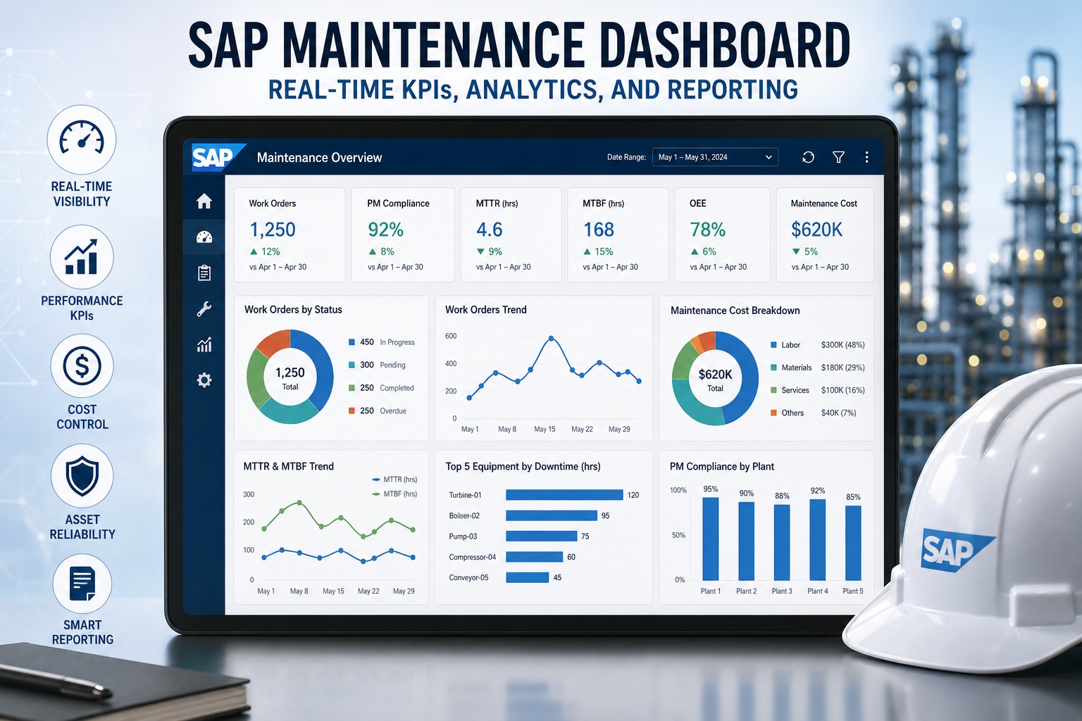
Maintenance KPI Dashboard
Q3 2026 · All Plants
MTTR
4.2hrs
12% vs Q2
MTBF
287hrs
8% vs Q2
PM Compliance
92%
5% vs Q2
Backlog Ratio
1.2wks
6% vs Q2
Work Orders Completed (12 weeks)
Overall OEE
84.3% Target 85%
Plant A · On Target
Plant B · Watch List
Plant C · On Target

Why Most Maintenance Dashboards Get Ignored After Week Two

Walk into any plant control room and you'll find at least one large monitor cycling through KPI charts that nobody looks at. The dashboard was built with enthusiasm during implementation, displayed prominently, then quietly stopped influencing decisions within a month. ARC Advisory Group's 2025 maintenance analytics research identified three root causes: too many metrics, no clear ownership, and KPIs that don't connect to daily decisions. The dashboards that survive aren't necessarily the prettiest—they're the ones designed around what the maintenance team actually decides every day.

73%
of maintenance dashboards become irrelevant within 90 days of launch
7
core KPIs covers 90% of maintenance decisions—anything more creates noise
3.4x
higher ROI on dashboards tied to specific operational decisions vs. general reporting

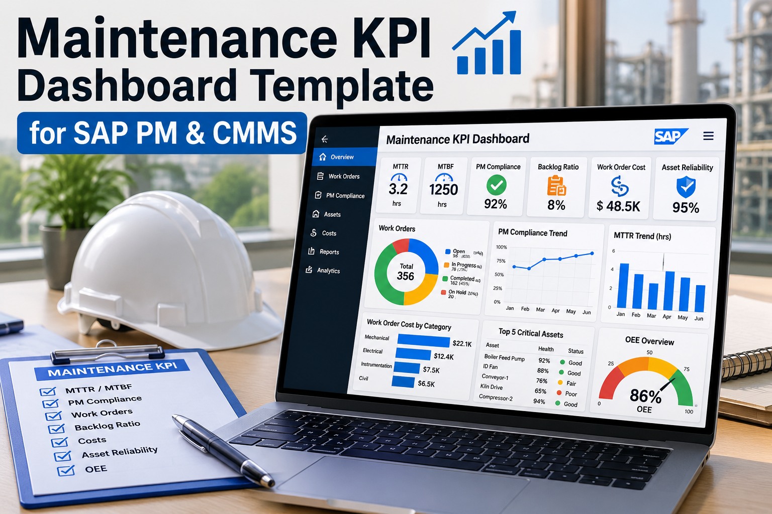
The template above isn't generic—it focuses on the seven KPIs that consistently drive maintenance performance across SAP-integrated plants. Sign up free to deploy this dashboard template against your live SAP PM and CMMS data.

The 7 KPIs Every Maintenance Dashboard Must Track

After analyzing dashboards from over 200 manufacturing operations, the pattern is consistent: high-performing teams track these seven metrics, organized into three categories. Each KPI answers a specific question that comes up in daily operations, weekly planning meetings, or monthly leadership reviews. The catalog below shows formula, healthy target, and what each metric tells you when it moves.

KPI Reference Library
Seven metrics organized by what they measure
01
MTTR
Mean Time To Repair
Σ Downtime / # Failures
Healthy: < 4 hours
02
MTBF
Mean Time Between Failures
Operating Time / # Failures
Healthy: > 250 hours
03
Failure Rate
Asset Failure Frequency
# Failures / Operating Hours
Healthy: < 0.4%
04
PM Compliance
Preventive Maintenance Adherence
PMs Completed On Time / PMs Scheduled
Healthy: > 90%
05
Backlog Ratio
Work Order Backlog (Weeks)
Open WO Hours / Weekly Capacity
Healthy: 2-4 weeks
06
WO Cost
Average Work Order Cost
Total WO Spend / # Work Orders
Trend-based target
07
OEE
Overall Equipment Effectiveness
Availability × Performance × Quality
World-class: > 85%

Reliability KPIs: Reading the Health of Your Assets

MTTR, MTBF, and Failure Rate work together to tell the reliability story. MTTR reveals how efficiently your team responds to breakdowns—rising MTTR points to skill gaps, parts availability issues, or root-cause complexity. MTBF reflects asset condition and PM effectiveness—dropping MTBF signals that preventive maintenance isn't catching wear patterns early enough. Failure Rate trended over months reveals whether your reliability program is improving or regressing. Track these three together; isolated readings of any one create misleading conclusions.

Execution KPIs: Are You Doing What You Planned?

PM Compliance and Backlog Ratio measure execution discipline. PM Compliance below 85% almost always correlates with rising emergency work, longer MTTR, and shorter MTBF—it's the single most predictive maintenance KPI. Backlog Ratio reveals capacity health: under 2 weeks suggests overstaffing or insufficient scope identification, while over 4 weeks indicates chronic understaffing or parts-availability problems that need leadership attention. Sign up free to track these KPIs with automatic SAP PM integration.

Cost & Performance KPIs: Connecting Maintenance to the Business

Work Order Cost and OEE are the metrics that translate maintenance performance into business language. Average WO Cost trended over quarters reveals whether your operation is becoming more or less efficient—seasonal variation is expected, but a steady upward trend signals deeper problems with parts costs, labor productivity, or repair complexity. OEE bridges maintenance to production, with the availability component being the maintenance team's direct lever. Plants tracking maintenance-driven OEE consistently outperform those that treat reliability as separate from operations.

See Your Real Numbers in This Dashboard
Stop building dashboards from scratch in Excel. Watch a 30-minute walkthrough where we connect this template to live SAP PM data and your CMMS in real time—then you decide what fits.

Setting Healthy Thresholds and Alert Levels

A dashboard without thresholds is just a number display. Each KPI needs a healthy range, a warning band, and a critical level—plus named accountability for each threshold breach. The thresholds below reflect typical mid-size manufacturing operations running SAP-integrated CMMS environments. Adjust them based on your industry: pharmaceutical operations should run tighter on PM Compliance, while high-throughput consumer goods operations may accept higher backlog ratios during peak production windows.

KPI Threshold Reference Table
KPIHealthyWarningCritical
MTTR< 4 hrs4-8 hrs> 8 hrs
MTBF> 250 hrs150-250 hrs< 150 hrs
Failure Rate< 0.4%0.4-1.0%> 1.0%
PM Compliance> 90%80-90%< 80%
Backlog Ratio2-4 weeks4-6 wks / < 2 wks> 6 weeks
Work Order CostTrending downFlat 90+ daysRising 60+ days
OEE> 85%65-85%< 65%

Each threshold should map to a specific action: warning levels trigger investigation, critical levels trigger escalation to the operations director or plant manager. Sign up free to configure these thresholds as automated alerts within your CMMS workflow.

Expert Perspective: Building a Dashboard People Actually Use

The dashboards that drive results have one thing in common: every KPI on them maps to a decision someone makes weekly. The MTTR tile isn't decoration—it's the data your maintenance manager uses in Monday's planning meeting. The Backlog Ratio isn't a vanity metric—it's what triggers the conversation about hiring a third technician. When you build a dashboard, write down who looks at each metric and what they do with it. If you can't answer both questions in one sentence, delete the metric. The dashboards that fail are the ones where everyone admires the data and nobody acts on it.
Map KPIs to Decisions
Each metric must answer a recurring operational question. If a KPI doesn't trigger a regular conversation or action, it doesn't belong on the dashboard.
Assign Named Ownership
Every KPI needs an owner who explains breaches in weekly reviews. Shared ownership becomes no ownership very quickly.
Review Monthly, Refine Quarterly
Dashboards are living documents. Retire metrics that don't drive behavior, add metrics that emerge as decision-critical, and adjust thresholds as your operation matures.

Teams ready to deploy this template against their actual SAP and CMMS data can request a guided setup session. Book a free demo to configure this dashboard with your real maintenance metrics in under 30 minutes.

Skip the Spreadsheet Phase Entirely
Most plants spend 6-12 months building maintenance dashboards in Excel before realizing they need something better. Start with a CMMS designed around these seven KPIs from day one—live data, automated alerts, mobile access included.

Frequently Asked Questions

How many KPIs should a maintenance dashboard actually display?
Five to seven is the practical sweet spot for primary dashboards. Below five, you're missing important dimensions; above seven, attention fragments and individual metrics lose meaning. The seven KPIs in this template were selected because they collectively answer the questions that come up in 90% of maintenance decisions. Secondary dashboards can drill into sub-metrics—asset-specific MTTR, plant-by-plant PM Compliance—but the primary view should fit on a single screen without scrolling.
Should the same dashboard serve technicians, planners, and executives?
No—each audience needs different views of the same underlying data. Technicians need today's work orders and immediate priorities. Planners need weekly backlog, PM compliance, and resource allocation. Executives need monthly trends, cost-per-asset, and OEE. The seven KPIs in this template serve as the executive-level view; tactical dashboards for planners and technicians should derive from the same data sources but display different cuts of it.
How often should KPI dashboards update with new data?
Real-time updates sound appealing but rarely add value for KPIs measured in days, weeks, or months. Daily refresh is sufficient for MTTR, PM Compliance, and Backlog Ratio. Hourly refresh adds value only for OEE in continuous-process operations. Real-time alerts (push notifications) work better than real-time dashboards for urgent items—reserve the dashboard for trend visibility and the alert system for immediate action triggers.
What if my SAP data doesn't directly support these KPI calculations?
SAP PM has all the raw data needed for every KPI in this template—work orders, equipment master, time confirmations, cost postings. The challenge is usually configuration, not data availability. Common issues include inconsistent equipment criticality flags, work order types not aligned to PM/CM distinction, and incomplete time confirmations. A properly designed CMMS integration extracts what's needed and supplements with technician-entered data via mobile capture for fields SAP doesn't track natively.
How do I get my team to actually look at the dashboard regularly?
Build the dashboard review into existing meetings rather than expecting people to check it independently. Start the weekly maintenance planning meeting with the dashboard on screen—the first three minutes should walk through the seven KPIs and flag anything in warning or critical. Within four to six weeks, the dashboard becomes the natural anchor for planning conversations. Standalone dashboards that nobody opens fail predictably; embedded dashboards that drive recurring conversations stick permanently.


Share This Story, Choose Your Platform!