Most maintenance managers know exactly what their plant's MTTR was last quarter. They have no idea what it is right now. Dashboards live in spreadsheets updated every Monday by an analyst stitching SAP exports together. By meeting time, the numbers describe a plant that no longer exists. McKinsey research shows companies using standardized KPI dashboards outperform peers by 25 percent in asset uptime and 20 percent in cost efficiency. The gap isn't which metrics matter—it's how fast you see them. Ready to see live KPIs? Book a free demo of a real-time maintenance dashboard.
Why Spreadsheet Dashboards Fail to Drive Decisions
The spreadsheet dashboard has been the standard maintenance reporting tool in SAP shops for two decades. It works—until it doesn't. The problem isn't accuracy; SAP holds the data correctly. The problem is latency. By the time a maintenance manager opens their Monday morning dashboard, the data is between 24 and 96 hours old. The work orders that closed Friday evening haven't been reconciled. The unplanned outage Saturday night appears as a single line in IW38 with no failure code. Three critical assets are trending toward bearing failure and the data exists, but it's buried in a CSV that nobody has time to pivot before the 9 AM meeting.
The result is a maintenance program managed in arrears. Every decision is made on numbers describing a plant that doesn't exist anymore. Compare that to plants running live KPI dashboards: the maintenance supervisor sees MTTR climbing for Line 3 the moment a third repair extends past two hours. The bad actor list refreshes after every work order closure. The reactive-to-planned ratio updates the moment an emergency order gets generated. Plants ready to move from weekly reports to live decisions can Sign up free to launch a live SAP maintenance dashboard this week.
Anatomy of a Real-Time SAP Maintenance Dashboard
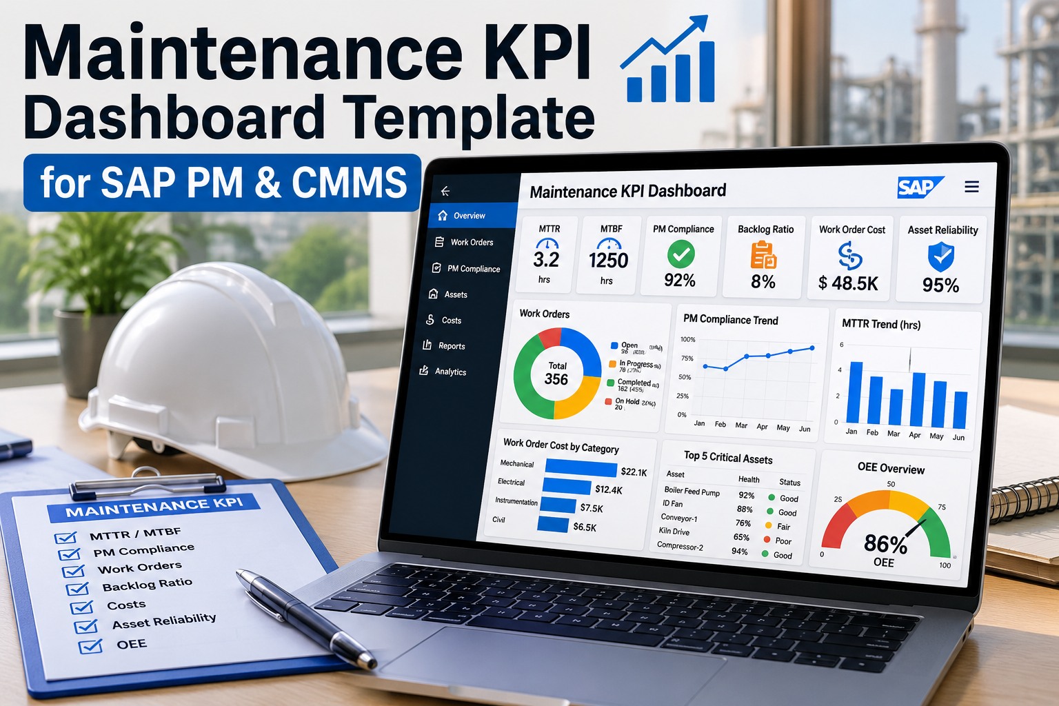
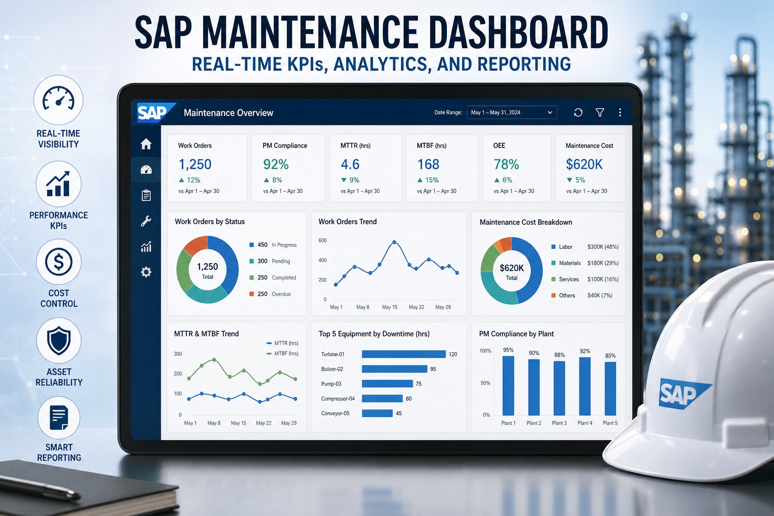
The mockup below is what a live SAP maintenance dashboard looks like in practice—built from work order data flowing in real time from SAP PM, condition data from connected sensors, and cost postings from the SAP financial layer. Every tile updates as technicians close work orders in the field.
What makes this dashboard work isn't the visual design—it's the data freshness. Every tile reads from a live SAP PM connection. A technician closing a work order on a mobile device at 2:47 PM is reflected in MTTR, backlog, and cost trend by 2:48 PM. The bad actor list resorts. The reactive ratio updates. No analyst stitches anything together. The plant manager sees current reality, not historical reconstruction.
The Eight KPIs Every SAP Maintenance Dashboard Must Track
Manufacturing maintenance has converged on a consistent shortlist of essential metrics. Tracking all eight tells a complete reliability story; tracking fewer leaves blind spots. Here's the canonical set, with the formula, the world-class benchmark, and what each number actually reveals.
| KPI | Formula | World-Class | What It Reveals |
|---|---|---|---|
| MTTR | Total repair time ÷ # of repairs | < 2 hrs | Technician efficiency, parts availability, diagnostic speed |
| MTBF | Total uptime ÷ # of failures | > 500 hrs | Asset reliability, PM effectiveness, early degradation signals |
| OEE | Availability × Performance × Quality | 85%+ | True productive capacity vs theoretical maximum |
| PM Compliance | On-time PMs ÷ scheduled PMs (10% rule) | 90%+ | Discipline of the proactive maintenance program |
| Schedule Adherence | Work completed on plan date ÷ planned | 94%+ | Planner accuracy and execution consistency |
| Backlog Hours | Open WO hrs ÷ weekly capacity | 2–4 wks | Resource balance — too low or high are both warnings |
| Planned % | Planned WO ÷ total WO | 80%+ | Maturity of maintenance strategy, reactive vs proactive |
| Cost / RAV | Annual maint cost ÷ replacement asset value | < 3% | Financial efficiency normalized for asset base |
The trap most plants fall into is tracking only lagging indicators—MTTR, MTBF, downtime percentage. These describe what already happened. The leading indicators—PM compliance, schedule adherence, backlog hours—predict what's about to happen. World-class plants track both, with leading indicators driving daily decisions and lagging indicators validating that the strategy is working. Teams ready to start tracking all eight on live SAP data can Sign up free and have the canonical eight running this week.
How SAP Data Becomes a Live KPI Tile
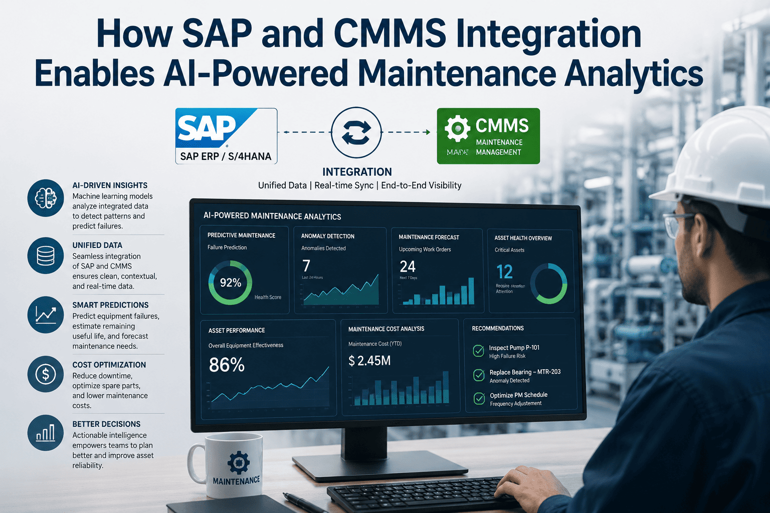
The mechanical question every maintenance manager asks: how does a closed work order in SAP IW38 turn into the MTTR tile updating on a dashboard 60 seconds later? The flow is below—simpler than most assume, but only when the integration is built on standard OData rather than custom ABAP.
The trip from closure to dashboard happens in well under a minute when standard OData APIs are doing the heavy lifting. The latency lives elsewhere—usually in the human gap between a technician finishing a job and actually pressing the confirmation button. That's why mobile-first execution matters: the closer the close button is to the asset, the fresher every KPI on the dashboard.
ROI: Live Dashboards vs Weekly Reports
The performance gap between plants on live dashboards and plants on weekly spreadsheet reports is wider than most managers expect. Live measurement changes behavior in ways monthly review meetings never do. The numbers below come from operating data at discrete manufacturers that transitioned from weekly reporting to live KPI dashboards over 12 months.
| Operating Metric | Weekly Spreadsheet | Live Dashboard | Shift |
|---|---|---|---|
| MTTR (critical assets) | 3.4 hrs | 1.8 hrs | −47% |
| Unplanned downtime hrs / week | Baseline | Down 9 hrs/wk | −9 hrs |
| OEE | 67% | 83% | +16 pts |
| PM compliance | 73% | 91% | +18 pts |
| Analyst hours / month on reporting | 8–12 hrs | < 1 hr | −90% |
| Decision latency | 4–7 days | Minutes | −99% |
The biggest gain is rarely the metric itself—it's the behavior change. When a supervisor sees MTTR creeping up while a repair is still in progress, they intervene. When a planner sees backlog hours climbing through the work week, they reallocate. When a plant manager sees PM compliance dip below target on a Tuesday, they don't wait until Friday's meeting. The dashboard turns reporting into operating. Teams ready to model the dashboard ROI for their own plant can Book a free demo to walk through projected savings on their asset base.
Expert Perspective: What Dashboards Get Wrong
Most maintenance dashboards fail for one of three reasons: they show too many metrics so nothing stands out, they show the wrong metrics so the wrong decisions get made, or they show the right metrics with stale data so people stop trusting the numbers. World-class dashboards do the opposite—eight metrics, the ones that actually drive reliability, refreshed live from the source system. When the dashboard is fast, trusted, and focused, the maintenance program runs itself. When it's slow, suspect, or sprawling, the spreadsheets come back within a quarter.
The 30-Day Path to Your First Live Dashboard
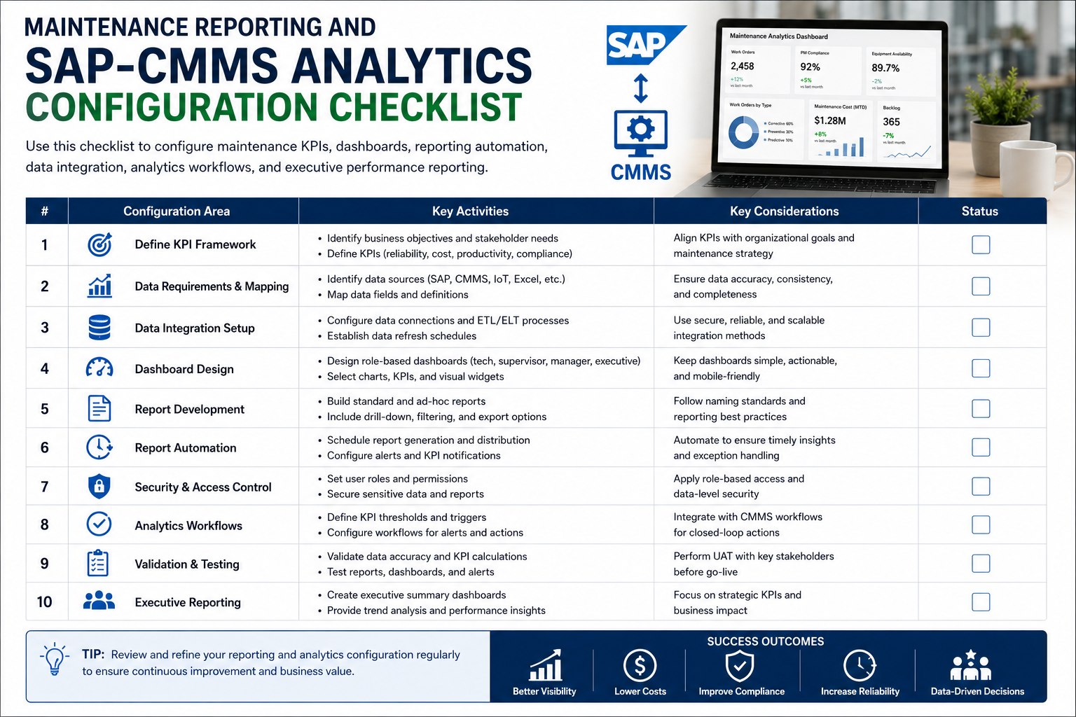
Most teams overestimate the work required to launch a live SAP maintenance dashboard. The technology side is well understood—standard OData connections, prebuilt KPI calculations, mobile data capture. The harder part is data hygiene, and that's exactly what this 30-day path addresses.
By day 30, the analyst who used to spend two days a month stitching together MTBF reports is back working on reliability engineering. The plant manager opens the dashboard during morning coffee and sees yesterday in real numbers. The maintenance team operates on facts, not memory. Teams ready to start the connect-and-validate phase can Sign up free to launch the first live KPI tiles this week.