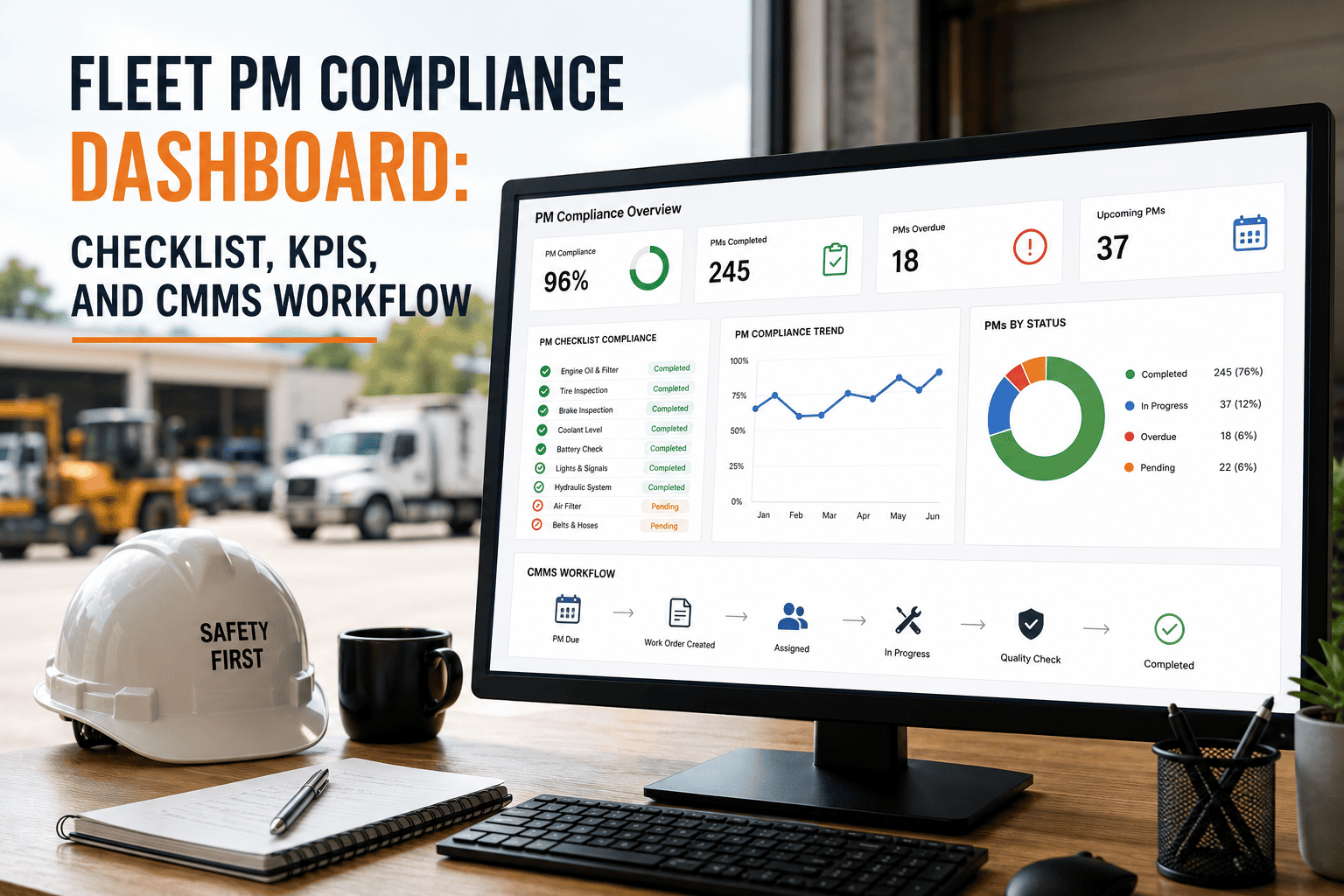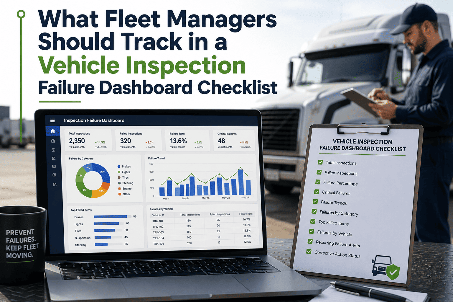
A vehicle inspection failure dashboard fails when it shows everything. Cram forty metrics onto one screen with equal weight and managers stop looking at it entirely — the phenomenon known as dashboard fatigue. The best inspection dashboards follow one rule: simple enough for a hallway decision, detailed enough for a deep investigation. This guide breaks down exactly what a fleet manager should track, layered by priority, so the screen drives action instead of noise. Sign Up Free to build yours on live data.
Stop Building Spreadsheets. Start Seeing Failures.
OxMaint calculates every inspection failure metric automatically from your DVIRs and work orders — DVIR completion, defect trends, breakdown risk scores, and cost per mile update every shift, so you spend your time acting on the data instead of assembling it.
The Layered Dashboard — Four North Stars on Top
Industry best practice in 2026 is a tiered layout: three to four North Star KPIs shown large at the top, a band of diagnostic metrics beneath, and one-click drill-down to everything else. These four are the ones where improving the number directly reduces cost, prevents downtime, or protects you from risk. If you track nothing else, track these — with green, yellow, and red status you can read in under 30 seconds. Book a Demo to see the live layout.
The single best predictor of reliability. Moving from 70% to 94% cuts breakdowns by around half. Below 85% statistically guarantees more failures within 60–90 days.
Every day a vehicle sits out of service costs real revenue, and 78% of it is preventable. Track hours per vehicle per month and the scheduled-vs-unscheduled ratio.
If drivers are not inspecting, defects are not being caught. Below 90% is a red flag. Track daily, by location, shift, and driver group to find the gaps.
The clearest signal of financial health. Rising CPM without a revenue increase means something needs attention now — do not wait for the quarterly review.
Track Both Leading and Lagging Signals
The most common dashboard mistake after fatigue is tracking only lagging indicators — reporting roadside violations and CSA scores after the fact, with nothing that predicts them. A failure dashboard needs both: lagging metrics that measure what happened, and leading metrics that warn you before it does. The leading side is where breakdowns get prevented.
- Breakdown risk score (1–10) per vehicle from MTBF trend, overdue PM, fault codes, and mileage since service
- MTBF trend direction — a decline of 15% quarter-over-quarter means a breakdown is coming
- Defect trends by component — recurring failures pointing to the next expensive pattern
- Zero-defect anomaly rate — clean inspections on high-risk vehicles signal pencil-whipping
- Failure probability forecast at 30, 60, and 90 days
- Roadside inspection pass/fail and OOS rate compared against your internal inspection quality
- CSA BASIC scores and their trajectory against intervention thresholds
- Violation counts by category — brakes, tires, lights, air systems
- Unplanned downtime hours logged per vehicle
- Realized maintenance cost versus budget
See the Failure Before It Happens
OxMaint assigns every vehicle a live breakdown risk score from its inspection and maintenance history, flags any unit scoring 7 or higher, and auto-generates the inspection work order before it goes out on the next shift — turning your dashboard into an early-warning system.
The Dashboard Tracking Checklist
Use this to build a failure dashboard that drives decisions. Each item is something a fleet manager should be able to see, filter, and act on — not just a number that sits there. Work through them and your dashboard becomes a decision engine, not a decoration.
Three or four North Star KPIs with red/yellow/green status
Keep the top view to five or fewer metrics readable in under 30 seconds. PM compliance, unplanned downtime, DVIR completion, and cost per mile earn the top row — everything else drills down on click.
A per-vehicle breakdown risk score
Combine MTBF trend, overdue PM status, active fault codes, days since inspection, and mileage since service into a single 1–10 score, weighted by age and class. Auto-flag and auto-inspect anything scoring 7 or above.
Defect trends by component, vehicle, and location
Surface which parts and units fail repeatedly. A vehicle with two consecutive failed inspections on the same defect needs escalation, not another inspection form. Prioritize by repeatability plus severity.
Defect-to-repair response time
Track the clock from finding to work order to certified fix. Same day for safety items, 24 hours for the rest. A defect-to-repair cycle over 48 hours should trigger a manager review automatically.
Automated threshold alerts, not just charts
A dashboard is a live monitoring system, not a report. Set thresholds so a safety-critical defect, a DVIR completion drop below 80%, or an OOS event pushes a notification to the right person within minutes.
Role-based views for each stakeholder
A dispatcher does not need the CFO's dashboard. Give executives a one-page view with 5–7 KPIs and exception counts, managers the operational detail, and drivers their personal scorecards — same data, different views.
Match the Review Cadence to the Metric
Tracking a KPI without acting on it is the most dangerous waste. Different metrics reward different review rhythms — and every review should produce action items with owners and deadlines. The table scrolls sideways on mobile.
| Cadence | What to review | Action it triggers |
|---|---|---|
| Daily | DVIR completion, open safety-critical defects, risk-score flags | Ground vehicles, dispatch inspections |
| Weekly | PM compliance, availability, work order backlog, defect trends | Assign corrective actions with deadlines |
| Monthly | Cost per mile, MTBF/MTTR patterns, repeat defects by asset | Flag high-cost vehicles, adjust PM intervals |
| Quarterly | CSA trajectory, replacement candidates, KPI targets | Replace assets, reset targets, present ROI |
I used to spend six hours every Friday pulling inspection and repair data into a spreadsheet that was already stale by the time I finished. Now the dashboard updates every shift, the risk scores tell me which trucks to pull before they strand a driver, and I spend those six hours acting on what the data says instead of assembling it.
— Fleet Manager, regional carrier, 85 vehicles
Frequently Asked Questions
The questions fleet managers ask most about designing an inspection failure dashboard that actually gets used.
Three to four North Star KPIs, five to seven at most on the executive view. More than that causes dashboard fatigue and people stop looking. Keep the top simple and let everything else drill down. Sign Up Free to see the layered layout.
PM compliance rate. It is the leading indicator that drives six other KPIs — improving it from 70% to 94% cuts breakdowns roughly in half and lowers MTTR, emergency parts spend, and cost per mile within 90 days.
A 1–10 score per vehicle blending MTBF trend, overdue PM, active fault codes, days since inspection, and mileage since service, weighted by age and class. Vehicles scoring 7 or higher get flagged for immediate inspection.
Compliance numbers are lagging — they tell you what already happened. Leading signals like MTBF decline and defect trends warn you weeks ahead, which is the only window in which a breakdown can still be prevented.
Yes. Every inspection, defect, and work order feeds the dashboard live — North Star KPIs, risk scores, defect trends, and threshold alerts with no spreadsheets or manual entry. Book a Demo to see it running.
Build a Dashboard That Prevents Failures, Not Just Reports Them
OxMaint turns your inspection and work order data into a layered, real-time failure dashboard — North Star KPIs up top, breakdown risk scores and defect trends beneath, threshold alerts to the right people, and role-based views for every stakeholder. No spreadsheets, no lag, just the clarity to act before the breakdown.